
You're watching a finance video from a top creator. The stock chart appears on screen and it looks... expensive. Glowing cyan lines on a dark grid. Crisp monospace numbers ticking upward. That signature Bloomberg Terminal aesthetic that screams "I know what I'm talking about."
Then you look at your own videos. A screenshot from Yahoo Finance. Maybe a basic line chart from Google Sheets. It works, technically. But it doesn't look like you belong in the same category as the creators you admire.
Here's what nobody tells you: that Bloomberg-style look isn't actually hard to achieve. It's not proprietary. It's not locked behind expensive software. It's a specific combination of design elements that you can replicate—if you know what those elements are.
This guide breaks down the Bloomberg aesthetic completely. What makes it look premium. How to create it yourself. And how to do it without hiring a designer or spending weeks in After Effects.
<h2 id="bloomberg-aesthetic">Deconstructing the Bloomberg Aesthetic</h2>
<p>Before you can recreate the look, you need to understand what creates it. The Bloomberg Terminal aesthetic isn't accidental—it's a specific combination of deliberate design choices.</p>
<h3 id="dark-background">Dark Background with Grid Lines</h3>
<p>Bloomberg's signature look starts with a dark background. Not pure black, but a deep charcoal or navy. Usually #0a0a0a to #1a1a2e range.</p>
<p>Over this dark base sits a subtle grid. Thin lines, low opacity, creating structure without overwhelming the data. The grid suggests precision and analysis—like graph paper for serious financial work.</p>
<p>This dark foundation does two things:</p>
<ol>
<li>Creates contrast that makes data pop</li>
<li>Signals "professional trading environment" to viewers</li>
</ol>
<p>Bright, white backgrounds feel consumer-grade. Dark backgrounds feel institutional.</p>
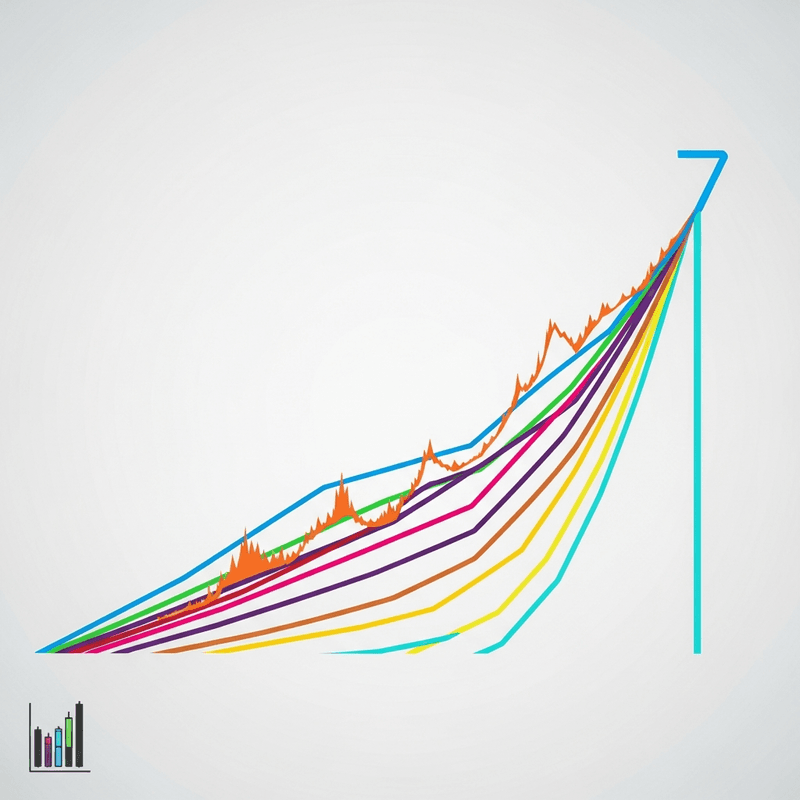
<h3 id="glowing-lines">Glowing, High-Contrast Lines</h3>
<p>The chart lines themselves glow. Not literally animated glow (though that works too), but high-saturation colors with slight blur or bloom effects that make them appear luminous against the dark background.</p>
<p>Signature colors:</p>
<ul>
<li><strong>Cyan/Teal:</strong> #00d4ff, #00ffd5—the classic Bloomberg accent</li>
<li><strong>Green:</strong> #00ff88, #39ff14—for positive movements</li>
<li><strong>Red:</strong> #ff3366, #ff0055—for negative movements</li>
<li><strong>Amber/Gold:</strong> #ffaa00, #ffd700—for highlights and warnings</li>
</ul>
<p>These aren't pastel or muted. They're vivid, almost neon. On the dark background, they appear to emit light.</p>
<h3 id="monospace-typography">Monospace Typography</h3>
<p>Numbers in Bloomberg-style designs use monospace fonts. Every digit takes the same width, creating clean vertical alignment in data columns.</p>
<p>Common choices:</p>
<ul>
<li><strong>SF Mono</strong>—Apple's system monospace</li>
<li><strong>JetBrains Mono</strong>—popular with developers</li>
<li><strong>Roboto Mono</strong>—Google's clean option</li>
<li><strong>IBM Plex Mono</strong>—corporate but modern</li>
<li><strong>Fira Code</strong>—distinctive character</li>
</ul>
<p>The monospace choice signals technical precision. Variable-width fonts feel casual by comparison. When viewers see monospace numbers ticking, they think "trading terminal."</p>
<h3 id="data-density">Strategic Data Density</h3>
<p>Bloomberg terminals pack information densely. Premium finance visuals embrace this—but strategically.</p>
<p>Elements that add density:</p>
<ul>
<li>Multiple data points visible simultaneously</li>
<li>Axis labels with specific values</li>
<li>Time stamps or date ranges</li>
<li>Secondary indicators or reference lines</li>
<li>Volume bars or additional metrics below main chart</li>
</ul>
<p>The key is density that feels intentional, not cluttered. Every element should serve a purpose.</p>
<h3 id="subtle-animation">Subtle Animation</h3>
<p>When animated, Bloomberg-style charts move with purpose:</p>
<ul>
<li>Lines draw smoothly, not instantly appearing</li>
<li>Numbers tick up/down rather than jumping</li>
<li>Transitions feel fluid, not jarring</li>
<li>Subtle pulse or glow effects on key data points</li>
</ul>
<p>The animation should feel like watching a live trading system—smooth, continuous, professional.</p>
<h2 id="why-it-matters">Why This Aesthetic Matters for Finance Content</h2>
<p>Visual style isn't just decoration. For finance content specifically, the Bloomberg aesthetic serves strategic purposes.</p>
<h3 id="credibility-signal">Credibility Signaling</h3>
<p>Finance is a trust-dependent niche. Viewers need to believe you know what you're talking about before they'll take your analysis seriously.</p>
<p>Premium visuals create a halo effect. When your charts look like they came from a professional trading floor, viewers assume your analysis is equally professional. Fair or not, production quality influences perceived expertise.</p>
<h3 id="content-differentiation">Content Differentiation</h3>
<p>Most finance YouTubers and TikTokers use the same visuals:</p>
<ul>
<li>Screenshots from trading platforms</li>
<li>Basic TradingView embeds</li>
<li>Google Sheets charts</li>
<li>Stock photos of graphs</li>
</ul>
<p>Bloomberg-style custom visuals immediately differentiate your content. In a sea of screenshots, animated premium charts stop scrolls.</p>
<h3 id="watch-time">Increased Watch Time</h3>
<p>Animated charts keep eyes on screen. A static screenshot gets glanced at and forgotten. An animated line drawing itself, numbers ticking in real-time—these create moments viewers watch rather than skip.</p>
<p>For YouTube's algorithm and TikTok's algorithm, watch time matters above almost everything else. Better visuals directly impact distribution.</p>
<h3 id="brand-building">Brand Building</h3>
<p>Consistent visual style builds brand recognition. When every video features the same premium chart aesthetic, viewers start recognizing your content before they see your name.</p>
<p>Over time, the style becomes part of your brand. "Oh, that's a [Your Channel] chart." That recognition has compounding value.</p>
<h2 id="traditional-creation">The Traditional Way to Create This Look</h2>
<p>Let's be honest about what creating Bloomberg-style visuals has traditionally required.</p>
<h3 id="after-effects-approach">The After Effects Approach</h3>
<p><strong>What's needed:</strong></p>
<ul>
<li>After Effects subscription ($22.99/month)</li>
<li>Intermediate to advanced AE skills</li>
<li>Understanding of expressions for data-driven animation</li>
<li>3-6 hours per custom chart animation</li>
</ul>
<p><strong>The process:</strong></p>
<ol>
<li>Create composition with dark background</li>
<li>Build grid using shape layers or effects</li>
<li>Create chart elements (line paths, bars, etc.)</li>
<li>Rig with expressions to drive from data</li>
<li>Apply glow effects and color grading</li>
<li>Animate with keyframes or expressions</li>
<li>Add typography elements</li>
<li>Render and export</li>
</ol>
<p>For a skilled motion designer, this produces excellent results. For a finance content creator who isn't a motion designer, it's a significant time investment for every video.</p>
<h3 id="template-approach">The Template Approach</h3>
<p>After Effects templates exist for financial visualizations. Buy once, customize for each video.</p>
<p><strong>Problems:</strong></p>
<ul>
<li>Still requires After Effects and basic skills</li>
<li>Templates often don't match your exact data needs</li>
<li>Customization for your specific numbers takes time</li>
<li>Popular templates = your charts look like everyone else's</li>
<li>Quality varies dramatically</li>
</ul>
<p>Templates reduce work but don't eliminate it. You're still spending 30-60 minutes per chart customizing.</p>
<h3 id="designer-hire">The Designer/Editor Approach</h3>
<p>Hire someone to create your financial visuals.</p>
<p><strong>Costs:</strong></p>
<ul>
<li>$50-200 per custom chart animation</li>
<li>Higher for complex multi-element visualizations</li>
<li>Ongoing cost for every video</li>
<li>Communication overhead and revision cycles</li>
</ul>
<p>This produces great results if you find the right person. But for creators publishing frequently, costs add up quickly. Ten charts per month at $100 each is $12,000/year on chart animation alone.</p>
<h2 id="elements-breakdown">Building Blocks: Elements of Premium Finance Visuals</h2>
<p>Let's break down the specific elements you need to create.</p>
<h3 id="line-charts">Animated Line Charts</h3>
<p>The core of finance visualization. Stock prices, index performance, growth trends—all shown as lines over time.</p>
<p><strong>Bloomberg-style requirements:</strong></p>
<ul>
<li>Smooth line draw animation (not instant appearance)</li>
<li>Glowing line effect against dark background</li>
<li>Subtle gradient or area fill below line (optional)</li>
<li>Grid lines visible behind</li>
<li>Axis labels in monospace</li>
<li>Time range indicator</li>
</ul>
<h3 id="stock-tickers">Stock Tickers</h3>
<p>The scrolling or static display of stock symbols with prices and changes.</p>
<p><strong>Bloomberg-style requirements:</strong></p>
<ul>
<li>Monospace font for all numbers</li>
<li>Color coding: green for up, red for down</li>
<li>Percentage change prominently displayed</li>
<li>Ticker symbols in caps</li>
<li>Clean spacing between elements</li>
<li>Smooth animation if scrolling</li>
</ul>
<h3 id="candlestick-charts">Candlestick Charts</h3>
<p>The trader's standard for showing open, high, low, close data.</p>
<p><strong>Bloomberg-style requirements:</strong></p>
<ul>
<li>Traditional green/red coloring (or custom brand colors)</li>
<li>Dark background with subtle grid</li>
<li>Volume bars below main chart</li>
<li>Animation: candles building left to right</li>
<li>Date/time axis clearly labeled</li>
</ul>
<h3 id="comparison-charts">Comparison Charts</h3>
<p>Multiple lines showing relative performance of different assets.</p>
<p><strong>Bloomberg-style requirements:</strong></p>
<ul>
<li>Distinct colors for each line (from neon palette)</li>
<li>Legend clearly identifying each line</li>
<li>Lines drawing simultaneously or sequentially</li>
<li>Percentage scale for fair comparison</li>
<li>Interactive-feeling highlights on key moments</li>
</ul>
<h3 id="number-counters">Number Tickers/Counters</h3>
<p>Animated numbers showing prices, market caps, or other values.</p>
<p><strong>Bloomberg-style requirements:</strong></p>
<ul>
<li>Monospace font</li>
<li>Numbers "roll" rather than jump</li>
<li>Thousands separators (commas)</li>
<li>Currency symbols or units</li>
<li>Subtle glow or highlight effect</li>
</ul>
<h2 id="flowi-solution">Creating Bloomberg-Style Charts with flowi.video</h2>
<p><a href="https://flowi.video">flowi.video</a> includes a "Neon Finance" template style specifically designed to replicate this premium aesthetic—without requiring any design skills.</p>
<h3 id="neon-finance-template">The Neon Finance Style</h3>
<p>The Neon Finance template in flowi.video is built from the ground up with Bloomberg-inspired design:</p>
<p><strong>Dark mode foundation:</strong></p>
<ul>
<li>Deep charcoal/navy backgrounds</li>
<li>Subtle grid lines with proper opacity</li>
<li>Professional dark-on-dark layering</li>
</ul>
<p><strong>Signature color palette:</strong></p>
<ul>
<li>Glowing cyan primary lines</li>
<li>Neon green for positive values</li>
<li>Vivid red for negative values</li>
<li>Amber accents for highlights</li>
</ul>
<p><strong>Typography:</strong></p>
<ul>
<li>Monospace numbers throughout</li>
<li>Clean sans-serif for labels</li>
<li>Proper sizing for video readability</li>
</ul>
<p><strong>Animation:</strong></p>
<ul>
<li>Smooth line drawing effects</li>
<li>Number ticking/rolling</li>
<li>Subtle glow pulses</li>
<li>Professional easing on all movement</li>
</ul>
<p>You don't build this from scratch. You select the style, input your data, and the template handles the aesthetic.</p>
<h3 id="workflow">The Workflow</h3>
<p><strong>Step 1: Input your financial data (30 seconds)</strong></p>
<p>Enter your data directly:</p>
<ul>
<li>Stock prices over time</li>
<li>Comparison values for multiple assets</li>
<li>Single values for ticker displays</li>
<li>Percentage changes</li>
</ul>
<p>Paste from a spreadsheet or type directly. The interface accepts both.</p>
<p><strong>Step 2: Select Neon Finance style (10 seconds)</strong></p>
<p>Choose the Neon Finance template from available styles. The dark background, glowing lines, and monospace typography are pre-configured.</p>
<p><strong>Step 3: Choose visualization type (10 seconds)</strong></p>
<p>Select what you're creating:</p>
<ul>
<li>Line chart (single or multi-line)</li>
<li>Stock ticker display</li>
<li>Number counter animation</li>
<li>Comparison chart</li>
</ul>
<p><strong>Step 4: Configure and generate (30-60 seconds)</strong></p>
<p>Set aspect ratio (16:9 for YouTube, 9:16 for TikTok/Reels), duration, and any specific preferences. Click generate.</p>
<p>The AI handles:</p>
<ul>
<li>Scaling data to fit frame properly</li>
<li>Applying the Neon Finance aesthetic</li>
<li>Creating smooth animation</li>
<li>Rendering broadcast-quality output</li>
</ul>
<p><strong>Step 5: Download and use (10 seconds)</strong></p>
<p>Download your MP4. Drop it into your video timeline. Done.</p>
<p><strong>Total time: Under 2 minutes per chart.</strong></p>
<h3 id="what-you-get">What You Actually Get</h3>
<p>The output from flowi.video with Neon Finance styling:</p>
<ul>
<li><strong>Broadcast-quality MP4</strong>—1080p or 4K resolution</li>
<li><strong>Premium aesthetic</strong>—indistinguishable from custom motion design</li>
<li><strong>Smooth animation</strong>—60 FPS fluid motion</li>
<li><strong>Platform-ready formats</strong>—16:9 for YouTube, 9:16 for vertical, 1:1 for square</li>
<li><strong>Transparent background option</strong>—for compositing over other footage</li>
</ul>
<p>This is the same visual quality that would cost $100-200 from a freelancer or 3-4 hours in After Effects—generated in under 2 minutes.</p>
<h2 id="use-cases">Use Cases for Bloomberg-Style Visuals</h2>
<p>Where does this aesthetic fit in actual content?</p>
<h3 id="youtube-finance">YouTube Finance Videos</h3>
<p>Stock analysis, market commentary, earnings breakdowns—all benefit from premium chart animation.</p>
<p>Use for:</p>
<ul>
<li>Opening hook showing dramatic price movement</li>
<li>Illustrating analysis points with animated data</li>
<li>Comparing stock performance visually</li>
<li>Showing historical trends</li>
<li>Earnings and financial metric displays</li>
</ul>
<p>The Bloomberg aesthetic positions your channel as serious finance content, not casual commentary.</p>
<h3 id="tiktok-finance">TikTok/Reels Finance Content</h3>
<p>Short-form finance content thrives with eye-catching visuals.</p>
<p>Use for:</p>
<ul>
<li>"Stock of the day" ticker animations</li>
<li>Quick price movement visualizations</li>
<li>Market recap charts</li>
<li>Dramatic before/after price comparisons</li>
<li>Viral "this stock did X" content</li>
</ul>
<p>The glowing neon aesthetic stops scrolls in dark-mode feeds—which is how most people browse.</p>
<h3 id="presentations">Investor Presentations</h3>
<p>Pitching to investors? Premium financial visuals signal professionalism.</p>
<p>Use for:</p>
<ul>
<li>Growth trajectory charts</li>
<li>Market size visualizations</li>
<li>Financial projection animations</li>
<li>Competitive comparison charts</li>
<li>Key metric highlights</li>
</ul>
<p>The Bloomberg look says "we take data seriously" before you've spoken a word.</p>
<h3 id="courses">Finance Courses and Education</h3>
<p>Teaching finance concepts benefits from visual clarity.</p>
<p>Use for:</p>
<ul>
<li>Explaining chart patterns</li>
<li>Showing how indicators work</li>
<li>Historical market examples</li>
<li>Portfolio performance concepts</li>
<li>Risk/return visualizations</li>
</ul>
<p>Students engage more with premium visuals. And they perceive higher course value.</p>
<h3 id="social-proof">Social Media Presence</h3>
<p>Building a finance-focused brand on any platform.</p>
<p>Use for:</p>
<ul>
<li>Daily/weekly market posts</li>
<li>Portfolio update graphics</li>
<li>"What I'm watching" stock highlights</li>
<li>Educational thread visualizations</li>
<li>Consistent brand aesthetic across platforms</li>
</ul>
<h2 id="optimization-tips">Optimization Tips for Finance Visuals</h2>
<p>Once you're creating Bloomberg-style charts easily, optimize for maximum impact.</p>
<h3 id="data-storytelling">Lead with the Story</h3>
<p>Don't just show data—show the interesting part of the data.</p>
<p>Instead of showing 10 years of steady growth, show:</p>
<ul>
<li>The crash and recovery</li>
<li>The moment of breakout</li>
<li>The comparison point where lines cross</li>
<li>The dramatic underperformance or outperformance</li>
</ul>
<p>Trim your data to the compelling narrative, not the complete history.</p>
<h3 id="timing">Animation Timing</h3>
<p>Match animation speed to your narration:</p>
<ul>
<li>Slow enough for viewers to read labels</li>
<li>Fast enough to maintain energy</li>
<li>Pauses at key moments for emphasis</li>
<li>Speed changes to highlight dramatic movement</li>
</ul>
<p>A 10-year chart shouldn't take 30 seconds to draw. A key moment might deserve a 2-second pause.</p>
<h3 id="consistency">Maintain Consistency</h3>
<p>Use the same style across all your content:</p>
<ul>
<li>Same color palette (always)</li>
<li>Same font choices</li>
<li>Same animation style</li>
<li>Same layout patterns</li>
</ul>
<p>Consistency builds recognition. Viewers should know it's your chart before they see your logo.</p>
<h3 id="context-labels">Add Context Labels</h3>
<p>Don't assume viewers understand what they're seeing:</p>
<ul>
<li>Clear axis labels</li>
<li>Time period indicators</li>
<li>Event markers ("COVID crash," "Fed rate hike")</li>
<li>Comparison benchmarks</li>
</ul>
<p>Context transforms data into understanding.</p>
<h3 id="mobile-readability">Mobile-First Readability</h3>
<p>Most viewers watch on phones. Design for that:</p>
<ul>
<li>Larger text than you think necessary</li>
<li>Fewer data points for clarity</li>
<li>High contrast between elements</li>
<li>Test on your phone before publishing</li>
</ul>
<p>If labels are hard to read on your phone screen, they're too small.</p>
<h2 id="beyond-charts">Beyond Charts: Complete Finance Visual System</h2>
<p>Bloomberg-style charts are one element of a premium finance visual system. Consider extending the aesthetic to:</p>
<h3 id="lower-thirds">Lower Thirds</h3>
<p>Name/title graphics that match your chart style. Dark background, glowing accent lines, monospace elements.</p>
<h3 id="transitions">Transitions</h3>
<p>Scene transitions with the same color palette and glow effects. Creates cohesive visual flow.</p>
<h3 id="thumbnails">Thumbnails</h3>
<p>Static versions of your chart style for video thumbnails. Consistent aesthetic across all touchpoints.</p>
<h3 id="intro-outro">Intro/Outro</h3>
<p>Channel branding that incorporates the financial aesthetic. Sets the tone before content begins.</p>
<p>When everything matches, your channel feels like a premium financial media brand—not a creator with nice charts.</p>
<h2 id="getting-started">Getting Started Today</h2>
<p>You don't need to build this capability all at once. Start small and expand.</p>
<p><strong>Step 1: Create one chart</strong></p>
<p>Take a piece of financial data from your next video. Create a Bloomberg-style animated version using <a href="https://flowi.video">flowi.video</a>. See how it looks in your content.</p>
<p><strong>Step 2: Compare the impact</strong></p>
<p>Publish and watch retention analytics. Do viewers watch longer during the animated chart than during static screenshots in other videos?</p>
<p><strong>Step 3: Build your library</strong></p>
<p>Start creating charts for upcoming content. Build a collection of templates and styles that work for your specific content types.</p>
<p><strong>Step 4: Systematize</strong></p>
<p>Make premium charts your default. Every time you need to show financial data, use the system you've built. Static screenshots become the exception, not the rule.</p>
<h2 id="conclusion">Look Premium Without the Premium Cost</h2>
<p>The Bloomberg aesthetic isn't locked behind expensive software or designer rates. It's a specific combination of design elements: dark backgrounds, glowing lines, monospace typography, strategic animation.</p>
<p>Now that you understand what creates the look, you can achieve it without the traditional barriers.</p>
<p>With flowi.video's Neon Finance template, the process becomes trivial:</p>
<ul>
<li>Input data</li>
<li>Select style</li>
<li>Generate</li>
<li>Download</li>
</ul>
<p>Under 2 minutes. No designer. No After Effects. No coding.</p>
<p>The result: charts that look like they came from a professional trading floor. Visuals that signal expertise before you've made your first point. Content that stops scrolls and holds attention.</p>
<p>Your analysis deserves visuals that match its quality. Now you have the tools to create them.</p>
<div style="background-color: #f8f9fa; padding: 24px; border-radius: 8px; margin-top: 32px;">
<h3 style="margin-top: 0;">Create Bloomberg-Style Finance Visuals in Minutes</h3>
<p style="margin-bottom: 16px;">The Neon Finance template in flowi.video gives you premium glowing charts, animated stock tickers, and professional financial visualizations—no design skills required. Dark grids, neon lines, monospace numbers. Just add your data.</p>
<p style="margin-bottom: 0;"><a href="https://flowi.video" style="font-weight: bold;">Try flowi.video free →</a></p>
</div>Read Next
Continue Exploring
7 Engagement Metrics Finance Creators Must Track in 2025
Discover 7 engagement metrics that reveal what your finance audience actually wants. Learn to use data storytelling insights that drive real audience engagem...

How to Create TikTok Videos from Still Images Using AI Motion Graphics
Turn still images into scroll-stopping TikTok videos using AI motion graphics. Step-by-step guide for animated maps, charts, text, and logo reveals.

How AI Animation Fixes Broken Financial Data Stories
Discover how AI animation helps financial content creators turn complex data into clear, accurate visuals. Frameworks and strategies for building audience tr...