Transform raw audience data into storytelling decisions that build lasting viewer relationships
Learn which engagement metrics actually predict finance content success and how to use them as a creative compass. This guide connects each metric to specific storytelling improvements you can implement immediately.
TL;DR
Retention curves reveal narrative weak points - Map where audiences drop off to identify which sections of your financial content need stronger visual pacing or clearer data presentation.
Engagement depth ratio matters more than view counts - Measure comments and shares relative to views to understand whether your content builds authority or just attracts passive scrolling.
Cross-platform differentials guide format decisions - The same content performs differently across platforms, and tracking these patterns helps you optimize visual storytelling for each audience.
Repeat viewer percentage indicates real value - New viewers show reach, but returning viewers prove your finance content delivers consistent value worth coming back for.
Start with two metrics, not seven - Begin with retention analysis and engagement depth ratio, then expand your tracking as your analytical workflow matures.
Why Your Finance Content Falls Flat (And What the Data Actually Tells You)
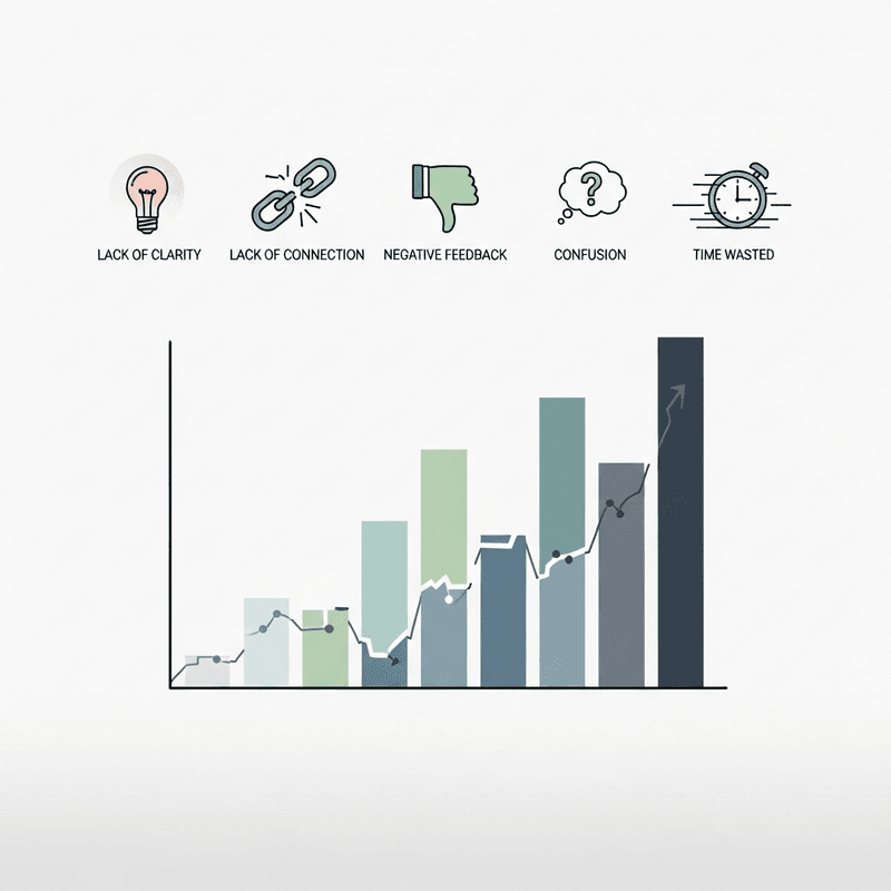
You spent hours crafting that market analysis video. The charts were accurate. The narrative was sound. Yet the engagement metrics tell a different story: minimal shares, few comments, and watch time that drops off a cliff at the 30-second mark.
This disconnect frustrates finance content creators daily. The problem rarely lies in the quality of your analysis. It lies in how you measure and respond to audience behavior. Most creators treat engagement metrics as a report card, something to check after the fact. Strategic creators use them as a compass, guiding every decision from topic selection to visual pacing.
In 2025, the gap between these two approaches determines who builds lasting audiences and who shouts into the void. Financial services content on LinkedIn averages a 3.2% engagement rate, while thought leadership content from brands like Adobe achieves 8-10%. That difference comes down to understanding what your metrics actually mean.
What This Guide Delivers
This listicle targets finance content creators, data journalists, and financial communicators who want to transform raw engagement data into actionable storytelling decisions. We focus on metrics that reveal audience intent, not vanity numbers that look impressive but tell you nothing useful.
You will not find generic advice about posting more consistently or using trending hashtags. Instead, each metric connects directly to how audiences consume financial narratives and how you can adjust your data storytelling to match their actual behavior patterns.
How We Selected These Metrics
Each metric earned its place based on three criteria: direct correlation to audience engagement quality, actionability for content creators without dedicated analytics teams, and relevance to visual financial storytelling specifically. We excluded metrics that require enterprise-level tools or those that measure activity without indicating genuine audience connection.
1. Retention Curve Analysis
Why It Matters
Retention curves expose exactly where your financial narrative loses people. Unlike total view counts, this metric reveals whether audiences disengage during your data introduction, your methodology explanation, or your conclusions. Finance content often fails at the transition between context-setting and insight delivery. Retention curves pinpoint that moment.
What It Looks Like Today
Modern platforms provide granular retention data showing second-by-second audience behavior. YouTube Studio, LinkedIn Analytics, and TikTok Creator Tools all offer this visualization. The most useful view compares retention across similar content pieces to identify patterns rather than one-off anomalies.
How to Apply It
Map your retention drop-offs against your video timeline. If audiences leave when you show static tables, that signals a need for animated data visualization. If they drop during verbal explanations, your visual pacing may be too slow. Use these insights to restructure your next piece, front-loading your most compelling visual moments before the typical drop-off point.
2. Engagement Depth Ratio
Why It Matters
This metric measures the proportion of viewers who take secondary actions (comments, shares, saves) relative to primary engagement (views, likes). A high view count with minimal secondary engagement suggests your content entertains but fails to resonate deeply enough to prompt action. For finance creators, this distinction separates content that builds authority from content that gets scrolled past.
What It Looks Like Today
Carousels lead engagement for financial services brands on Instagram, partly because the swipe mechanic creates natural secondary engagement. Platforms increasingly surface content with higher engagement depth, making this metric crucial for algorithmic visibility.
How to Apply It
Calculate your ratio by dividing comments plus shares by total views. Track this across content types to identify which formats generate deeper audience engagement. If your animated chart videos outperform static infographics on this metric, prioritize motion graphics in your production workflow. Tools that automate visual creation, like Flowi, help you test more formats without multiplying your production time.
3. Share-to-View Velocity
Why It Matters
How quickly your content gets shared after viewing indicates its perceived urgency and relevance. Financial content often has time-sensitive value. A market analysis shared within minutes of viewing suggests the audience found it immediately useful. Shares that trickle in over days suggest reference value but less immediate impact.
What It Looks Like Today
Most analytics platforms show share timing in aggregate rather than individual patterns. You can approximate this by comparing share counts at 1-hour, 24-hour, and 7-day intervals. Fast-sharing content typically features clear, shareable insights visualized in ways that communicate value without requiring full viewing.
How to Apply It
Design your financial visuals with shareability in mind. Include a standalone insight in your thumbnail or opening frame that communicates value immediately. When your data storytelling delivers the core message within seconds, audiences share before finishing, which signals algorithmic systems to amplify reach.
4. Completion Rate by Content Length
Why It Matters
This metric reveals your optimal content duration for different topics and platforms. The median Google Analytics 4 engagement rate across industries sits at 56.21%, but finance content often skews lower because creators misjudge how long audiences will commit to complex topics.
What It Looks Like Today
Platforms provide completion percentages segmented by video length. The pattern for most finance creators shows a sweet spot, often between 60-90 seconds for social content, where completion rates peak. Beyond that threshold, each additional second costs disproportionate audience retention.
How to Apply It
Map your completion rates against content duration for your last 20 pieces. Identify where completion drops below 50% and treat that as your maximum length for similar content. For complex analyses that require longer formats, structure them as series rather than single pieces, maintaining completion rates while delivering comprehensive coverage.
5. Comment Sentiment Distribution
Why It Matters
Raw comment counts obscure whether your audience agrees, disagrees, asks questions, or simply reacts. Sentiment distribution reveals whether your financial narrative persuades, confuses, or provokes. A video with 100 comments asking clarifying questions indicates different optimization needs than one with 100 comments debating your conclusions.
What It Looks Like Today
AI-powered analytics tools now categorize comments automatically. Even without specialized tools, you can manually sample 20-30 comments and categorize them: agreement, disagreement, questions, tangential discussion. This analysis takes minutes but reveals patterns invisible in aggregate metrics.
How to Apply It
If questions dominate, your visual communication may need clearer labeling or pacing. If disagreement dominates, consider whether your data visualization adequately supports your claims. High question rates on specific chart types signal opportunities to refine your visual storytelling techniques for those formats.
6. Cross-Platform Engagement Differential
Why It Matters
The same content performs differently across platforms, but the pattern of that difference reveals audience preferences. Financial services content averages 3.8% engagement on Instagram versus 3.2% on LinkedIn. Your specific differential tells you where your visual style and narrative approach resonates most strongly.
What It Looks Like Today
Instagram carousel posts achieve the highest engagement rate at 1.26%, while Instagram Reels average 3.1% for financial services. These benchmarks provide context, but your own cross-platform data reveals whether your specific approach to data-driven storytelling suits one audience better than another.
How to Apply It
Track the same content piece across platforms for 7 days. Calculate the engagement rate differential and look for patterns across multiple pieces. If your animated charts consistently outperform on one platform, consider creating platform-specific versions that lean into those visual preferences rather than publishing identical content everywhere.
7. Repeat Viewer Percentage
Why It Matters
New viewers indicate reach. Repeat viewers indicate value. For finance content creators building authority, repeat viewer percentage measures whether your audience engagement translates into ongoing relationships. A 5% repeat viewer rate suggests your content attracts but does not retain. A 25% rate suggests you are building genuine community.
What It Looks Like Today
YouTube and newsletter platforms provide returning viewer metrics directly. Social platforms require inference from follower engagement rates and comment patterns. The most useful analysis compares repeat viewer rates across content categories to identify which topics build loyalty versus which attract one-time interest.
How to Apply It
Create content series around topics that show high repeat viewer rates. If your market analysis videos bring people back while your tutorial content does not, that signals where to focus your production energy. Use visual consistency, including recurring chart styles and animation patterns, to make your content instantly recognizable to returning viewers.
The Pattern Beneath the Metrics
These seven metrics share a common thread: they measure depth over breadth. Each distinguishes between audiences who passively consume and audiences who actively engage with your financial narratives. Together, they form a system for understanding not just how many people see your content, but how your content changes their behavior.
The tradeoff is clear. Optimizing for these metrics requires more analytical work than checking view counts. But that work compounds. Each insight improves your next piece, creating a feedback loop that separates strategic creators from those who never understand why their content underperforms.
Notice also how visual quality threads through every metric. Retention, sharing, completion, and repeat viewing all respond to how effectively your data visualization communicates complex information quickly. The creators who master engagement metrics inevitably conclude that better visuals drive better numbers.
Where to Start
Do not attempt to track all seven metrics simultaneously. Begin with retention curve analysis and engagement depth ratio. These two metrics provide the most immediate, actionable insights for most finance content creators.
Add metrics as your analytical capacity grows. If you produce content weekly, review metrics monthly. If you produce daily, review weekly. The goal is sustainable improvement, not data overwhelm.
Resource constraints are real. If you lack time for both metric analysis and content production, prioritize production but build metric review into your workflow at natural intervals. One hour of monthly analysis often yields more improvement than ten hours of unfocused content creation.
Frequently Asked Questions
What is data visualization and why is it important for audience engagement?
Data visualization transforms numerical information into visual formats like charts, graphs, and animations. For audience engagement, it matters because visual processing happens faster than text comprehension. Financial audiences can grasp trends, comparisons, and outliers in seconds through effective visualization, while the same insights buried in tables or paragraphs often go unnoticed. Strong data visualization directly improves retention rates and sharing behavior.
How can interactive charts improve audience engagement?
Interactive charts invite audiences to explore data on their own terms, creating active rather than passive consumption. This interaction increases time spent with content and improves information retention. For finance content, interactive elements let viewers drill into specific time periods, compare assets, or adjust parameters, making the data personally relevant rather than generically informative.
Which metrics are most important to track in an audience engagement analysis?
Prioritize metrics that measure depth over reach. Retention curves show where content loses attention. Engagement depth ratio reveals whether views translate to meaningful actions. Completion rates indicate content-length optimization opportunities. These three metrics provide actionable insights for most finance content creators without requiring enterprise analytics infrastructure.
How can I interpret trends in my engagement data over time?
Look for patterns across similar content types rather than comparing dissimilar pieces. A market analysis video and a tutorial serve different purposes and attract different engagement patterns. Compare your Q1 market analyses to your Q2 market analyses. Track whether changes to your visual approach, pacing, or narrative structure correlate with metric improvements.
What are best practices for designing effective data visualizations for social content?
Lead with the insight, not the methodology. Place your most compelling data point in the opening seconds. Use motion to guide attention through complex information. Maintain visual consistency across pieces so returning viewers recognize your style immediately. Keep text minimal and let the visual do the explanatory work.
How do engagement metrics differ between platforms for financial content?
LinkedIn audiences engage more with professional analysis and industry commentary. Instagram audiences respond to visually striking presentations and quick insights. YouTube audiences tolerate longer formats but demand strong retention hooks. Track your own cross-platform differential to understand where your specific visual style and narrative approach resonates most effectively.
Sources
Read Next
Continue Exploring
5 Signs Your Interactive Charts Are Failing to Engage
Discover 5 key indicators that your interactive charts aren't engaging audiences. Learn which engagement metrics reveal real problems versus vanity numbers.

7 Visualization Techniques That Make Data Stories Click
Discover visualization techniques that transform raw data into compelling stories. Strategic methods for finance creators to boost engagement and retention.

Dynamic Models vs. Static Visuals: Which Drives Engagement?
Compare dynamic models and static visuals for finance content. Discover which approach drives better engagement based on your platform, timeline, and data type.