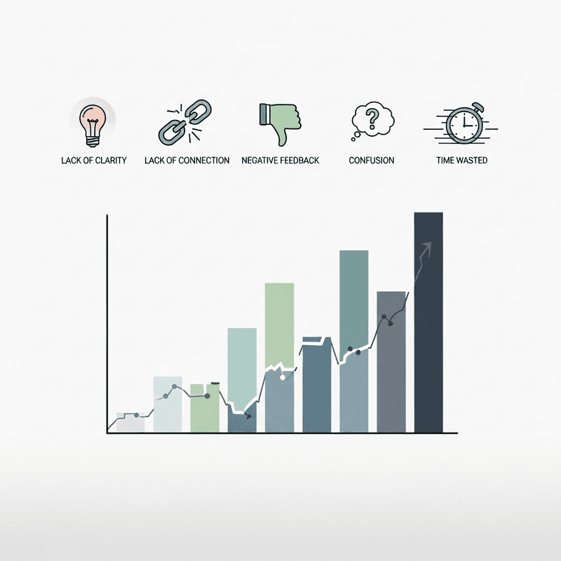
How audience behavior analysis reveals what your engagement metrics are really telling you
Learn to identify the behavioral signals that separate charts people use from charts they scroll past. This diagnostic framework connects engagement metrics to measurable outcomes.
TL;DR
Dwell time below 30% improvement over static signals your interactivity adds friction without value
Engagement rates trailing static alternatives indicates complexity is repelling rather than attracting audiences
Shallow interaction depth reveals that viewers find initial interactions unrewarding and disengage before exploring deeper
No measurable engagement spike at launch suggests fundamental misalignment with audience needs or distribution failures
Missing platform benchmarks means you are optimizing in a vacuum rather than against what audiences actually respond to
Why Your Interactive Charts Might Be Working Against You
You invested in interactive charts because the data promised better engagement. Buyers spend 53% more time on interactive content than static alternatives. The logic seemed sound.
Yet your analytics tell a different story. Viewers click once, maybe twice, then leave. Comments stay sparse. Shares remain flat. The sophisticated visualization you spent hours building performs worse than a simple bar chart your competitor posted last week.
The problem rarely lies in the data itself. It lies in how audience behavior analysis gets overlooked during the design process. Most creators focus on what looks impressive rather than what drives meaningful interaction. They optimize for visual complexity when they should optimize for cognitive clarity.
Understanding engagement metrics beyond surface-level views reveals patterns that separate charts people actually use from charts people scroll past. These indicators expose whether your visualizations serve your audience or merely serve your assumptions about what audiences want.
What This Diagnostic Framework Delivers
This framework targets finance content creators, data journalists, and analysts who build interactive charts for audiences that matter. It excludes basic design critiques and focuses instead on behavioral signals that indicate systemic engagement failures.
Each indicator connects directly to measurable outcomes. You will identify which metrics expose genuine problems versus normal variance. You will recognize patterns that suggest your charts need structural changes, not cosmetic adjustments.
The goal is actionable diagnosis. By the end, you will know exactly which engagement metrics to monitor and what thresholds signal intervention.
How These Indicators Were Selected
Selection prioritized signals that distinguish interactive chart failures from broader content performance issues. Each indicator must be measurable through standard analytics, actionable through design changes, and validated by research on audience behavior patterns. Vanity metrics and platform-specific anomalies were excluded.
Indicator 1: Dwell Time Falls Below the 30% Threshold
Why It Matters
Dwell time measures whether your interactive charts hold attention long enough for comprehension. Interactive content boosts dwell time by up to 30% on average compared to static equivalents. When your charts fail to meet this benchmark, they are not delivering on the core promise of interactivity.
Many creators mistake initial clicks for engagement. A viewer who clicks a dropdown but leaves within seconds extracted no value. The chart functioned as a speed bump, not a destination.
What It Looks Like Today
Analytics platforms now track time-on-element alongside page-level metrics. Tools like Hotjar and Amplitude isolate chart-specific engagement from surrounding content. If your interactive charts show dwell times comparable to or below static images, the interactivity adds friction without adding value.
How to Apply It
Compare your interactive chart dwell time against static chart baselines from the same content. If the gap falls below 30%, audit the interaction design. Prioritize reducing cognitive load in the first interaction, ensuring viewers understand immediately what they can do and why it matters.
Indicator 2: Engagement Rate Underperforms Static Alternatives
Why It Matters
The assumption that interactivity automatically drives engagement is false. ZoomSphere's 2025 analysis of over 5 million posts found Instagram static images achieved 6.2% engagement rates versus 3.5% for Reels. Poorly designed interactive elements underperform simple visuals consistently.
This counterintuitive finding reflects a core truth: complexity without clarity repels audiences. Interactive charts that require explanation before interaction create barriers that static charts avoid entirely.
What It Looks Like Today
Content performance analysis now enables direct comparison between interactive and static versions of similar data. A/B testing frameworks can isolate format effects from content effects. If your interactive charts consistently trail static alternatives in engagement rate measurement, the format is working against you.
How to Apply It
Run controlled comparisons between interactive and static versions of your next three visualizations. Track engagement metrics across both formats. If static versions win twice or more, your interaction design needs fundamental rethinking, not incremental improvement.
Indicator 3: Interaction Depth Stays Shallow
Why It Matters
Interactive content generates 52.6% more engagement than static content when executed well. The operative phrase is "when executed well." Shallow interaction depth, where users engage with only one or two elements before leaving, signals that your chart's deeper functionality goes unused.
This pattern often indicates that initial interactions fail to reward curiosity. Viewers click once, find the experience unrewarding, and disengage. The chart's additional layers become invisible.
What It Looks Like Today
User interaction tracking now captures click sequences, hover patterns, and exploration paths. Heatmaps reveal which interactive elements attract attention and which get ignored. Granular audience insights show whether viewers explore systematically or abandon after surface-level engagement.
How to Apply It
Map the intended interaction journey against actual user behavior. Identify where drop-off occurs. If most users stop after the first interaction, redesign that initial touchpoint to preview the value of going deeper. Consider progressive disclosure that rewards each interaction with meaningful new information.
Indicator 4: No Measurable Engagement Spike After Launch
Why It Matters
66% of marketers report increased engagement from interactive content. If your interactive charts launch without any measurable spike in audience participation patterns, something fundamental is broken. Either the distribution failed, the content missed audience needs, or the interactivity itself creates barriers.
The absence of a spike is more diagnostic than a small spike. It suggests the chart failed to generate any differentiated response from your audience.
What It Looks Like Today
Real-time insights from analytics platforms show engagement patterns within hours of publication. Social listening tools track mentions and shares. Content performance analysis reveals whether interactive charts drive conversation or disappear into the feed.
How to Apply It
Establish baseline engagement rates for your static content. Launch interactive charts with identical distribution strategies. If engagement fails to exceed baseline by a meaningful margin within 48 hours, conduct rapid audience feedback sessions. The problem may lie in topic selection, interaction design, or misalignment with audience expectations.
Indicator 5: Platform Benchmarks Remain Unreached
Why It Matters
Each platform has established engagement ceilings for high-performing interactive content. LinkedIn documents achieve 37% engagement rates, dramatically exceeding other formats. Instagram's median engagement rate dropped from 2.94% to 0.61% between January 2024 and January 2025. Charts that fail to approach platform-specific highs indicate fundamental design or distribution problems.
These benchmarks matter because they represent what audiences on each platform actually respond to. Ignoring them means optimizing in a vacuum.
What It Looks Like Today
Platform-specific analytics now provide benchmark comparisons automatically. Visual analytics tools overlay your performance against category averages. Data democratization has made these comparisons accessible to creators without dedicated analytics teams.
How to Apply It
Research current engagement benchmarks for your primary distribution platforms. Compare your interactive chart performance against top-quartile results, not averages. If you consistently fall below median performance, audit your visual storytelling techniques against high-performing examples in your category.
Patterns Across These Indicators
Three themes connect these engagement failures. First, interactivity without clear purpose creates friction rather than value. Second, audience behavior analysis must inform design decisions from the start, not validate them afterward. Third, platform context shapes what "good" looks like more than universal best practices.
These indicators function as a system. Shallow interaction depth often correlates with low dwell time. Missing engagement spikes frequently accompany underperformance against static alternatives. Addressing one indicator in isolation rarely solves the underlying problem.
The most effective intervention targets the root cause: misalignment between what creators assume audiences want and what audience behavior actually reveals.
Where to Start
Do not attempt to address all five indicators simultaneously. Begin with dwell time and engagement rate comparisons, as these require minimal additional tooling and provide the clearest diagnostic signal.
If both metrics show problems, prioritize simplifying your first interaction before adding complexity elsewhere. Most interactive chart failures stem from overcomplicating the initial experience.
For teams with limited analytics resources, focus on indicator four (engagement spikes) as a binary signal. Either your interactive charts generate measurably different responses than static content, or they do not. This single data point often reveals enough to guide next steps.
Frequently Asked Questions
What is data visualization and why is it important for audience engagement?
Data visualization translates complex information into visual formats that audiences can process quickly. For engagement, effective visualization reduces cognitive load and enables viewers to extract insights without extensive explanation. Poor visualization creates barriers that cause audiences to disengage before understanding the underlying data.
How can interactive charts improve audience engagement when designed correctly?
Interactive charts improve engagement by allowing viewers to explore data relevant to their specific questions. This personalization increases dwell time and creates investment in the content. The key is ensuring each interaction delivers immediate value rather than requiring multiple steps to reach meaningful insights.
Which engagement metrics matter most for evaluating interactive chart performance?
Dwell time, interaction depth, and comparative engagement rates against static alternatives provide the most diagnostic value. Surface metrics like views or initial clicks fail to capture whether audiences actually extracted value from the interactivity. Focus on metrics that measure sustained engagement rather than initial attention.
How can I interpret declining trends in my engagement metrics?
Declining engagement often signals audience fatigue with repetitive formats or growing misalignment between content and audience needs. Compare your decline rate against platform-wide trends before diagnosing internal problems. If your decline exceeds platform averages, audit recent changes to interaction design, topic selection, or distribution timing.
What are common mistakes that cause interactive charts to underperform?
Overcomplicating initial interactions, requiring too many clicks to reach insights, and optimizing for visual impressiveness over cognitive clarity represent the most common failures. Many creators also neglect mobile optimization, where touch interactions behave differently than desktop clicks.
How do I balance visual complexity with audience comprehension?
Start with the simplest possible visualization that conveys your core insight. Add interactive layers only when they enable viewers to answer questions the base visualization cannot. Test each additional element against whether it increases or decreases dwell time and interaction depth.
Sources
Read Next
Continue Exploring

5 Community Growth Strategies Using Real-Time Data Insights
Discover 5 community growth strategies that help finance creators turn real-time insights into compelling data storytelling. Reduce your insight-to-publish gap.
7 Customizable Dashboards for Data-Driven Storytelling
Explore 7 customizable dashboards for data-driven storytelling in finance. These tools connect content performance analysis to actionable audience insights.

7 Data Storytelling Examples That Make Finance Click
Discover data storytelling examples that turn complex finance data into compelling narratives. See side-by-side comparisons of what works and what falls flat.