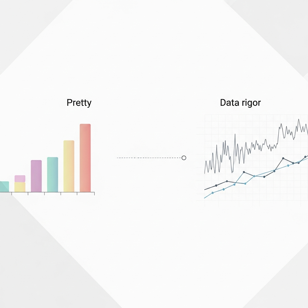
Why Pretty Charts Fail: Visual Storytelling Needs Data Rigor
Visual storytelling in finance fails without rigorous data analysis techniques. Learn why pretty charts mislead and what actually drives decisions.
42 articles
Visual storytelling in finance fails without rigorous data analysis techniques. Learn why pretty charts mislead and what actually drives decisions.

Master data storytelling with this practical guide. Learn to structure narratives, choose visualizations, and turn raw data into insights that drive decisions.

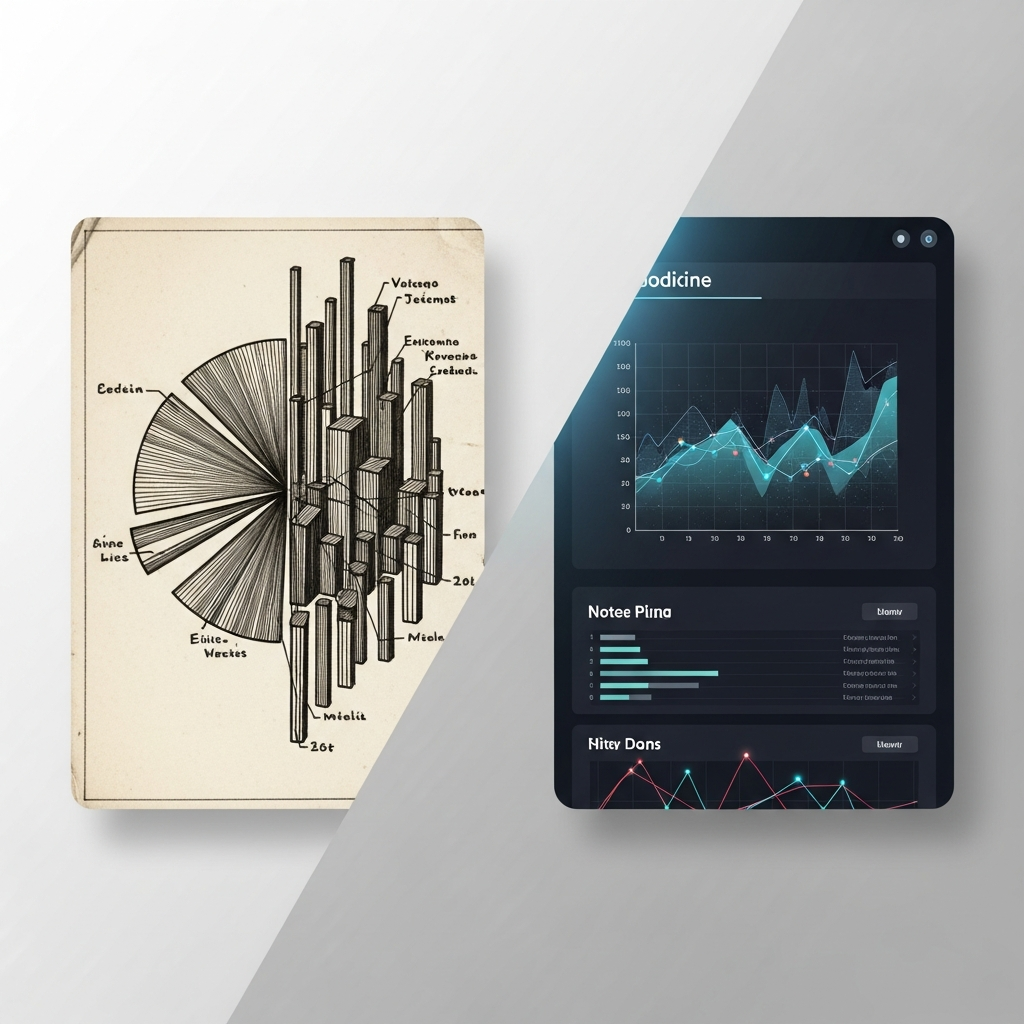
Discover data storytelling examples that turn complex finance data into compelling narratives. See side-by-side comparisons of what works and what falls flat.

Discover visualization techniques that transform raw data into compelling stories. Strategic methods for finance creators to boost engagement and retention.

Beautiful charts aren't enough. Discover why narrative structure is the key to data visualization that drives decisions, not just impressions.
Compare traditional data analysis techniques with modern visualization methods. Learn which approach drives understanding and action for your specific audience.
Discover how to extract actionable insights from financial data using proven storytelling frameworks. Learn techniques that boost audience retention to 70%.

Discover the key elements of high-fidelity animation that build audience trust in financial content. Essential guide for creators who prioritize accuracy.
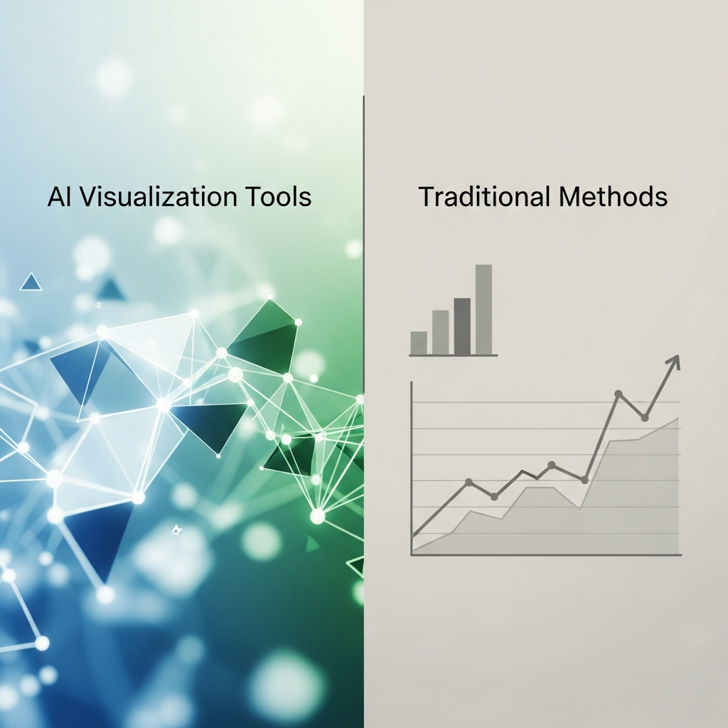
Compare AI visualization tools vs traditional methods for finance YouTubers. See which approach wins on data accuracy, production speed, and visual quality.

Build a procedural workflow for performance in motion graphics. Create auto-animating finance charts in After Effects, Blender, or Flowi in under 90 minutes.
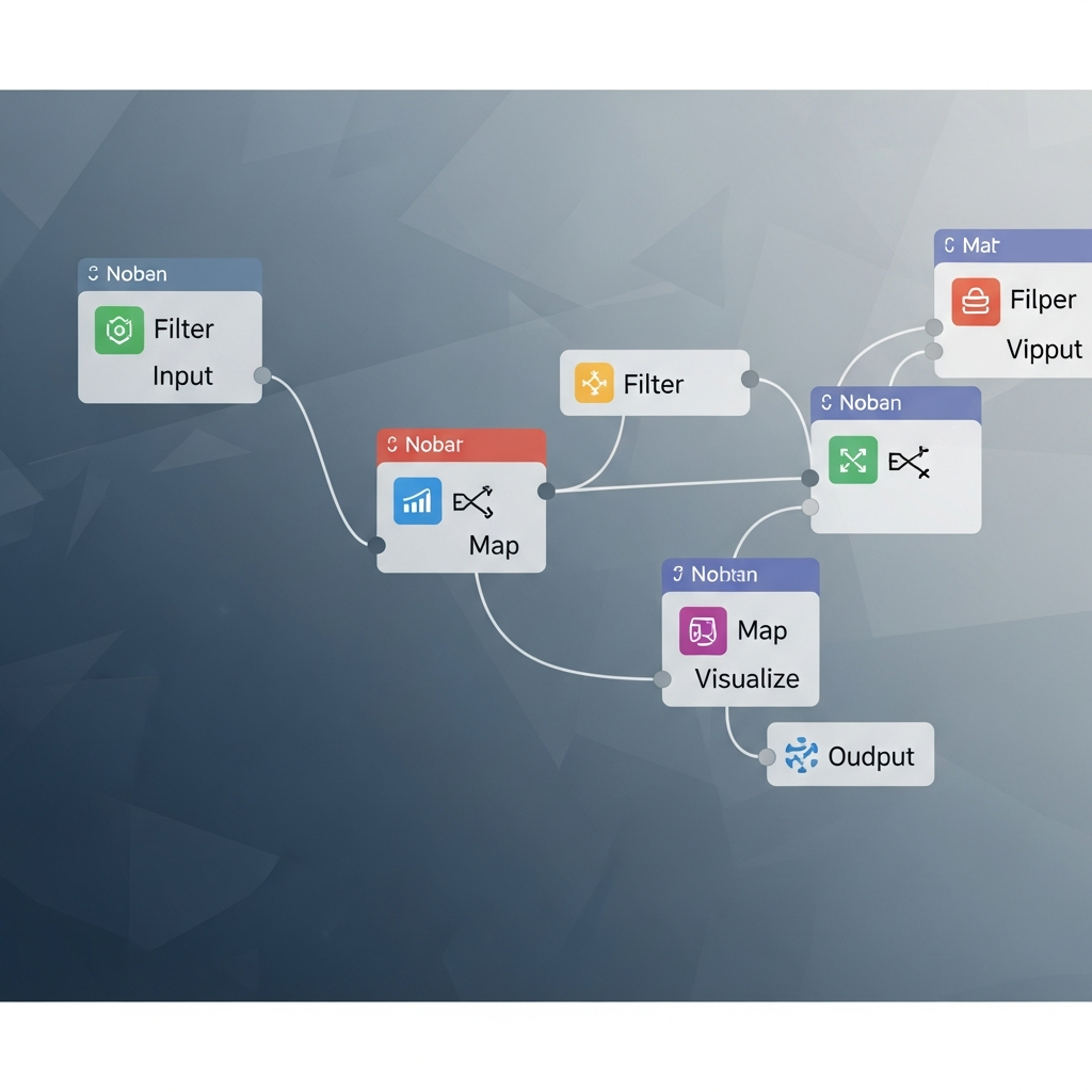
Master node-based compositing for data visualization. Build animated financial charts in Nuke, Natron, or Fusion with this step-by-step tutorial.
Compare Blender for animation vs After Effects for finance content. Discover which workflow delivers better results for data visualization and market graphics.

Compare After Effects alternatives for finance creators. Find motion graphics tools that streamline chart animations, data visualization, and financial expla...
Explore the AI visualization market to find generative models that cut production time for financial videos. Practical evaluation framework for finance creat...

Learn how to use AI animation to transform financial data into engaging visual stories. A complete guide covering strategy, tools, and workflow integration.

Learn 5 ways multi-image fusion elevates financial narratives with better visual fidelity, faster turnaround, and stronger investor engagement.

Create interactive visualizations that boost engagement. This 90-minute tutorial shows you how to build animated financial presentations with hover-responsiv...

High-fidelity animation is now table stakes—but without narrative structure, it's just beautiful noise. Learn what actually makes data visuals memorable.

Compare dynamic models vs. traditional charts for financial content. See which visualization method drives higher viewer engagement and fits your workflow.

Build a scientific visualization workflow that transforms financial spreadsheets into animated presentations automatically. Step-by-step tutorial for finance...

Discover 5 community growth strategies that help finance creators turn real-time insights into compelling data storytelling. Reduce your insight-to-publish gap.

The AI visualization market is moving to credit-based pricing. Learn how this shift impacts finance content workflows and what creators should do now.

Transform complex scientific diagrams into engaging animations with AI tools. Step-by-step tutorial for creating professional financial visualizations in min...

Cut finance video production time by 50% with visual storytelling techniques. Build automated workflows that replace manual charting and boost audience growth.

Discover why scientific accuracy in AI visualization tools matters for finance creators. Five essential reasons to prioritize precision in your dynamic models.

Explore 7 ways multi-image fusion enhances financial education through AI-driven animation. Learn how to transform complex data into clear visual sequences.

Compare dynamic models and static visuals for finance content. Discover which approach drives better engagement based on your platform, timeline, and data type.
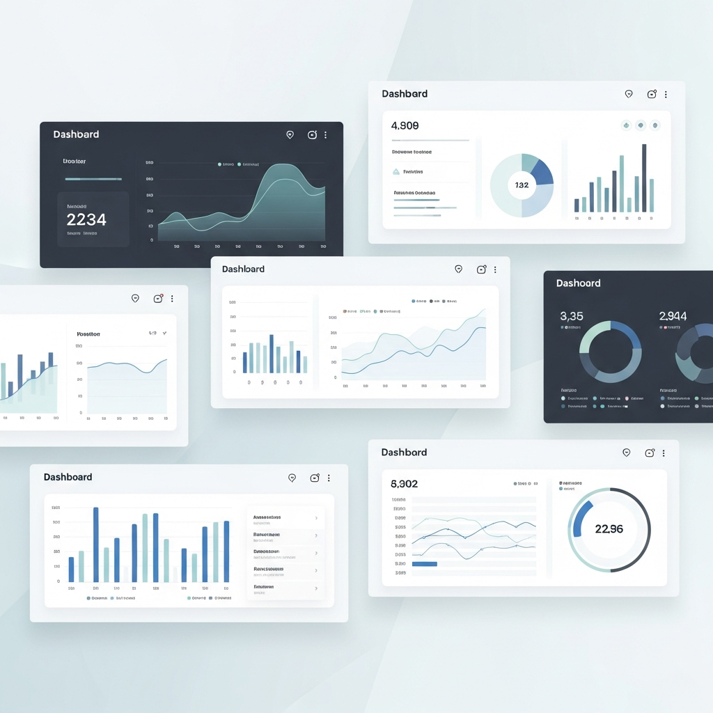
Explore 7 customizable dashboards for data-driven storytelling in finance. These tools connect content performance analysis to actionable audience insights.
Discover how AI-powered analytics extracts granular audience insights from user interaction tracking. A practical guide for finance content creators.
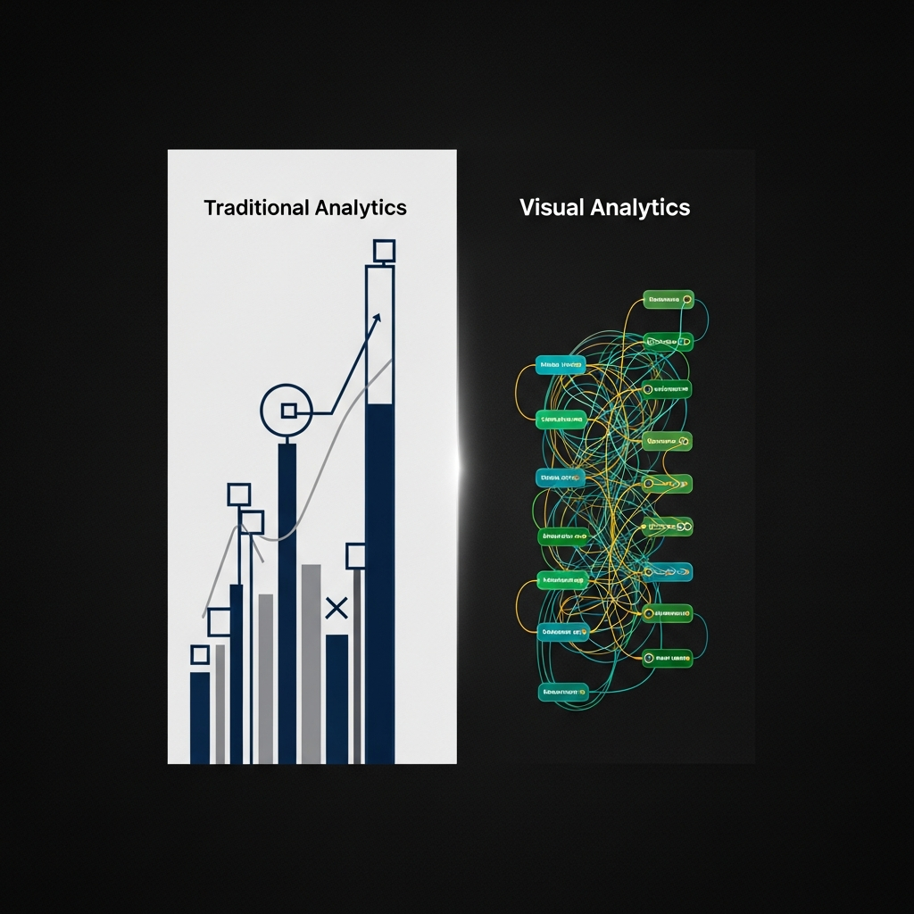
Compare visual analytics vs traditional analytics for finance content. See how real-time engagement metrics help creators optimize charts, videos, and data v...
Transform raw financial data into compelling animated videos in 45 minutes. Learn data storytelling techniques that boost retention from 10% to 67%.

Data democratization cuts content production from weeks to hours. Learn how to eliminate bottlenecks and improve engagement rate measurement in finance content.
Transform user interaction tracking into visual data stories. Follow this workflow to connect engagement metrics with audience insights and create animated c...
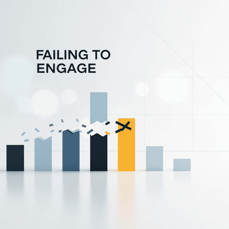
Discover 5 key indicators that your interactive charts aren't engaging audiences. Learn which engagement metrics reveal real problems versus vanity numbers.
Learn how to transform financial data into visual stories that drive action. Practical techniques for data storytelling that boosts audience engagement.

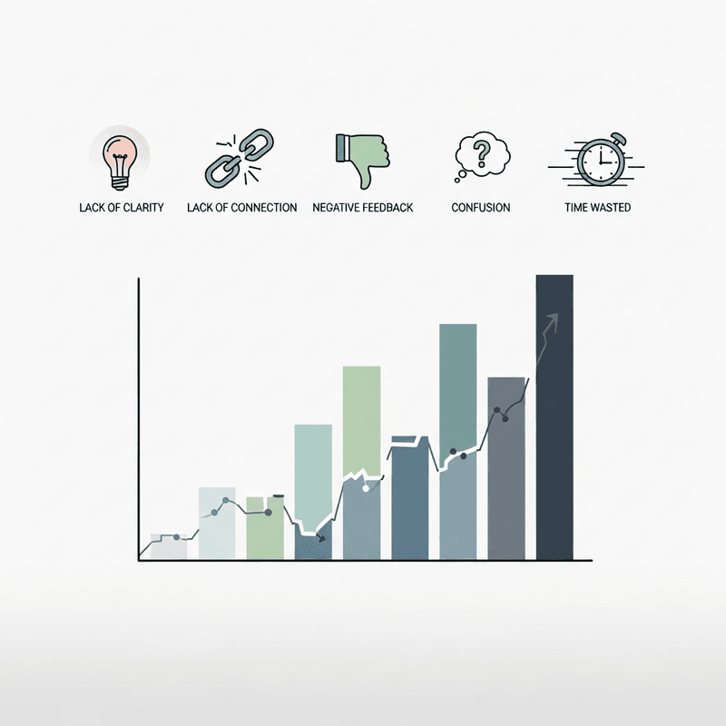
Data-driven storytelling falls flat when you measure the wrong things. Learn why audience participation patterns matter more than raw metrics for content tha...

Learn how interactive data visualization helps finance creators boost audience engagement. Practical frameworks for visual storytelling and workflow automation.

Learn how to integrate visual communication tools with engagement metrics. A practical framework for finance creators building sustainable audience growth.
Create viral bar chart race videos for TikTok fast. Step-by-step guide comparing Python, After Effects, and AI tools. Export 9:16 MP4 in under 2 minutes.
Static charts tank YouTube retention. Learn why animated data visualizations keep viewers watching longer—and how to create them in seconds without After Effects.

Learn how AI motion generation creates professional animated maps, charts, and logo reveals in minutes—no After Effects skills required.
Stop putting prospects to sleep with static slides. Here are 5 ways to use motion graphics to visualize data and close more deals.