A practical framework for financial communicators who want data-driven videos that drive action, not just views
Learn why most financial data presentations fail to move audiences and how to fix it. This guide covers engagement diagnosis, visual storytelling techniques for finance content, and automation strategies that maintain quality.
TL;DR
Engagement is a design input, not just an output metric - Build audience engagement strategies into your data storytelling from the planning phase, not as an afterthought after publication.
Structure narratives around audience decisions - Lead with insights that matter to your specific viewers, not with data organized chronologically or by availability.
Match visual complexity to audience expertise - Executives need high-level trends with clear takeaways; analysts expect granular data with verification ability.
Automate production to enable iteration - AI-powered tools like Flowi generate professional motion graphics from data, reducing production time so you can iterate based on engagement feedback.
Measure engagement depth, not reach breadth - Watch time, drop-off points, and action completion rates matter more than view counts for validating whether your data storytelling actually works.
Guide Orientation: What This Guide Covers
This guide addresses a specific problem: financial data that fails to move audiences because engagement strategies remain an afterthought. You will learn how to transform raw numbers into compelling visual narratives that drive action, not just comprehension.
This content is designed for data journalists, finance influencers, and financial communicators who produce video content regularly. By the end, you will understand how to diagnose engagement gaps in your data presentations, apply visual storytelling techniques that resonate with different audience segments, and automate production without sacrificing quality.
We focus on financial and analytical content specifically. General marketing storytelling falls outside our scope. If you create charts, graphs, or data-driven videos for finance audiences, this guide applies directly to your workflow.
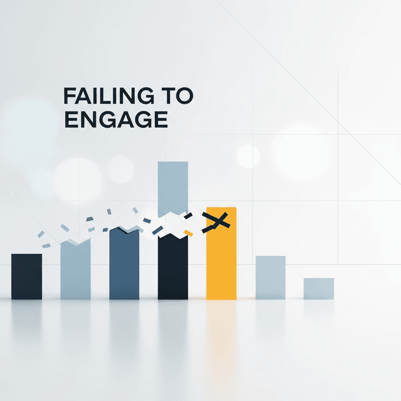
Why Audience Engagement Determines Data Storytelling Success
The gap between presenting data and driving action has never been wider. Gartner predicts that by 2025, data stories will be the most widespread way of consuming analytics. Yet most financial content still treats engagement as a secondary concern, something to measure after publication rather than design for from the start.
This creates a measurable cost. Marketing teams using website traffic or social media engagement data often struggle with insight-to-value conversion when presented as raw statistics alone. The data exists, the analysis is sound, but the audience disengages before reaching the conclusion that matters.
The shift toward data-driven storytelling reflects a deeper change in how audiences process information. 55% of consumers are more likely to remember a story than a list of facts. For finance content creators, this means static charts and slide decks compete against narrative-driven content that captures attention and sustains it.
Without deliberate audience engagement strategies, even accurate, well-researched financial content fails to generate shares, comments, or the downstream actions you need. The data becomes noise rather than signal.
Core Concepts: Understanding Data Storytelling and Engagement
What Data Storytelling Actually Means
Data storytelling combines three elements: data, visuals, and narrative. Removing any one element weakens the whole. A chart without context is decoration. A narrative without data is opinion. Data without visuals is inaccessible to most audiences.
The common misconception is that data storytelling means adding animations to existing charts. This confuses production technique with communication strategy. True data storytelling structures information around audience needs, using visuals as a delivery mechanism for insights that matter to specific viewers.
Audience Engagement vs. Audience Reach
Reach measures exposure. Engagement measures response. A video seen by 100,000 people who scroll past delivers less value than content seen by 10,000 who watch to completion and take action. For financial communicators, engagement metrics (watch time, shares, comments, click-throughs) indicate whether your data storytelling actually works.
Visual Storytelling Techniques in Finance
Visual storytelling techniques translate abstract numbers into concrete meaning. This includes motion graphics that reveal trends over time, comparative visualizations that highlight differences, and animated annotations that guide viewer attention. The technique serves the story, not the reverse.
Interactive charts extend engagement by letting audiences explore data relevant to their specific questions. However, interactivity requires careful design. Overwhelming viewers with options reduces engagement rather than increasing it.
The Engagement-First Framework for Financial Data Stories
Effective data storytelling follows a four-phase structure: Audience Definition, Narrative Architecture, Visual Execution, and Engagement Measurement. Each phase builds on the previous one, creating a feedback loop that improves content over time.
Audience Definition establishes who you are reaching and what they need to understand or do. Narrative Architecture structures your data around that audience's decision-making process. Visual Execution translates the narrative into motion graphics and charts that sustain attention. Engagement Measurement validates whether your approach worked and informs the next iteration.
This framework treats engagement as a design input, not just an output metric. You build for engagement from the first phase rather than hoping for it after publication.
Step-by-Step: Building Engagement-Optimized Financial Content
Step 1: Define Your Audience Segment and Their Decision Context
Objective: Identify exactly who will watch your content and what decision or action you want them to take.
Start by specifying your audience segment with precision. "Finance professionals" is too broad. "Portfolio managers evaluating quarterly performance against benchmarks" gives you a decision context to design around. The more specific your audience definition, the more targeted your visual storytelling techniques become.
Map your audience's existing knowledge level. What do they already understand? What misconceptions might they hold? This prevents you from over-explaining basics or assuming expertise that does not exist. Document the specific action you want viewers to take after watching: subscribe, share, click through, adjust a portfolio, approve a budget.
Anti-patterns: Creating content for "everyone interested in finance." Assuming your audience shares your technical vocabulary. Designing visuals that impress peers rather than serve viewers.
Success indicators: You can describe your target viewer in one sentence. You can articulate their primary question and desired outcome. Your team agrees on the intended post-viewing action.
Step 2: Structure Your Narrative Around Audience Pain Points
Objective: Organize your data into a narrative sequence that addresses what your audience actually cares about.
Holocentric experts note that "the narrative cannot be underestimated as it plays towards the emotional side of the brain. It pays dividends through persuasiveness, engagement, and memorability." Your narrative structure determines whether viewers stay or leave.
Begin with the tension your audience feels. For financial content, this often means uncertainty, risk, or missed opportunity. Present your data as the resolution to that tension. Structure your content to answer the viewer's implicit question before they consciously ask it.
Avoid the common mistake of presenting data chronologically just because that is how you analyzed it. Your audience does not care about your research process. They care about the insight and its implications for their decisions. Lead with the conclusion, then support it with evidence.
Anti-patterns: Building suspense that frustrates rather than engages. Burying the key insight at the end. Organizing content around data availability rather than audience need.
Success indicators: Your narrative answers "why should I care?" in the first 10 seconds. Each section builds toward the intended action. Test viewers can summarize your main point accurately.
Step 3: Select Visual Formats That Match Your Data and Audience
Objective: Choose visualization types that communicate your specific data clearly to your specific audience.
Storytelling aids conversion rates by 30% and increases product perception by 2,706%, but only when the visual format matches the message. A complex interactive dashboard overwhelms casual viewers. A simple line chart underwhelms analysts expecting depth.
Match visualization complexity to audience expertise. Executive audiences need high-level trends with clear takeaways. Analyst audiences expect granular data with the ability to verify conclusions. Choose formats that respect your viewer's time and intelligence simultaneously.
Consider motion as a narrative tool. Animated charts that reveal data progressively guide attention and build understanding. Static charts require viewers to construct the narrative themselves, which many will not do. Motion graphics transform passive viewing into guided discovery.
Anti-patterns: Using 3D charts for aesthetic reasons when 2D communicates more clearly. Adding animation that distracts from the data. Choosing visualization types based on what looks impressive rather than what communicates effectively.
Success indicators: Viewers can identify the key trend within 3 seconds of seeing each visualization. Your format choices can be justified by audience needs. Visual complexity matches data complexity.
Step 4: Automate Production Without Sacrificing Quality
Objective: Reduce production time while maintaining professional-grade output that sustains audience engagement.
By 2025, 75% of data stories will be automatically generated via augmented intelligence and machine learning. The question is not whether to automate, but how to automate without losing the narrative quality that drives engagement.
AI-powered tools now generate After Effects-quality motion graphics from data inputs, eliminating the timeline editing that traditionally consumed hours. Flowi exemplifies this approach, transforming complex financial data into polished visuals through domain-specific templates designed for analytical content.
Automation succeeds when it handles technical execution while preserving creative control over narrative. The goal is reducing handoffs between analysts who understand the data and designers who understand motion graphics. When one person can generate professional visuals directly, iteration speed increases and engagement-killing delays disappear.
Anti-patterns: Automating without quality checks. Sacrificing brand consistency for speed. Using generic templates that ignore your audience's expectations.
Success indicators: Production time decreases by 50% or more. Output quality remains consistent or improves. You can iterate on visuals in response to engagement data without starting from scratch.
Step 5: Build Engagement Checkpoints Into Your Content
Objective: Design specific moments that prompt viewer interaction and sustain attention throughout the content.
Data-driven stories can boost audience engagement by up to 300%, but only when engagement opportunities are deliberately constructed. Passive viewing leads to passive responses. Active viewing generates shares, comments, and actions.
Create engagement checkpoints at regular intervals. These include visual reveals that prompt emotional responses, data points that challenge assumptions, and calls-to-action that feel natural rather than intrusive. Each checkpoint gives viewers a reason to continue watching and a prompt to respond.
For financial content, effective checkpoints often involve comparison moments. Show how a trend compares to expectations, how performance differs across segments, or how current data contrasts with historical patterns. Comparison creates cognitive engagement that sustains attention.
Anti-patterns: Front-loading all interesting content in the first 30 seconds. Ending without a clear next step. Interrupting narrative flow with engagement requests that feel forced.
Success indicators: Watch time metrics show sustained attention, not early drop-off. Engagement actions (shares, comments) occur at designed checkpoint moments. Viewers complete the intended action at measurable rates.
Step 6: Measure Engagement and Iterate Based on Data
Objective: Establish feedback loops that improve future content based on actual audience behavior.
Engagement measurement closes the loop between content creation and audience response. Track watch time, drop-off points, share rates, and downstream actions. Each metric tells you something specific about where your data storytelling succeeds or fails.
Prioritize engagement rate measurement over vanity metrics. A video with 10,000 views and 2% engagement underperforms content with 2,000 views and 15% engagement if your goal is action rather than awareness. Define success metrics before publishing so you can evaluate performance objectively.
Use granular audience insights to refine future content. If viewers consistently drop off at the same timestamp, that section needs restructuring. If certain visual formats generate more shares, prioritize those formats. Let audience behavior analysis guide your creative decisions.
Anti-patterns: Measuring only reach and ignoring engagement depth. Changing multiple variables simultaneously, making it impossible to identify what worked. Ignoring negative feedback that challenges your assumptions.
Success indicators: You can identify which content elements drive engagement and which do not. Iteration cycles produce measurable improvements. Your content performance analysis informs specific creative decisions.
Practical Application: Marketing Team Case Study
Consider a marketing team presenting website traffic data to executives. The raw approach: a slide deck with monthly traffic charts, bounce rates, and conversion funnels. The result: executives skim, ask clarifying questions, and defer decisions.
The engagement-first approach restructures the same data around executive concerns. Lead with revenue impact, not traffic volume. Animate the conversion funnel to show where prospects drop off. Highlight the specific bottleneck that, if addressed, would improve results by a quantifiable amount.
The data is identical. The narrative architecture transforms it from information into insight. Executives engage because the content addresses their decision context directly. The visual storytelling techniques guide attention to what matters rather than overwhelming with comprehensiveness.
This pattern applies across financial content: quarterly reports, market analysis, portfolio reviews. Structure around audience decisions, not data availability. Visualize to guide attention, not to impress. Measure engagement to validate and improve.
Common Mistakes and How to Avoid Them
Treating engagement as an afterthought. Designing content first and hoping for engagement afterward inverts the process. Build engagement strategies into your planning from the start.
Confusing visual complexity with communication quality. Sophisticated animations that obscure the data point fail your audience. Clarity beats impressiveness every time.
Ignoring audience segment differences. Content that works for retail investors may fail with institutional analysts. One size does not fit all in financial data storytelling.
Optimizing for the wrong metrics. Views and impressions matter less than watch time and action rates. Define success by engagement depth, not reach breadth.
92% of consumers want brands to make ads that feel like a story. Your audience actively prefers narrative-driven content. The mistake is not attempting data storytelling; it is attempting it without audience engagement as the design constraint.
What to Do Next
Start with one piece of content you have already published. Review its engagement metrics and identify the drop-off points. Ask: where did the audience disengage, and why?
Then apply the framework to your next project. Define your audience segment precisely. Structure your narrative around their decision context. Select visuals that match their expertise level. Build engagement checkpoints deliberately. Measure the results and compare them to your baseline.
This guide serves as a reference, not a checklist. Return to specific sections as you encounter challenges. Data storytelling improves through iteration, not perfection on the first attempt. Each content piece teaches you something about your audience if you design for engagement and measure the response.
Frequently Asked Questions
What is data visualization and why is it important for audience engagement?
Data visualization translates numerical information into visual formats like charts, graphs, and motion graphics. It matters for engagement because visual processing is faster and more memorable than text processing. 55% of consumers are more likely to remember a story than a list of facts, and visuals serve as the delivery mechanism that makes data stories stick.
How can interactive charts improve audience engagement?
Interactive charts transform passive viewers into active participants. When audiences can explore data relevant to their specific questions, they invest more attention and retain more information. However, interactivity must be designed carefully. Too many options overwhelm viewers and reduce engagement rather than increasing it. The best interactive charts offer guided exploration with clear defaults.
Which metrics are most important to track in audience engagement?
Prioritize engagement depth over reach breadth. Watch time and drop-off points reveal where your content succeeds or fails. Share rates indicate emotional resonance. Click-through and action completion rates measure whether your data storytelling drives the intended outcome. Views alone tell you almost nothing about content effectiveness.
What are best practices for designing effective data visualizations?
Match visualization complexity to audience expertise. Lead with the insight, not the data. Use motion to guide attention progressively rather than revealing everything at once. Eliminate decorative elements that do not serve comprehension. Test with representative viewers to verify that your key point communicates within seconds.
How can I interpret trends in my engagement data?
Look for patterns across multiple content pieces rather than drawing conclusions from single videos. Consistent drop-off at similar timestamps suggests structural problems. Varying engagement by topic reveals audience preferences. Compare engagement rates across formats to identify what works for your specific audience segment.
How does AI change the data storytelling workflow?
By 2025, 75% of data stories will be automatically generated via augmented intelligence. AI tools like Flowi handle technical execution (motion graphics, chart animation) while preserving creative control over narrative. This reduces production time and eliminates handoffs between analysts and designers, enabling faster iteration based on engagement data.
Sources
Read Next
Continue Exploring

7 Data Storytelling Examples That Make Finance Click
Discover data storytelling examples that turn complex finance data into compelling narratives. See side-by-side comparisons of what works and what falls flat.

How to Turn Data into Decisions That Stick
Discover how to extract actionable insights from financial data using proven storytelling frameworks. Learn techniques that boost audience retention to 70%.

How to Turn Financial Data Into Animated Videos in 45 Minutes
Transform raw financial data into compelling animated videos in 45 minutes. Learn data storytelling techniques that boost retention from 10% to 67%.