
See what separates presentations that drive decisions from charts that get ignored
Learn why 93% of leaders credit storytelling over raw data for revenue decisions. These side-by-side comparisons reveal the techniques that transform cluttered finance visuals into compelling narratives.
TL;DR
Sequential revelation beats information dumping - Build understanding in layers rather than showing everything at once; lead with conclusions and reveal supporting evidence progressively
Context makes metrics meaningful - Every number needs a benchmark; compare against historical trends, competitors, or expectations to enable interpretation
Narrative structure drives engagement - Data-driven stories can boost engagement by 300% when they create tension and resolution rather than just listing chronological events
Motion maintains attention - Animated transitions preserve cognitive continuity; static slide sequences create breaks that lose viewers
Start with two techniques - Implement sequential revelation and contextual benchmarking first; these address the most common failures with minimal additional production time
Why Most Finance Presentations Fail to Land
The gap between data and decision-making has never been wider. Finance professionals generate more charts, graphs, and dashboards than ever before, yet 93% of leaders report that data storytelling, not raw data, drives revenue-boosting decisions.
The problem isn't the data itself. It's the presentation. Static spreadsheets and cluttered visuals force audiences to work harder than they should. Meanwhile, well-crafted data storytelling examples demonstrate how the same information, presented with narrative structure and visual clarity, can transform passive viewers into engaged decision-makers.
In 2025, the stakes have shifted. Data storytelling searches have grown 233% over five years. Finance influencers and data journalists compete for attention in feeds saturated with mediocre charts. The difference between content that gets shared and content that gets scrolled past often comes down to storytelling technique.
What This List Delivers
This guide targets finance content creators, data journalists, and analysts who need to communicate complex information without losing their audience. You won't find generic advice about "using color" or "keeping it simple."
Instead, these data storytelling examples contrast effective approaches with common mistakes, giving you a framework for evaluating your own work. We exclude static infographic design principles and focus specifically on techniques that work for financial narratives, whether you're explaining market trends, earnings reports, or economic forecasts.
Each example demonstrates why certain approaches captivate audiences while others confuse them.
How These Examples Were Selected
Selection criteria prioritized techniques with documented impact on audience engagement and retention. Stories are 22 times more memorable than facts alone, so each example had to demonstrate narrative integration, not just aesthetic improvement.
We evaluated approaches based on clarity under time pressure, adaptability across platforms, and production feasibility for solo creators or small teams.
Data Storytelling Examples That Separate Leaders from the Rest
1. Sequential Revelation vs. Information Dumping
Why It Matters: Most finance presentations fail because they show everything at once. Viewers face cognitive overload before they can identify what matters. Sequential revelation respects how humans process information, building understanding in layers rather than demanding instant comprehension.
What It Looks Like Today: Effective visual storytelling uses animated builds that introduce data points progressively. A quarterly earnings breakdown might start with the headline number, then reveal contributing factors one by one. Compare this to the traditional approach of displaying a dense table and expecting viewers to extract meaning themselves.
How to Apply It: Structure your data narrative with a clear hierarchy. Lead with the conclusion, then reveal supporting evidence in order of importance. Tools that automate animation sequences can reduce production time while maintaining professional pacing. Limit each visual to one primary insight before transitioning.
2. Contextual Benchmarking vs. Isolated Metrics
Why It Matters: A 15% revenue increase means nothing without context. Is that good? Bad? Expected? Isolated metrics force audiences to supply their own benchmarks, which leads to misinterpretation. Banks implementing advanced analytics saw revenues rise more than 20% over three years precisely because they contextualized performance against meaningful comparisons.
What It Looks Like Today: Strong engaging data visuals place current performance alongside historical trends, competitor benchmarks, or analyst expectations. A stock performance chart gains meaning when it includes sector indices. An expense ratio becomes actionable when shown against industry medians.
How to Apply It: For every metric you present, ask: "Compared to what?" Build comparison layers into your visualization. Use visual hierarchy (size, position, color intensity) to distinguish your primary subject from reference points without creating visual clutter.
3. Narrative Arc vs. Chronological Listing
Why It Matters: Chronological data presentation (Q1, then Q2, then Q3) is logical but rarely compelling. It lacks tension, stakes, or resolution. Data-driven stories can boost audience engagement by up to 300% when they follow narrative structures that create anticipation and payoff.
What It Looks Like Today: Finance creators increasingly structure content around conflict and resolution. Instead of "Here's what happened each quarter," they frame it as "The company faced a supply chain crisis in Q2. Here's how they responded, and what the Q4 numbers reveal about their recovery."
How to Apply It: Identify the tension in your data. What changed? What was unexpected? What decision hung in the balance? Structure your visualization to build toward the moment of resolution. This works for earnings reports, market analyses, and economic forecasts alike.
4. Motion-Based Transitions vs. Static Slide Sequences
Why It Matters: Static slides create cognitive breaks. Each transition forces viewers to reorient themselves, losing momentum and attention. Motion graphics maintain continuity, guiding the eye through data transformations while preserving context.
What It Looks Like Today: Professional finance content increasingly uses animated transitions that morph one chart into another, maintaining visual continuity while shifting analytical focus. A pie chart might transform into a bar chart to show the same data from a different angle, preserving the viewer's mental model.
How to Apply It: Plan transitions as part of your narrative, not afterthoughts. Consider what visual elements persist across scenes to maintain orientation. AI-powered tools can generate these transitions automatically, eliminating the need for timeline editing while producing After Effects-quality results.
5. Annotation Hierarchy vs. Label Overload
Why It Matters: Every label competes for attention. When everything is emphasized, nothing is. Effective data storytelling examples demonstrate selective annotation that guides interpretation rather than overwhelming it. More than 92% of business leaders cite data storytelling as a key decision-making factor, but that only works when the story is clear.
What It Looks Like Today: Strong visualizations use a three-tier annotation system: essential labels always visible, secondary information revealed on interaction or in sequence, and tertiary details available on demand. This respects both quick scanners and deep divers.
How to Apply It: Audit your current visuals. Count the labels. If you have more than five persistent annotations, prioritize ruthlessly. Use visual weight (bold, size, position) to establish hierarchy. Reserve detailed breakdowns for supplementary views.
6. Emotional Anchoring vs. Pure Rationality
Why It Matters: Finance professionals often assume their audience wants "just the facts." But 73.67% of individuals use data storytelling for sales data precisely because emotional resonance drives action. Numbers inform; stories motivate.
What It Looks Like Today: Effective finance content connects data to human outcomes. A cost-cutting measure isn't just a percentage; it's the difference between layoffs and retention. A market trend isn't abstract; it affects retirement portfolios and housing affordability.
How to Apply It: Identify the human stakes in your data. Who benefits? Who loses? What decisions become possible? Frame at least one element of your visualization around these stakes. This doesn't mean sensationalism; it means relevance.
7. Platform-Native Formatting vs. One-Size-Fits-All
Why It Matters: A visualization designed for a boardroom presentation fails on mobile. Content optimized for LinkedIn underperforms on YouTube. Companies adopting data-driven decision-making are 5% more productive and 6% more profitable, but only when insights reach decision-makers in formats they actually consume.
What It Looks Like Today: Finance influencers produce multiple versions of the same core content. Vertical video for social feeds. Widescreen for presentations. Square formats for newsletters. Each version optimizes text size, pacing, and information density for its platform.
How to Apply It: Design for your primary platform first, but build with adaptation in mind. Use modular visual elements that can be rearranged. Automation tools that generate platform-specific outputs from single sources dramatically reduce production overhead.
Patterns Across Effective Data Storytelling Examples
Three themes emerge from these examples. First, effective visual storytelling prioritizes viewer cognition over creator convenience. The extra work of sequencing, annotating selectively, and providing context pays dividends in comprehension and retention.
Second, motion and narrative structure aren't decorative. They're functional tools that maintain attention and guide interpretation. Static approaches require audiences to do more work, and most won't.
Third, there's a tension between thoroughness and clarity. Every example involves strategic omission. The skill isn't showing everything; it's showing the right things in the right order. By 2025, 75% of data stories will be automatically generated, which means human judgment about what to include becomes the differentiating factor.
Where to Start
You don't need to implement all seven approaches simultaneously. Start with sequential revelation and contextual benchmarking. These two techniques address the most common failures in finance content and require minimal additional production time.
If you're creating video content, prioritize motion-based transitions next. Tools like Flowi can automate the technical execution, letting you focus on narrative decisions rather than timeline editing.
For creators with established workflows, audit one recent piece against these criteria. Identify the single biggest gap and address it in your next project. Incremental improvement compounds faster than wholesale reinvention.
Frequently Asked Questions
What is data storytelling?
Data storytelling combines data analysis, visualization, and narrative structure to communicate insights in a way that drives understanding and action. Unlike raw data presentation, it contextualizes information, guides interpretation, and connects numbers to meaningful outcomes. Effective data storytelling answers not just "what happened" but "why it matters" and "what to do about it."
Why is data storytelling important for finance content?
Finance data is inherently complex, involving multiple variables, time periods, and stakeholder interests. Data storytelling transforms this complexity into clarity. Research shows that stories are 22 times more memorable than facts alone, and over 92% of business leaders cite data storytelling as a key factor in decision-making. For finance content creators, this translates directly to audience engagement and content shareability.
How can I create an effective data story?
Start with a clear narrative structure: identify the tension or question in your data, build toward a resolution, and provide actionable context. Use sequential revelation to prevent cognitive overload. Include benchmarks so viewers understand significance. Prioritize annotations ruthlessly, and consider motion graphics to maintain engagement. Test your story by asking: "Does someone unfamiliar with this data understand why it matters?"
Which visualizations are best for data storytelling?
The best visualization depends on your narrative goal. Line charts excel at showing trends over time. Bar charts work well for comparisons. Animated transitions between chart types can show the same data from multiple angles. The key is matching visualization type to the specific insight you're communicating, not defaulting to familiar formats.
When should I use data storytelling instead of traditional reporting?
Use data storytelling when you need to drive action, influence decisions, or communicate with non-specialist audiences. Traditional reporting works for reference documentation and detailed analysis. Data storytelling works for presentations, social content, and any situation where attention is limited and stakes are high.
How do AI tools change data storytelling production?
AI tools automate technical execution, from generating animations to formatting content for multiple platforms. This shifts the creator's focus from production mechanics to narrative decisions. By 2025, an estimated 75% of data stories will be automatically generated, making human judgment about story structure and insight selection the primary differentiator.
Sources
Read Next
Continue Exploring
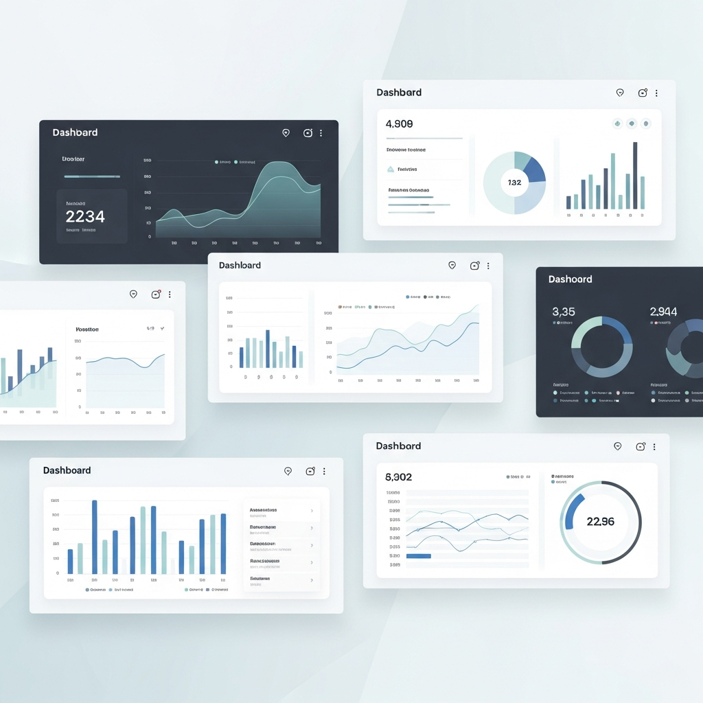
7 Customizable Dashboards for Data-Driven Storytelling
Explore 7 customizable dashboards for data-driven storytelling in finance. These tools connect content performance analysis to actionable audience insights.

How to Fix Data Storytelling That Fails to Engage
Learn how to transform financial data into visual stories that drive action. Practical techniques for data storytelling that boosts audience engagement.

How to Turn Data into Decisions That Stick
Discover how to extract actionable insights from financial data using proven storytelling frameworks. Learn techniques that boost audience retention to 70%.