Analytics tools that connect audience behavior to content decisions for finance creators
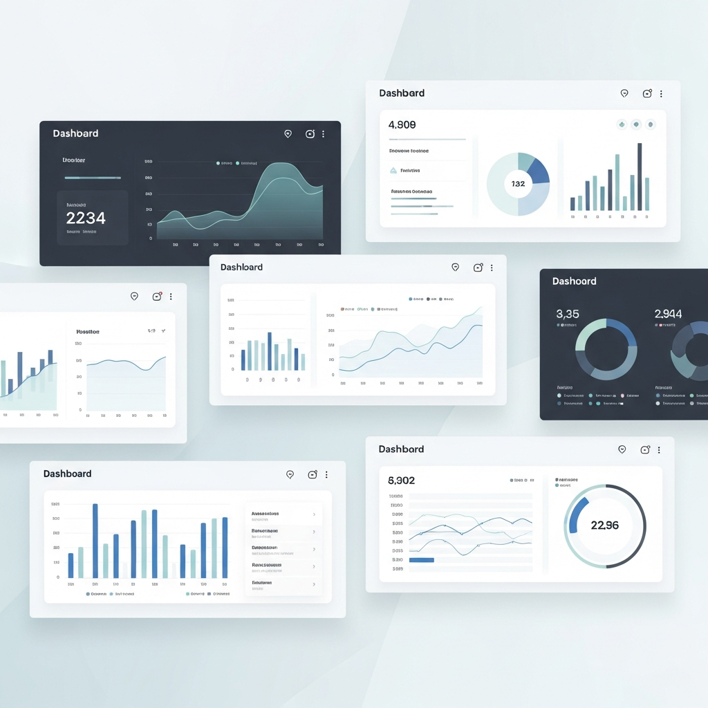
Discover seven dashboards built for finance content creators who need more than pageviews. Learn which tools enable sophisticated content performance analysis and reduce the gap between insight and action.
TL;DR
Databox and Geckoboard consolidate metrics from multiple platforms into unified, real-time views that support faster content decisions
Klipfolio and Chartio offer deeper customization through formula-based metrics and SQL access for granular audience analysis
Whatagraph and Flowi automate the translation of performance data into presentation-ready visuals and motion graphics
Google Looker Studio provides a free starting point for testing dashboard approaches before committing to premium tools
Start with one or two tools based on your primary constraint (time, communication, or budget) rather than implementing all platforms simultaneously
The Dashboard Gap in Finance Content Creation
Finance content creators face a persistent tension. The data exists. The stories are there. But the tools to connect analysis with audience engagement often fall short.
Generic analytics platforms track pageviews and bounce rates. They tell you what happened, not why it matters or how to improve. For creators building content around market movements, economic indicators, or investment insights, this surface-level visibility creates blind spots.
Meanwhile, financial services firms invested $35 billion in AI in 2023, with projections reaching $97 billion by 2027. Much of that spending targets analytics platforms that enable data-driven storytelling. The infrastructure for sophisticated content performance analysis exists, but accessing it requires knowing where to look.
This list moves beyond generic recommendations. These seven customizable dashboards address the specific challenges finance creators encounter: connecting audience behavior to content decisions, visualizing complex metrics clearly, and reducing the time between insight and action.
What This List Delivers
This resource targets finance content creators, data journalists covering markets, and financial influencers who measure success through engagement depth rather than vanity metrics. If you produce content explaining economic trends, investment strategies, or financial data, these tools address your workflow directly.
This list excludes enterprise-only platforms requiring six-figure contracts. It excludes tools designed primarily for e-commerce or general marketing. Each dashboard here supports content performance analysis specific to finance storytelling, with customization options that adapt to different publishing cadences and audience segments.
The value proposition: seven platforms that transform raw engagement data into actionable content decisions, each with distinct strengths for different creator contexts.
Selection Criteria
Each dashboard earned inclusion based on three factors. First, customization depth for finance-specific metrics beyond standard engagement rates. Second, visual communication tools that support data-driven storytelling in creator workflows. Third, accessibility for individual creators or small teams, not just enterprise departments. Tools that met all three criteria made the list.
1. Databox
Why It Matters
Most analytics tools force you to switch between platforms constantly. Databox consolidates metrics from multiple sources into unified views, eliminating the context-switching that fragments content analysis. For finance creators pulling data from YouTube, newsletters, and social platforms simultaneously, this integration prevents insight loss.
What It Looks Like Today
Databox connects to over 100 data sources and allows custom metric creation. Finance creators can build dashboards tracking video retention alongside newsletter open rates, identifying which content formats drive deeper engagement. The mobile app provides real-time insights without desktop dependency.
How to Apply It
Start with a single dashboard combining your two highest-priority platforms. Add complexity gradually. Focus initial customization on metrics that directly inform content decisions, such as watch time by topic or click-through by headline type.
2. Geckoboard
Why It Matters
Finance content often requires rapid response to market events. Geckoboard specializes in live dashboards designed for visibility, not just analysis. When breaking financial news demands quick content pivots, real-time engagement data displayed prominently supports faster editorial decisions.
What It Looks Like Today
Geckoboard emphasizes TV-mode displays and clean visual hierarchies. Teams can monitor content performance analysis across channels without drilling into complex interfaces. The platform supports custom widgets for tracking specific KPIs relevant to financial content, including audience behavior analysis during market volatility.
How to Apply It
Configure a dedicated dashboard for high-frequency content periods, such as earnings season or Fed announcements. Limit displayed metrics to five or fewer to maintain clarity under time pressure.
3. Klipfolio
Why It Matters
Finance creators often need granular audience insights that standard platforms obscure. Klipfolio offers deep customization through formula-based metrics, allowing creators to build proprietary engagement calculations. This flexibility supports content performance analysis tailored to specific audience segments or content categories.
What It Looks Like Today
Klipfolio provides a formula editor for creating custom metrics from raw data. Finance creators can calculate weighted engagement scores combining views, comments, and shares with different multipliers. The platform supports embedded dashboards for team sharing or client reporting.
How to Apply It
Identify one metric your current tools cannot track but would inform content decisions. Build that metric first. Resist the temptation to create dozens of custom calculations before validating their usefulness.
4. Chartio (now part of Atlassian)
Why It Matters
Data-driven storytelling requires connecting content performance to business outcomes. Chartio, integrated into Atlassian's ecosystem, enables SQL-based exploration for creators comfortable with data queries. This capability supports deeper analysis than drag-and-drop interfaces typically allow.
What It Looks Like Today
The platform combines visual query building with direct SQL access. Finance creators can analyze audience participation patterns across content types, correlating engagement metrics with external data like market performance. Integration with Confluence supports collaborative insight documentation.
How to Apply It
Use Chartio when standard dashboards cannot answer specific questions about content performance. Reserve it for monthly deep-dives rather than daily monitoring to maximize analytical value without workflow disruption.
5. Whatagraph
Why It Matters
Finance content creators often need to demonstrate value to sponsors, partners, or internal stakeholders. Whatagraph specializes in transforming analytics into presentation-ready reports. This capability supports both content optimization and professional communication about performance.
What It Looks Like Today
Whatagraph automates report generation with customizable templates. Finance creators can build branded dashboards that visualize engagement metrics, audience growth, and content reach in formats suitable for external sharing. The platform emphasizes visual storytelling techniques in its output design.
How to Apply It
Create two template types: one for internal content decisions (detailed, metric-heavy) and one for external communication (narrative-focused, highlighting trends). Automate delivery schedules to reduce manual reporting time.
6. Flowi
Why It Matters
Content performance analysis loses value if insights cannot be communicated visually. Flowi addresses the gap between data analysis and visual content creation, generating After Effects-quality charts and motion graphics from raw data without timeline editing. For finance creators, this automates the translation of performance insights into shareable visual content.
What It Looks Like Today
Flowi uses AI to transform complex financial data into animated visualizations. The platform offers domain-specific templates for market data, economic indicators, and performance metrics. Finance creators can generate polished graphics that communicate engagement trends or content performance without manual animation work.
How to Apply It
Use Flowi to visualize your own content performance data for audience transparency or sponsor reporting. The platform reduces production time for data-heavy content, allowing faster iteration on visual analytics pieces.
7. Google Looker Studio
Why It Matters
Accessibility matters for sustainable workflows. Looker Studio (formerly Data Studio) provides customizable dashboards at no cost, with integration depth that rivals paid alternatives. For finance creators testing dashboard approaches before committing to premium tools, Looker Studio offers a low-risk starting point.
What It Looks Like Today
Looker Studio connects natively to Google Analytics, YouTube Analytics, and dozens of third-party sources through community connectors. Finance creators can build interactive charts displaying engagement rate measurement across content categories. The platform supports calculated fields for custom metrics and scheduled email delivery.
How to Apply It
Build your first content performance dashboard in Looker Studio before evaluating paid alternatives. This establishes baseline requirements and reveals which features justify premium pricing for your specific workflow.
Patterns Across These Tools
Three themes emerge from this selection. First, customization depth correlates with analytical value. Platforms allowing formula-based metrics or SQL access enable questions that template-based tools cannot answer. Second, visualization quality affects insight adoption. Dashboards that communicate clearly get used; cluttered interfaces get abandoned.
Third, integration breadth determines workflow fit. Data-related issues remain the most cited barrier to AI adoption in financial services, and dashboard tools face similar challenges. Platforms connecting to your existing data sources reduce friction; those requiring manual data entry create it.
As Emily Prince of LSEG notes, "AI will play an even larger role in automating complex tasks, enhancing decision-making, and providing real-time insights via customizable dashboards for financial professionals." These seven tools represent current implementations of that trajectory.
Where to Start
Do not implement all seven platforms simultaneously. Select one or two based on your primary constraint. If time limits analysis, prioritize Databox or Geckoboard for consolidated real-time views. If communication bottlenecks slow your workflow, start with Whatagraph or Flowi for automated visual output.
If budget constraints dominate, begin with Looker Studio and validate your dashboard requirements before investing in premium alternatives. Agentic AI accelerates storytelling by handling computational work while humans retain judgment. These dashboards follow similar logic: automate the data aggregation, preserve human interpretation.
The goal is not comprehensive coverage. It is sustainable integration of content performance analysis into your existing workflow, supporting better content decisions without creating new bottlenecks.
Frequently Asked Questions
What is data visualization and why is it important for audience engagement?
Data visualization transforms numerical information into graphical formats that audiences can interpret quickly. For finance content, effective visualization reduces cognitive load when explaining complex concepts like market trends or economic indicators. Audiences engage longer with content that communicates data clearly, and visual formats increase shareability across social platforms.
How can interactive charts improve audience engagement?
Interactive charts allow audiences to explore data relevant to their specific interests rather than consuming static presentations. Finance content creators can use interactive elements to let viewers filter by time period, asset class, or geographic region. This personalization increases time-on-page and encourages repeat visits as users return to check updated data.
Which metrics are most important to track in content performance analysis?
Prioritize metrics that inform content decisions over vanity metrics. Watch time and read depth indicate content quality better than raw views. Engagement rate (interactions divided by reach) reveals resonance more accurately than total likes. For finance content, track which topics drive newsletter signups or return visits, as these indicate audience investment in your perspective.
What are best practices for designing effective data visualizations?
Start with the insight you want to communicate, then select the chart type that supports it. Avoid cluttering visualizations with excessive data points or decorative elements. Use consistent color coding across related content. For finance visualizations, ensure axis labels and time periods are immediately clear, as ambiguity undermines credibility with data-literate audiences.
How can I interpret trends in my audience engagement data?
Look for patterns across multiple content pieces rather than reacting to individual performance. Identify which topics, formats, or publishing times correlate with higher engagement consistently. Account for external factors like market events that may temporarily inflate or deflate metrics. Compare engagement trends to content changes you have implemented to validate what works.
How do customizable dashboards differ from standard analytics platforms?
Standard analytics platforms display predetermined metrics in fixed formats. Customizable dashboards allow creators to select which metrics appear, how they are calculated, and how they are visualized. This flexibility enables finance creators to track proprietary engagement calculations, combine data from multiple sources, and focus attention on metrics that directly inform their content strategy.
Sources
Read Next
Continue Exploring

7 Data Storytelling Examples That Make Finance Click
Discover data storytelling examples that turn complex finance data into compelling narratives. See side-by-side comparisons of what works and what falls flat.

5 Community Growth Strategies Using Real-Time Data Insights
Discover 5 community growth strategies that help finance creators turn real-time insights into compelling data storytelling. Reduce your insight-to-publish gap.
5 Signs Your Interactive Charts Are Failing to Engage
Discover 5 key indicators that your interactive charts aren't engaging audiences. Learn which engagement metrics reveal real problems versus vanity numbers.