Beautiful data visuals are everywhere now—but most say nothing memorable. Here's the missing element.
Discover why polished animations often fail to communicate insights. Learn how narrative structure transforms high-fidelity visuals from expensive noise into memorable data storytelling.
TL;DR
High-fidelity animation is now table stakes - Production quality alone no longer differentiates financial content
Narrative structure determines success - Research shows even cutting-edge animation models fail without story architecture
Sequence matters - Build insight, story, visual, then motion (not the reverse)
Data storytelling is architecture, not decoration - 35% better retention comes from narrative structure, not visual polish
The Uncomfortable Truth About Beautiful Charts That Say Nothing
I watched a finance influencer's quarterly earnings breakdown last week. The animations were flawless. Smooth transitions, perfectly timed reveals, colors that popped. After three minutes, I couldn't tell you a single insight.
This happens constantly now. High-fidelity animation has become so accessible that everyone's producing cinema-quality data visuals. Yet most of them fail to communicate anything memorable. The problem isn't the tools. It's what we've forgotten to build before we hit render.
The Seductive Trap of Visual Polish
The conventional wisdom goes like this: better visuals equal better communication. Invest in smoother transitions, higher frame rates, more sophisticated motion graphics. The audience will follow.
This belief drove the 3D animation market to $21.58 billion in 2024, with projections reaching $72.8 billion by 2032. Everyone's chasing fidelity. And it made sense when polished visuals were rare, when production quality itself signaled credibility.
But we've crossed a threshold. High-fidelity animation is no longer a differentiator. It's table stakes. And in the race to look better, we stopped asking whether we were actually saying anything.
Here's What Actually Matters
Narrative structure guidance determines whether high-fidelity animation succeeds or fails. Full stop. Without it, you're just making expensive noise.
Why Polish Without Purpose Falls Apart
Let me show you what I mean. A colleague recently shared a client presentation: beautifully animated revenue projections, each data point choreographed with precision. The client's feedback? "I don't understand what you're telling me."
The animations revealed numbers in sequence but established no relationship between them. No tension. No resolution. No story. Just movement.
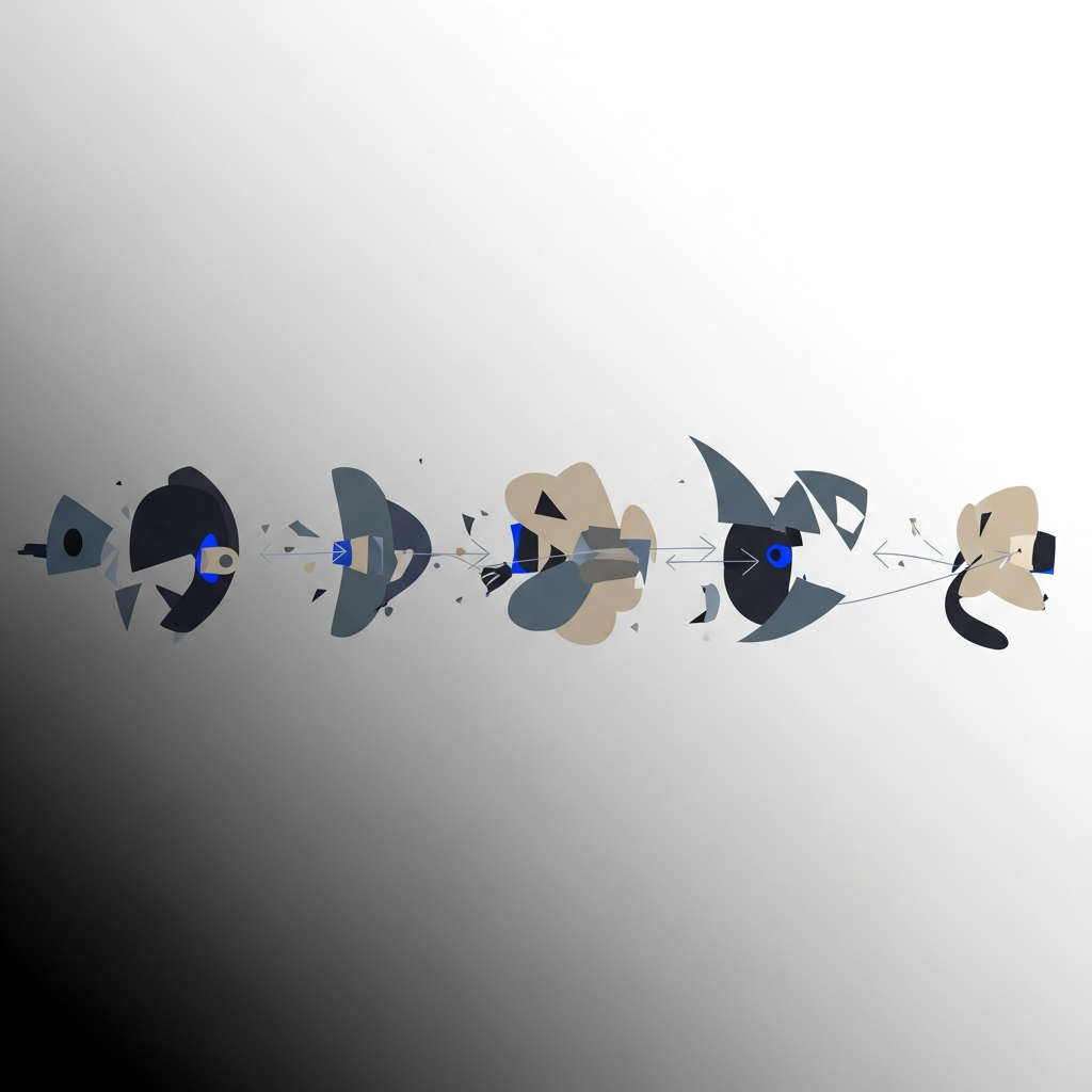
This isn't an isolated failure. Research analyzing 32 papers on long-video generation found that even cutting-edge models achieving impressive technical metrics (SSIM of 0.85, LPIPS of 0.12) still suffer from "inconsistent temporal coherence." Frame-to-frame continuity breaks down in longer sequences. The researchers' conclusion? Architecture must prioritize narrative over raw fidelity.
The film industry figured this out decades ago. 72.8% of US filmmakers prioritize detailed storyboards, with 42.3% using them explicitly for story development. They know that visual coherence emerges from narrative coherence, not the other way around.
Yet in financial communications, we skip straight to production. We animate first and hope meaning emerges. It rarely does.
Michelle Connolly, founder of Educational Voice, puts it directly: "Hyperrealistic 3D shines in product demos, but without narrative tools like visual metaphors and pacing, it falls flat. Detail alone doesn't ensure understanding."
This is the core tension. We've built incredible capacity to visualize data. We've neglected the harder work of deciding what story that data should tell.
What Changes If Narrative Comes First
If this perspective is correct, the implications reshape how we approach financial content creation entirely.
Production timelines don't start with asset creation. They start with story architecture. What's the central tension? What does the audience believe now versus what should they believe after? What's the emotional arc?
Tool selection shifts too. The question isn't "which platform produces the smoothest animations" but "which platform lets me structure narrative before I touch a single visual element."
Businesses using character-driven explainers with strong narrative structure see 35% better information retention than traditional presentations. The fidelity matters less than the framework holding it together.
For finance content creators specifically, this means your competitive advantage isn't animation quality. It's data storytelling clarity. Anyone can make charts move. Few can make them mean something.
A Better Way to Think About This
Here's the reframe: high-fidelity animation is a delivery mechanism, not a communication strategy.
Think of it like typography. Beautiful fonts don't create compelling writing. They present it. You wouldn't hire a calligrapher before knowing what you wanted to say. Yet that's exactly what happens when we prioritize animation tools over narrative structure guidance.
The sequence should be: insight, story, visual, motion. Most workflows reverse this, starting with motion and hoping insight emerges. It explains why so much financial content looks impressive and communicates nothing.
Data storytelling isn't decoration applied after the fact. It's the architecture that determines whether decoration serves any purpose at all.
The Opportunity in Front of You
The creators who will dominate financial content aren't chasing higher fidelity. They're building narrative discipline into their process before a single frame renders.
The tools exist to automate the technical work. The question is whether you've done the thinking that makes automation worthwhile.
Frequently Asked Questions
What is AI animation in data visualization?
AI animation automates the creation of motion graphics from data inputs, generating smooth transitions and visual sequences without manual keyframing. The technology accelerates production but still requires narrative structure to communicate effectively.
Why does high-fidelity animation fail without narrative structure?
Technical quality creates visual appeal but not comprehension. Without a clear story arc, audiences see movement without meaning, leading to poor retention and unclear takeaways despite impressive production values.
How can finance content creators improve data storytelling?
Start with the insight you want to communicate, then build the narrative arc before touching animation tools. Define the tension, the journey, and the resolution before selecting any visual elements.
Sources
Read Next
Continue Exploring

5 Benefits of Multi-Image Fusion for Financial Narratives
Learn 5 ways multi-image fusion elevates financial narratives with better visual fidelity, faster turnaround, and stronger investor engagement.

7 Elements That Make Financial Animations Trustworthy
Discover the key elements of high-fidelity animation that build audience trust in financial content. Essential guide for creators who prioritize accuracy.

7 Visualization Techniques That Make Data Stories Click
Discover visualization techniques that transform raw data into compelling stories. Strategic methods for finance creators to boost engagement and retention.