
7 Visualization Techniques That Make Data Stories Click
Discover visualization techniques that transform raw data into compelling stories. Strategic methods for finance creators to boost engagement and retention.
25 articles
Discover visualization techniques that transform raw data into compelling stories. Strategic methods for finance creators to boost engagement and retention.

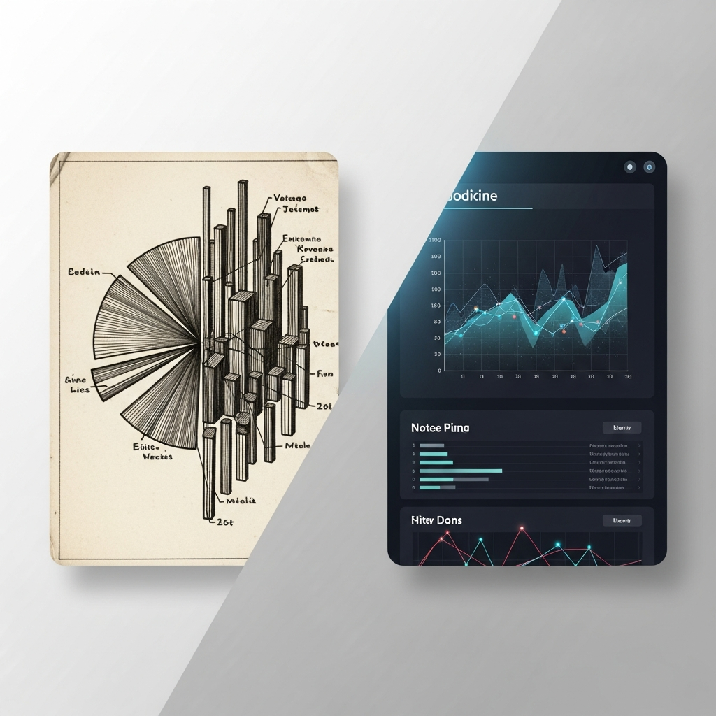
Beautiful charts aren't enough. Discover why narrative structure is the key to data visualization that drives decisions, not just impressions.
Compare traditional data analysis techniques with modern visualization methods. Learn which approach drives understanding and action for your specific audience.

Discover the key elements of high-fidelity animation that build audience trust in financial content. Essential guide for creators who prioritize accuracy.

Discover how AI animation helps financial content creators turn complex data into clear, accurate visuals. Frameworks and strategies for building audience tr...
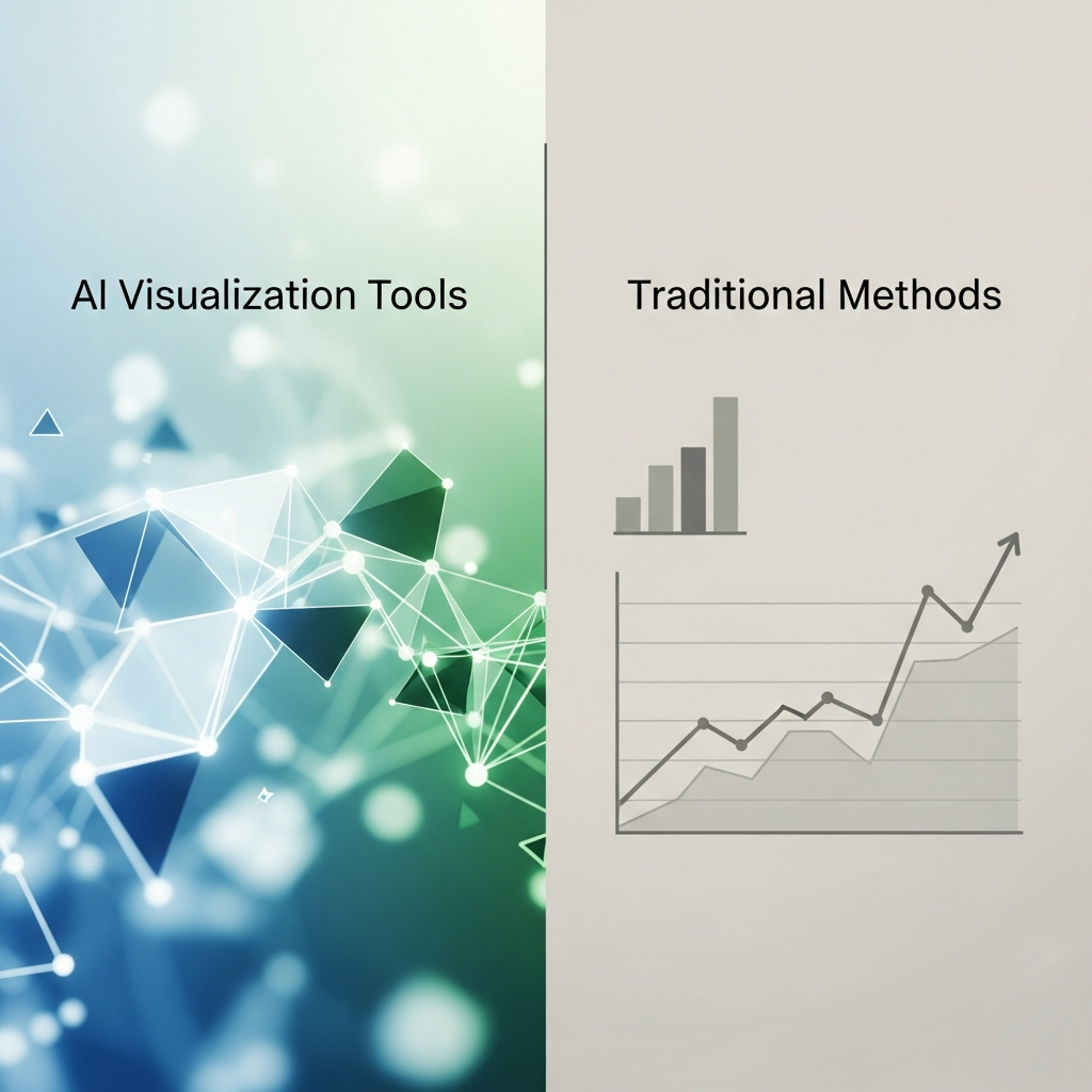
Compare AI visualization tools vs traditional methods for finance YouTubers. See which approach wins on data accuracy, production speed, and visual quality.
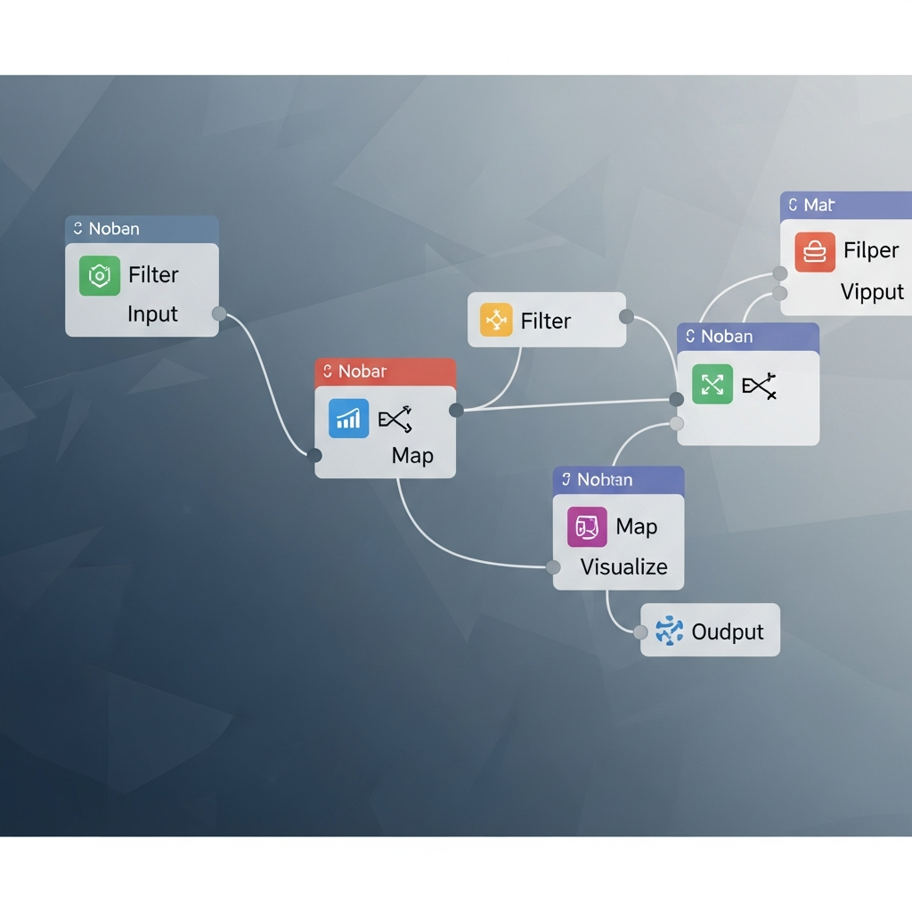
Master node-based compositing for data visualization. Build animated financial charts in Nuke, Natron, or Fusion with this step-by-step tutorial.

Compare visual effects software for finance creators. See how DaVinci Resolve Fusion delivers performance in motion graphics for data-driven content production.
Compare Blender for animation vs After Effects for finance content. Discover which workflow delivers better results for data visualization and market graphics.
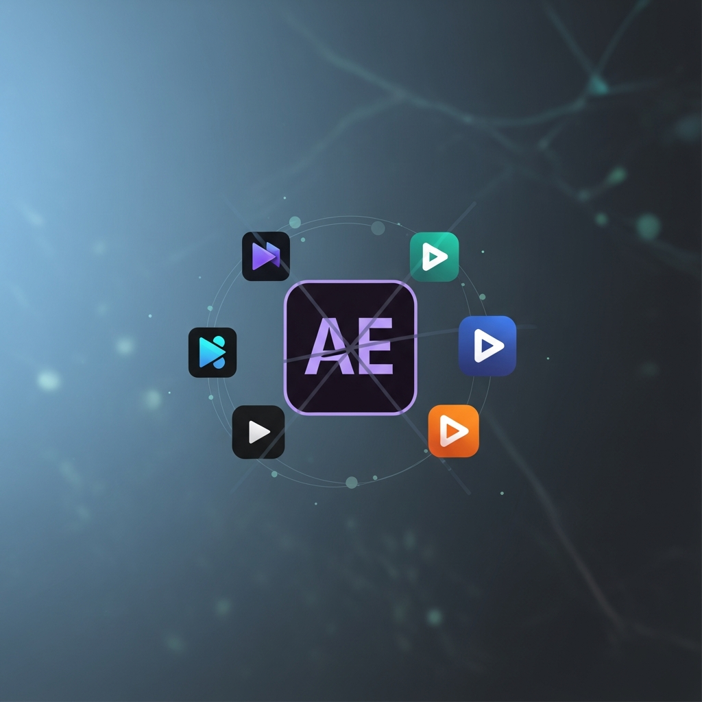
Compare After Effects alternatives for finance creators. Find motion graphics tools that streamline chart animations, data visualization, and financial expla...

Learn how to use AI animation to transform financial data into engaging visual stories. A complete guide covering strategy, tools, and workflow integration.
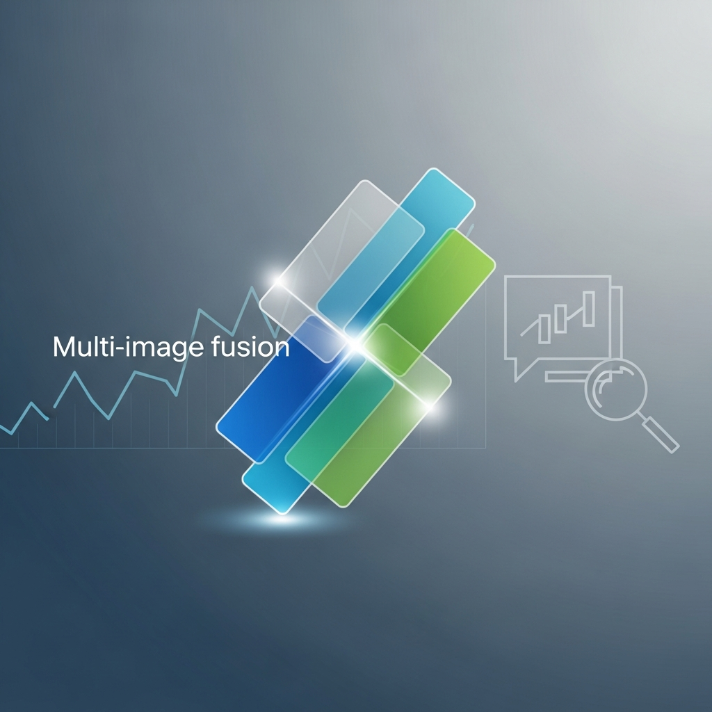
Learn 5 ways multi-image fusion elevates financial narratives with better visual fidelity, faster turnaround, and stronger investor engagement.

Create interactive visualizations that boost engagement. This 90-minute tutorial shows you how to build animated financial presentations with hover-responsiv...

High-fidelity animation is now table stakes—but without narrative structure, it's just beautiful noise. Learn what actually makes data visuals memorable.

Compare dynamic models vs. traditional charts for financial content. See which visualization method drives higher viewer engagement and fits your workflow.

Learn 7 ways AI-driven animation transforms complex financial data into clear, engaging narratives. Practical techniques for earnings calls and investor cont...

Transform complex scientific diagrams into engaging animations with AI tools. Step-by-step tutorial for creating professional financial visualizations in min...

Discover how AI animation provides narrative structure guidance for finance videos. Learn to create compelling, accurate financial stories with real-time phy...

Discover how AI-driven animation helps finance content creators build engaging educational tools. Learn to evaluate, implement, and measure visual impact.

Discover 15 Instagram Reels ideas using AI motion graphics. Create animated maps, data visuals, and kinetic typography without After Effects.
Comparing Flourish, Datawrapper, and flowi.video for video content. Which tool actually exports broadcast-quality MP4? Honest breakdown for creators.

From "anti-design" textures to kinetic maps, 2026 is moving away from polished perfection. Here are the top 10 trends defining motion design this year.

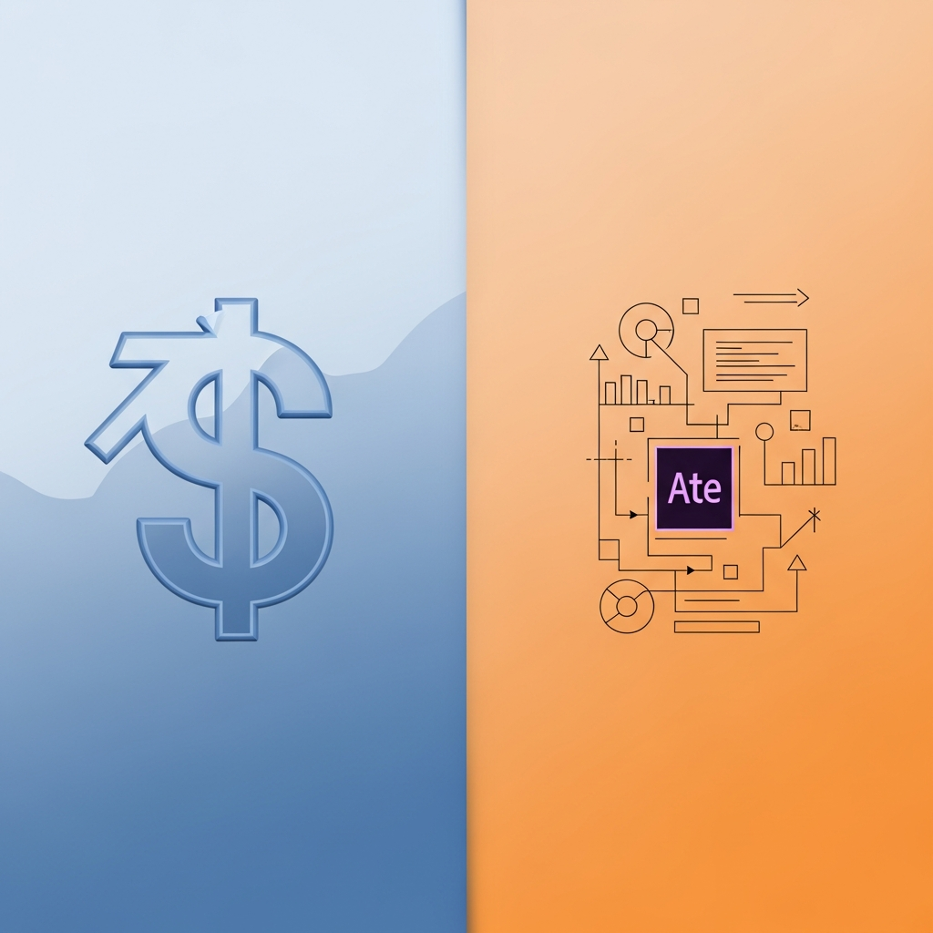
Is a $500 day rate worth it for a simple logo reveal? We break down the real costs of hiring a freelancer versus using AI motion tools.

Struggling with complex animation tools? We compare Flowi vs. After Effects to help you choose the right tool for your workflow.
Stop putting prospects to sleep with static slides. Here are 5 ways to use motion graphics to visualize data and close more deals.