
The missing narrative structure that transforms charts from decorative to decisive
Learn why beautiful charts often fail to communicate meaning and how narrative structure transforms data visualization from mere decoration into decision-driving evidence. Discover the framework that makes data actually matter.
TL;DR
Narrative structure beats visual polish - A beautiful chart without story context is just a picture of numbers that fails to drive decisions
Sequence creates understanding - Effective data visualization builds meaning through intentional ordering: context, tension, evidence, implication
Animation is pacing, not decoration - Motion graphics work when they guide attention and reveal information in the right order
Reframe your approach - Stop asking "Does this look professional?" and start asking "Does this build understanding in the right sequence?"
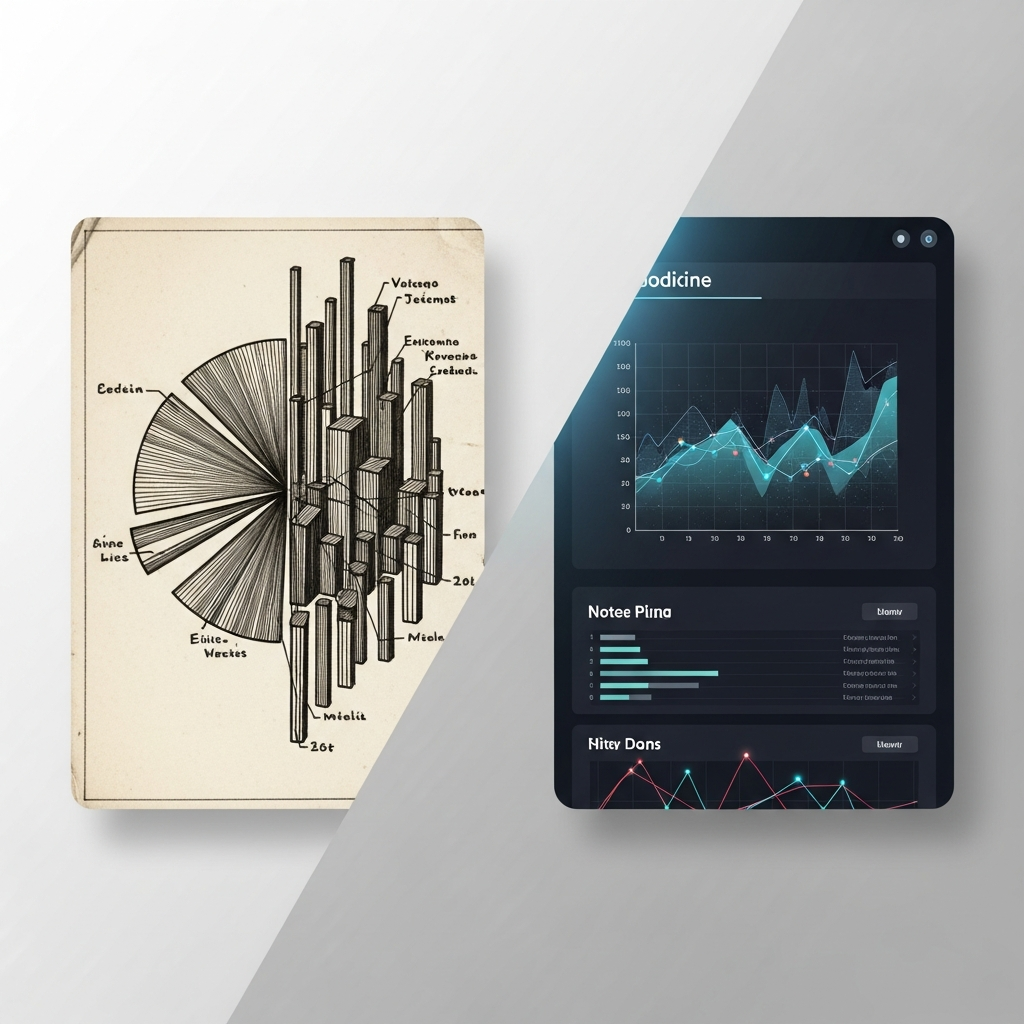
The Chart That Said Nothing
I watched a senior analyst present quarterly results last month. Fifteen slides. Beautiful gradients. Perfectly aligned axes. The room was silent, but not in a good way.
When she finished, the CFO asked one question: "So what does this mean for us?" The analyst paused. The data was all there. The story wasn't.
This happens constantly. We've become experts at generating charts and amateurs at making them matter.
The Visualization Trap We All Fell Into
Somewhere along the way, data visualization became synonymous with data communication. We convinced ourselves that if the chart looked professional, the message would land.
This belief made sense when dashboards were novel. When simply showing a trend line felt like insight. When audiences were impressed by the mere act of turning spreadsheets into visuals.
That era is over. Over 5.35 billion people now use the internet, swimming in charts, graphs, and infographics daily. Visual literacy has skyrocketed. Your audience doesn't need another bar chart. They need to understand why that bar matters.
Yet most data visualization workflows still optimize for appearance first, meaning second.
Here's What Actually Drives Understanding
Narrative structure is the difference between data that informs and data that transforms decisions. Not aesthetics. Not animation speed. Not color palettes. Structure.
A chart without narrative context is just a picture of numbers. A chart embedded in story becomes evidence that moves people to act.
Why Structure Beats Style Every Time
Consider how memory works. Cognitive research consistently shows that information embedded in narrative is retained at dramatically higher rates than isolated facts. Your brain doesn't file away "Q3 revenue increased 12%." It files away "We were losing ground until the product pivot, then everything changed."
This isn't soft thinking. It's how decisions actually get made.
The Anatomy of Data That Sticks
Effective data storytelling follows a recognizable arc. You establish context (where we were), introduce tension (what changed or what's at stake), present evidence (the data), and resolve with implication (what this means going forward).
Watch any compelling earnings call or investor presentation. The numbers aren't just displayed. They're sequenced to build understanding. Each visualization earns its place by answering the question the previous one raised.
Research from The Wharton School found that data visualization can reduce meeting time by up to 24%. But that efficiency gain doesn't come from prettier charts. It comes from visualizations that eliminate the need for explanation because the structure makes the meaning self-evident.
What Finance Communicators Get Wrong
I've reviewed hundreds of data presentations from analysts and finance content creators. The pattern is consistent: they front-load complexity.
They show the comprehensive view first, then try to explain what matters. This is backwards. It forces audiences to hold everything in working memory while waiting for significance.
Strong narrative structure does the opposite. It creates anticipation, then delivers. It makes the audience want the next data point because they understand what question it answers.
The Motion Graphics Advantage
Static charts struggle with narrative structure because they show everything at once. Animated data visualization, when done with intention, reveals information in sequence. It controls attention. It builds.
This is why the most effective data visualizations of 2025 across conflict analysis, climate communication, and financial reporting shared one trait: they used motion to guide understanding, not just to look sophisticated.
The animation wasn't decoration. It was pacing. It was emphasis. It was the visual equivalent of a skilled presenter knowing exactly when to pause.
What Changes If This Is True
If narrative structure matters more than visual polish, then most data visualization workflows are optimized for the wrong outcome.
Time spent perfecting gradients is time not spent clarifying the story arc. Energy devoted to timeline editing is energy diverted from sequencing insights. The handoff to motion graphics specialists who don't understand the data creates beautiful videos that miss the point.
For finance content creators and data journalists, this has direct implications. Audience engagement doesn't come from production value alone. It comes from the feeling of understanding something that felt complex a moment ago. That feeling is engineered through structure.
A Better Mental Model
Stop thinking of data visualization as translation (data to image). Start thinking of it as argumentation (claim, evidence, implication).
Every chart should answer one question clearly. Every transition should raise the next question naturally. Every visualization sequence should feel like a conversation where the audience is always one step ahead of where they started.
This reframe changes what you prioritize. You stop asking "Does this look professional?" and start asking "Does this build understanding in the right order?"
The Real Unlock
Data storytelling importance isn't about making numbers more palatable. It's about respecting your audience enough to structure information so it lands.
The analysts who win attention in 2025 won't be the ones with the best design tools. They'll be the ones who understand that a chart is never the point. The point is always the decision it enables.
Structure first. Everything else follows.
Frequently Asked Questions
What is data storytelling?
Data storytelling combines data analysis with narrative structure to communicate insights in a way that drives understanding and action. It sequences information to build meaning rather than simply displaying numbers.
Why is data storytelling important?
Audiences retain narrative-embedded information far better than isolated facts. Effective data storytelling transforms complex analysis into clear arguments that influence decisions.
Which visualizations are best for data storytelling?
The best visualizations are those that answer one question clearly and naturally raise the next. Animated and sequenced visuals often outperform static charts because they control pacing and emphasis.
Sources
Read Next
Continue Exploring

7 Visualization Techniques That Make Data Stories Click
Discover visualization techniques that transform raw data into compelling stories. Strategic methods for finance creators to boost engagement and retention.

Dynamic Models vs. Traditional Charts: Which Wins?
Compare dynamic models vs. traditional charts for financial content. See which visualization method drives higher viewer engagement and fits your workflow.
Traditional vs Modern Data Visualization: Which Drives Action?
Compare traditional data analysis techniques with modern visualization methods. Learn which approach drives understanding and action for your specific audience.