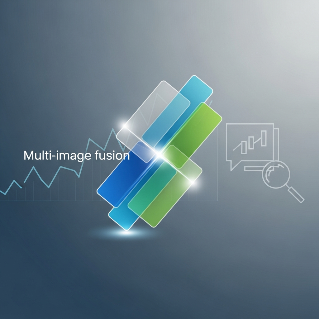
How layered visual techniques elevate fidelity and storytelling in investor presentations
Discover how multi-image fusion transforms financial presentations by combining visual elements into cohesive narratives. Learn five specific benefits that reduce production time and boost audience engagement.
TL;DR
Unified narratives from multiple sources eliminate fragmented storytelling by synthesizing disparate data into cohesive visual presentations
Real-time synchronization replaces periodic manual updates, reducing reconciliation time from hours to seconds while improving accuracy
Layered sentiment communication uses motion, color, and visual hierarchy to convey emotional context alongside raw numbers
Scenario modeling through visual layers enables "what-if" presentations that acknowledge uncertainty without fragmenting core narratives
Cross-platform visual consistency maintains brand identity across investor decks, social content, and regulatory filings without manual reformatting
The Visual Fidelity Problem in Financial Storytelling
Financial presentations face a credibility gap. Analysts spend hours assembling data from multiple sources, yet the final visuals often fail to convey the complexity behind the numbers. Static charts flatten nuance. Disconnected slides fragment the narrative.
The challenge intensifies in 2025 as stakeholders expect dynamic, real-time insights rather than quarterly snapshots. Goldman Sachs projects generative AI will create $20 trillion in economic value, with significant gains in financial data synthesis. Yet most finance teams still struggle to transform raw data into compelling visual stories.
Multi-image fusion offers a path forward. By combining multiple visual elements into cohesive, layered presentations, this technique elevates both visual fidelity and narrative clarity. The result: financial narratives that inform and persuade.
What This List Delivers
This guide targets data journalists, finance influencers, and content creators who produce investor-ready materials under tight deadlines. If you build financial presentations that need to balance accuracy with engagement, these benefits apply directly to your workflow.
We exclude basic charting advice and generic AI hype. Instead, we focus on five specific advantages of multi-image fusion that address real production bottlenecks. Each benefit connects to measurable outcomes: faster turnaround, reduced errors, and stronger audience engagement.
Selection Criteria
These benefits were selected based on three factors: documented impact on production efficiency, relevance to current financial communication standards, and scalability across different content formats. Each addresses a specific limitation in traditional presentation workflows.
1. Unified Data Narratives from Disparate Sources
Why It Matters
Financial stories rarely emerge from single datasets. Earnings reports, market trends, and operational metrics each tell partial truths. Multi-image fusion synthesizes these fragments into coherent visual narratives, eliminating the cognitive load of mental assembly for your audience.
What It Looks Like Today
Platforms like Lucid Financials demonstrate this shift by transforming static reports into dynamic, multi-source fused visuals. Real-time dashboards integrate data platforms with anomaly detection, flagging trends like rising burn rates alongside contributing factors. This represents a departure from the slide-by-slide isolation of traditional presentations.
How to Apply It
Start by mapping data relationships before designing visuals. Identify which metrics reinforce or contradict each other. Then layer these elements spatially rather than sequentially. Tools that automate chart generation, like Flowi, can accelerate this process by handling the technical composition while you focus on narrative architecture.
2. Real-Time Visual Synchronization
Why It Matters
Traditional financial reporting operates on weekly or monthly update cycles. By the time visuals reach stakeholders, the underlying data may have shifted. Multi-image fusion enables real-time synchronization, ensuring visual fidelity matches current conditions.
What It Looks Like Today
AI-powered data collection now enables instant synchronization versus traditional periodic updates, reducing reconciliation time from hours to seconds while cutting human error risk. This capability transforms presentations from historical records into living documents.
How to Apply It
Prioritize data connections over static imports. When building presentation workflows, establish direct links to source systems rather than manual data entry points. Reserve real-time updates for metrics that genuinely shift audience understanding, not every available data point.
3. Enhanced Sentiment Communication
Why It Matters
Numbers alone rarely drive decisions. Stakeholders need to grasp the emotional weight behind financial movements. Multi-image fusion allows layered visual cues (color gradients, motion dynamics, comparative overlays) that communicate sentiment alongside data.
What It Looks Like Today
Research from Taylor & Francis shows GPT-3.5 generates summaries of financial disclosures more predictive of stock returns than full documents, precisely because of improved sentiment capture. Visual applications of this principle use animation pacing and color intensity to signal urgency or stability.
How to Apply It
Establish a visual language for sentiment before production begins. Define what acceleration, color shifts, or overlay density mean in your presentation context. Consistency matters more than complexity. Audiences should intuitively read emotional undertones without explicit explanation.
4. Scenario Modeling Through Visual Layers
Why It Matters
Financial narratives gain credibility when they acknowledge uncertainty. Multi-image fusion enables "what-if" visualizations that overlay potential outcomes without fragmenting the core narrative. This technique transforms static forecasts into interactive decision tools.
What It Looks Like Today
AI visualizations in tax planning demonstrate this capability by fusing multiple data streams (IRMAA thresholds, Roth conversions, Medicare premiums) to show lifetime impacts. One documented case illustrated $800,000 in federal tax savings through layered scenario presentation.
How to Apply It
Limit scenario layers to three or four variations. More options create confusion rather than clarity. Use visual hierarchy to distinguish base cases from alternatives. Toggle-based presentations work well for live discussions, while sequential reveals suit recorded content.
5. Consistent Cross-Platform Visual Identity
Why It Matters
Financial content now spans investor decks, social clips, webinar backgrounds, and regulatory filings. Multi-image fusion maintains visual fidelity across formats, ensuring brand consistency without manual reformatting for each channel.
What It Looks Like Today
66% of wealth management advisors rate integrations as the most valuable feature for creating a "single source of truth" in visuals and narratives. This reflects growing demand for unified visual systems that adapt rather than require recreation.
How to Apply It
Build modular visual components rather than fixed layouts. Design charts, annotations, and motion elements as independent assets that combine differently across platforms. Automation tools like Flowi support this approach by generating After Effects-quality motion graphics from standardized templates.
Pattern Recognition: The Underlying System
These five benefits share a common thread: they shift production effort from assembly to architecture. Multi-image fusion reduces time spent on mechanical composition, freeing analysts to focus on narrative strategy and insight extraction.
The tradeoff involves upfront investment. Building effective fusion workflows requires clear data relationships, consistent visual languages, and appropriate tooling. Teams that skip this foundation often produce visually dense but narratively confused presentations.
Consider these benefits as an integrated system rather than isolated features. Real-time synchronization enables scenario modeling. Unified data narratives support cross-platform consistency. The compounding effect exceeds individual improvements.
Where to Start
Begin with one or two benefits that address your most pressing bottleneck. If stakeholder confusion is the problem, prioritize unified data narratives. If production speed limits output, focus on real-time synchronization and cross-platform consistency.
Resource constraints are real. Not every presentation requires all five capabilities. Reserve advanced scenario modeling for high-stakes investor materials. Apply basic fusion techniques to routine reporting. Match technique complexity to audience importance and available production time.
Frequently Asked Questions
What is multi-image fusion in financial presentations?
Multi-image fusion combines multiple visual elements (charts, annotations, data overlays, motion graphics) into cohesive, layered presentations. Rather than displaying data points in isolation, this technique synthesizes information from disparate sources into unified visual narratives that communicate relationships and context simultaneously.
How does AI-driven animation improve data visualization accuracy?
AI-driven animation automates the translation of data into visual form, reducing manual transcription errors. These systems pull directly from source data, apply consistent formatting rules, and flag anomalies that might indicate input problems. The result is higher visual fidelity with lower human error risk compared to manual chart creation.
When should finance teams consider using AI for visual storytelling?
AI-powered visualization tools deliver the strongest returns when production volume is high, data sources are numerous, or turnaround times are tight. Teams producing regular investor updates, quarterly reports, or social media content benefit most. For one-off presentations with simple data, manual approaches may suffice.
What challenges do AI-driven animations face in maintaining financial accuracy?
Primary challenges include data currency (ensuring visuals reflect current information), context interpretation (understanding which metrics matter most), and regulatory compliance (meeting disclosure requirements). Human oversight remains essential for validating AI-generated outputs, particularly for materials subject to regulatory review.
How does multi-image fusion differ from traditional slide-based presentations?
Traditional presentations display information sequentially, requiring audiences to mentally assemble relationships across slides. Multi-image fusion presents layered information simultaneously, showing connections visually rather than verbally. This approach reduces cognitive load and enables more nuanced storytelling within single frames.
What tools support multi-image fusion for financial content?
Several platforms now support this capability. Flowi automates After Effects-quality chart generation and motion graphics for financial communicators. Lucid Financials transforms static reports into dynamic dashboards. The choice depends on output format (video versus interactive), production volume, and integration requirements with existing data systems.
Sources
Read Next
Continue Exploring

7 Elements That Make Financial Animations Trustworthy
Discover the key elements of high-fidelity animation that build audience trust in financial content. Essential guide for creators who prioritize accuracy.
7 Visualization Techniques That Make Data Stories Click
Discover visualization techniques that transform raw data into compelling stories. Strategic methods for finance creators to boost engagement and retention.

7 Ways Multi-Image Fusion Transforms Financial Education
Explore 7 ways multi-image fusion enhances financial education through AI-driven animation. Learn how to transform complex data into clear visual sequences.