
Raw metrics won't fix flat content — audience participation patterns reveal what dashboards miss
Learn why tracking views and clicks fails to explain content performance. This POV shows how shifting focus to audience participation patterns transforms data-driven storytelling from noise into impact.
TL;DR
Raw data isn't the problem - Treating data-heavy content as data-driven storytelling misses what actually drives engagement
Participation beats views - Audience participation patterns (shares, comments, saves) reveal impact better than passive consumption metrics
Stories make data stick - Statistics in narrative context become 22 times more memorable than isolated figures
Design for provocation - The best financial content creates tension between what audiences believed and what data reveals, prompting active response
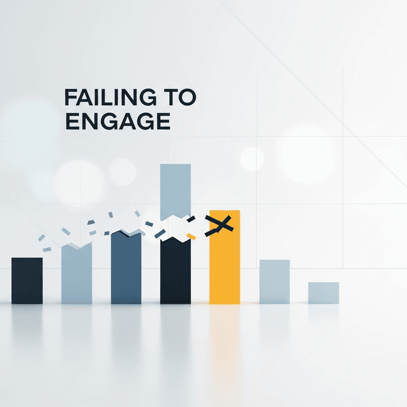
The Dashboard Delusion
I've watched financial communicators obsess over the wrong numbers for years. They build beautiful dashboards, track every metric imaginable, and still wonder why their content falls flat.
The problem isn't the data. It's the assumption that more data equals better storytelling. It doesn't. Not even close.
Why Raw Data Became the Default
Somewhere along the way, data-driven storytelling became synonymous with data-heavy storytelling. The logic seemed sound: audiences want credibility, credibility requires evidence, evidence means numbers. So we stuffed our financial content with charts, percentages, and year-over-year comparisons.
This approach worked when attention was abundant and competition was scarce. Finance professionals could publish a quarterly report with dense tables, and audiences would parse through it because alternatives didn't exist.
That world is gone. Today, your audience scrolls past dozens of data visualizations before lunch. The bar for capturing attention has risen dramatically, but most content performance analysis still measures the wrong things: views, time on page, click-through rates. These metrics tell you what happened. They reveal nothing about why.
Here's What Actually Drives Engagement
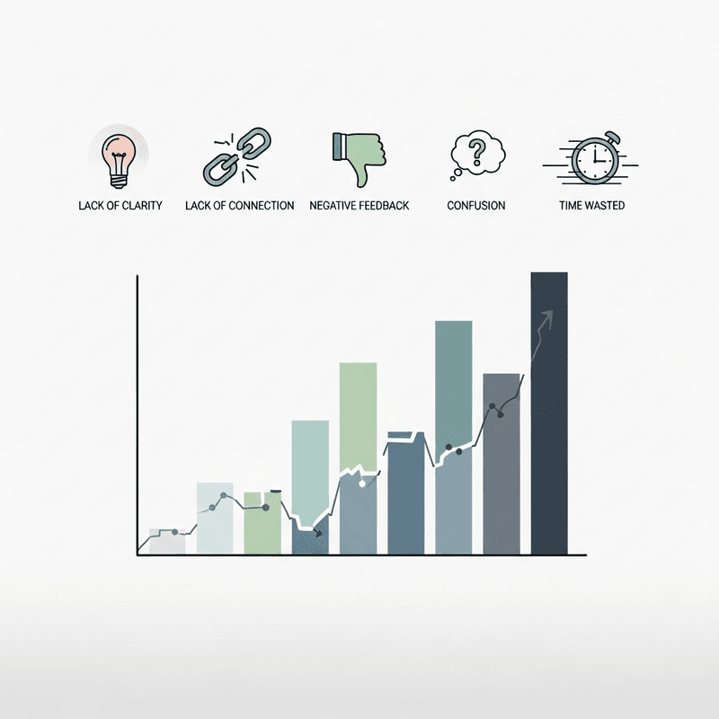
The metric that matters most is audience participation patterns, not passive consumption. When someone shares your chart, comments on your analysis, or saves your video for later, they're signaling something fundamentally different from a view count. They're telling you the story landed.
The Participation Gap in Financial Content
Consider what happened in a recent experiment by Rainmaker Media Group. Researchers took patient satisfaction data and presented it two ways. The first version showed raw percentages in standard charts. The second transformed identical data points into a narrative following a typical patient's journey.
The engagement difference was described as "night and day." Same data. Same accuracy. Completely different audience response.
This pattern repeats across financial content. Statistics placed within narrative context become 22 times more memorable than isolated figures. That's not a marginal improvement. That's a different category of impact.
The reason comes down to how humans process information. We don't remember numbers. We remember what numbers mean for people like us. A 15% increase in quarterly revenue is forgettable. The story of how a company pivoted its strategy and what that 15% enabled for employees and customers, that sticks.
Data-driven stories can boost engagement by up to 300%, but only when they prioritize participation over presentation. The difference lies in designing content that invites response rather than passive observation.
Interactive elements illustrate this clearly. When financial communicators use platform-native features like polls, Q&A prompts, or clickable data points, audience participation in social stories increases measurably. The data becomes a conversation starter rather than a conversation ender.
What Changes When You Measure Participation
If audience participation patterns matter more than raw views, then most content strategies need restructuring. The implications run deeper than switching metrics in a dashboard.
First, production priorities shift. Instead of optimizing for comprehensiveness, you optimize for moments that trigger response. That might mean fewer data points presented more compellingly, or strategic pauses in video content that prompt reflection.
Second, success timelines change. Participation-focused content often performs differently than view-optimized content. A video that generates discussion may have lower initial views but higher long-term value through shares and saves.
Third, tool selection matters differently. Platforms that enable rapid iteration, like AI-powered animation tools that transform complex data into motion graphics without timeline editing, become essential. When testing participation patterns, speed to publish determines how quickly you learn.
A Better Frame for Financial Storytelling
Stop thinking of data visualization as presentation. Start thinking of it as provocation.
The best financial content doesn't just inform. It creates a gap between what the audience believed and what the data reveals. That gap generates participation because people need to reconcile the tension.
This reframe changes everything about how you approach content performance analysis. Instead of asking "how many people saw this," you ask "how many people felt compelled to respond." Instead of measuring reach, you measure resonance.
Storytelling aids conversion rates by 30% precisely because it creates this kind of productive tension. The audience doesn't just receive information. They engage with an argument.
The Real Measure of Impact
Financial storytelling is entering a new phase. By 2025, 75% of data stories will be automatically generated through augmented intelligence. The competitive advantage won't come from producing more content. It will come from producing content that earns participation.
The communicators who win will be those who stop treating their audience as passive recipients of data and start treating them as active participants in meaning-making. That shift requires better tools, yes. But more fundamentally, it requires a different definition of success.
Measure participation. The rest follows.
Frequently Asked Questions
What is data visualization and why is it important for audience engagement?
Data visualization transforms numbers into visual formats that humans process faster than text. It matters for engagement because visuals that tell stories, rather than just display information, invite audience participation and emotional connection.
Which metrics are most important to track for content performance analysis?
Prioritize participation metrics like shares, saves, comments, and response rates over passive metrics like views. These signals indicate whether your story resonated enough to prompt action.
How can interactive charts improve audience engagement?
Interactive elements transform viewers into participants by inviting exploration and response. When audiences can manipulate data or respond to prompts, they invest attention and remember the content longer.
Sources
Read Next
Continue Exploring
How to Fix Data Storytelling That Fails to Engage
Learn how to transform financial data into visual stories that drive action. Practical techniques for data storytelling that boosts audience engagement.

5 Community Growth Strategies Using Real-Time Data Insights
Discover 5 community growth strategies that help finance creators turn real-time insights into compelling data storytelling. Reduce your insight-to-publish gap.
5 Signs Your Interactive Charts Are Failing to Engage
Discover 5 key indicators that your interactive charts aren't engaging audiences. Learn which engagement metrics reveal real problems versus vanity numbers.