
A systematic framework for integrating data visualization with engagement metrics to build lasting audience growth
Learn how to select the right visual formats for financial data, measure their impact accurately, and iterate based on audience behavior. This guide connects visual storytelling with measurable community growth.
TL;DR
Integrate visuals with measurement - Treat visual communication tools and engagement rate measurement as connected components, not separate workflows. Each informs the other.
Follow the five-stage framework - Identify insight, select format, execute production, measure performance, iterate based on evidence. The cycle creates compounding improvements.
Prioritize insight clarity over production polish - A clear message in a simple format outperforms a confusing message in a beautiful animation every time.
Automate technical work to focus on storytelling - AI-powered tools handle animation and chart generation, freeing you to concentrate on what your data actually means for audiences.
Measure what matters for community growth - Completion rates, saves, and comment quality indicate audience value better than raw view counts or follower numbers.
Guide Orientation: What This Guide Covers
This guide teaches finance content creators how to integrate visual communication tools with engagement rate measurement to build sustainable community growth strategies. You will learn a systematic approach to financial storytelling that treats visuals and metrics as interconnected components rather than separate workflows.
By the end, you will understand how to select the right visual formats for financial data, measure their impact accurately, and iterate based on audience behavior analysis. This guide covers the strategic framework and execution steps. It does not cover basic video editing techniques or platform-specific algorithm hacks.
If you create financial content and want to increase audience engagement through better data visualization, this guide is for you. If you are looking for general social media tips, look elsewhere.
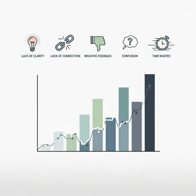
Why Financial Storytelling Demands a New Approach
The gap between financial insight and audience understanding continues to widen. Complex data requires translation. Static charts and text-heavy explanations no longer compete effectively for attention.
Video campaigns in 2025 generate 60% higher engagement rates than text-only campaigns. This shift reflects how audiences now consume information. They scroll faster, expect immediate clarity, and reward content that respects their time.
Platform algorithms have adapted accordingly. Watch time and completion rate now drive recommendations more than raw view counts. A 5-minute video with 60% average view duration outperforms a 10-minute video with 30% AVD in most recommendation systems.
For finance content creators, this creates both pressure and opportunity. The pressure comes from production demands. Creating polished motion graphics traditionally required specialized skills and significant time investment. The opportunity emerges when you automate the technical work and focus on insight quality.
The cost of inaction is measurable. Competitors who master visual data storytelling will capture audience attention and build communities while others struggle with outdated formats. The window for establishing authority in financial content narrows as more creators adopt advanced visual communication tools.
Core Concepts: Building Your Foundation
Visual Communication Tools Defined
Visual communication tools transform raw data into formats that audiences can process quickly and remember longer. In financial storytelling, these include animated charts, motion graphics, interactive dashboards, and data-driven video content.
The distinction that matters: static visuals inform, but animated visuals explain. When a chart builds progressively, audiences follow the logic. When data points move in relation to each other, patterns become obvious without narration.
Engagement Rate Measurement Explained
Engagement rate measures how actively your audience interacts with content relative to its reach. The formula varies by platform, but the principle remains constant: engagement indicates resonance.
Common misconception: high views equal success. Reality: average Instagram engagement rate sits at 3.5% across industries. A video with 10,000 views and 2% engagement underperforms one with 5,000 views and 6% engagement for community building purposes.
Community Growth Strategies in Context
Community growth strategies focus on converting passive viewers into active participants. This requires content that invites response, creates discussion, and delivers consistent value.
The framework connecting these concepts: visual communication tools create the content, engagement rate measurement reveals what works, and community growth strategies guide iteration. They function as a cycle, not separate activities.
The Integrated Storytelling Framework
This guide follows a five-stage process that connects visual creation directly to audience growth outcomes.
Stage 1: Insight Identification determines what story your data tells. Stage 2: Format Selection matches that story to the right visual approach. Stage 3: Production Execution creates the content efficiently. Stage 4: Distribution and Measurement captures performance data. Stage 5: Iteration applies learnings to improve future content.
Each stage feeds the next. Measurement insights inform format selection for subsequent content. Production efficiency enables faster iteration cycles. The framework creates compounding improvements over time.
Step-by-Step Breakdown
Step 1: Identify the Core Insight
Objective: Extract one clear, communicable insight from your financial data.
Start by asking what changed and why it matters. Financial data contains many potential stories. Your job is to find the one that serves your audience's needs. Review your data for trends, anomalies, comparisons, or projections that create genuine value for viewers.
Write your insight as a single sentence. If you cannot summarize it clearly, you have not identified it yet. Test the insight against audience relevance: does this help them make decisions, understand markets, or see opportunities?
What to avoid: Trying to communicate multiple insights in one piece of content. Choosing insights that impress peers rather than serve audiences. Starting production before the insight is crystal clear.
Success indicators: You can state the insight in under 15 words. A non-expert would understand why it matters. The insight connects to questions your audience actually asks.
Step 2: Select the Optimal Visual Format
Objective: Match your insight to the visual format that communicates it most effectively.
Different insights demand different treatments. Trends over time work best as animated line charts. Comparisons between categories call for bar charts with sequential reveals. Part-to-whole relationships need pie charts or treemaps. Correlations require scatter plots with highlighted clusters.
Content with visuals gets 94% more total views, but the right visual matters more than any visual. Consider your platform constraints. Instagram Reels favor vertical formats with bold text overlays. LinkedIn accommodates longer explanations and horizontal layouts.
Factor in production resources. AI-powered tools like Flowi can generate After Effects-quality motion graphics without timeline editing, making animated charts accessible even with tight deadlines.
What to avoid: Defaulting to the same format every time. Choosing complexity over clarity. Ignoring platform-specific best practices for aspect ratios and duration.
Success indicators: The format makes the insight obvious within 3 seconds. Production timeline fits your publishing schedule. The format matches platform norms for your target audience.
Step 3: Execute Production Efficiently
Objective: Create polished visual content without sacrificing speed or accuracy.
Production bottlenecks kill content programs. The traditional workflow (data preparation, design, animation, review, revision) can consume days for a single chart. This pace makes consistent publishing impossible.
Automate where possible. Domain-specific templates reduce design decisions. AI-driven animation handles motion timing. Automated data validation catches errors before they reach audiences. These efficiencies let you focus on storytelling rather than technical execution.
Build a production checklist: data accuracy verified, visual hierarchy clear, text readable at mobile sizes, brand consistency maintained, call-to-action included. Run through this checklist before every publish.
What to avoid: Manual processes that could be automated. Perfectionism that delays publishing. Skipping accuracy checks in favor of speed.
Success indicators: Production time decreases with each piece. Error rate stays below acceptable threshold. You can maintain your target publishing frequency.
Step 4: Distribute and Measure Systematically
Objective: Capture actionable engagement data from every piece of content.
Publishing without measurement wastes learning opportunities. Define your key metrics before distribution. For video content, prioritize watch time, completion rate, and saves. For static visuals, track shares, comments, and click-through rates.
Instagram Reels average engagement rates range from 3-8%, with nano-influencers seeing 8-15%. Know your benchmarks. Track performance against your own historical averages, not just platform-wide statistics.
Document performance in a consistent format. Include the insight type, visual format, platform, publish time, and engagement metrics. This data becomes invaluable for pattern recognition over time.
What to avoid: Vanity metrics that feel good but do not inform decisions. Inconsistent tracking that prevents comparison. Ignoring qualitative feedback in comments.
Success indicators: You can compare performance across content types. Patterns emerge in what resonates with your audience. Engagement trends upward over time.
Step 5: Iterate Based on Evidence
Objective: Apply measurement insights to improve future content systematically.
Review performance data weekly. Look for patterns: which insight types generate most engagement? Which formats drive highest completion rates? What posting times correlate with better performance?
Form hypotheses and test them deliberately. If animated charts outperform static images, increase their frequency. If certain topics consistently underperform, investigate whether the problem is topic selection or execution quality.
Posts with images receive 40% higher engagement rates, but your specific audience may differ. Let your data guide decisions rather than general statistics.
What to avoid: Changing multiple variables simultaneously. Abandoning formats after single underperformances. Ignoring data that contradicts assumptions.
Success indicators: You can articulate what works for your audience specifically. Content performance improves quarter over quarter. Community growth metrics trend positively.
Practical Application: Before and After
Scenario: Quarterly Earnings Analysis
Before integration: A finance influencer creates a static chart showing revenue growth, posts it with a lengthy caption explaining the numbers, and hopes for engagement. Production takes 2 hours. Engagement rate: 2.1%. Comments focus on asking clarifying questions the visual should have answered.
After integration: The same creator identifies the key insight (margin expansion despite revenue pressure), selects an animated dual-axis chart that reveals the story progressively, and produces it in 30 minutes using AI-powered tools. The visual explains itself. Engagement rate: 5.8%. Comments discuss implications rather than seeking clarification.
The difference lies not in effort but in approach. The integrated framework connects visual decisions to audience understanding, which drives engagement, which informs future content decisions.
Scenario: Market Trend Explanation
Before: A data journalist publishes a dense infographic with seven data points, requiring significant cognitive effort to parse. Shares: 12. Average time on page: 18 seconds.
After: The journalist breaks the same data into a 45-second animated sequence, each data point building on the previous. Shares: 89. Average completion rate: 71%. The visual analytics show viewers watch the key insight reveal multiple times.
Marketers using visual content report 65% higher conversion rates compared to text-only approaches. These scenarios illustrate why: visuals that respect cognitive load outperform those that demand effort.
Common Mistakes and How to Avoid Them
Mistake 1: Prioritizing production polish over insight clarity. Beautiful animations that obscure the message waste resources. Always verify the insight lands before refining aesthetics.
Mistake 2: Measuring the wrong metrics. Follower count growth means little if engagement rates decline. LinkedIn's average engagement rate of 3.4% provides a benchmark, but your community health depends on whether engaged followers convert to loyal audience members.
Mistake 3: Inconsistent publishing schedules. Community growth strategies require reliability. Sporadic content, regardless of quality, undermines audience trust and algorithmic favor.
Mistake 4: Ignoring platform-specific norms. A visualization optimized for YouTube fails on TikTok. Adapt formats to platform expectations rather than forcing one approach everywhere.
Mistake 5: Treating measurement as an afterthought. Engagement rate measurement should inform every production decision. Build tracking into your workflow from the start.
What to Do Next
Start with one piece of content. Apply the five-stage framework: identify a single clear insight from recent financial data, select the visual format that communicates it most directly, produce it efficiently, measure its performance, and document what you learn.
Do not attempt to overhaul your entire content operation immediately. Sustainable improvement comes from consistent small iterations. Use this guide as a reference point, returning to specific sections as you encounter challenges.
The integration of visual communication tools with engagement measurement is not a destination but a practice. Each content cycle teaches you more about your specific audience. Over time, these learnings compound into genuine competitive advantage and community growth that sustains your work.
Frequently Asked Questions
What is data visualization and why is it important for audience engagement?
Data visualization transforms numerical information into visual formats like charts, graphs, and motion graphics. It matters for engagement because audiences process visual information faster than text and retain it longer. For financial content specifically, visualization makes complex data accessible without requiring specialized knowledge from viewers.
How can interactive charts improve audience engagement?
Interactive charts invite active participation rather than passive consumption. When viewers can explore data themselves (hovering for details, filtering by category, adjusting timeframes), they spend more time with content and develop deeper understanding. This increased time-on-content signals quality to platform algorithms and builds stronger audience relationships.
Which metrics are most important to track for financial content?
Prioritize completion rate for video content, as it indicates whether your storytelling holds attention through the insight reveal. Track saves and shares as indicators of perceived value. Monitor comment quality to understand whether audiences grasp your insights or need clarification. Follower growth matters less than engagement rate trends over time.
What are best practices for designing effective financial data visualizations?
Lead with the insight, not the data. Use progressive revelation to guide viewers through complex information. Maintain consistent visual language across your content. Ensure text remains readable at mobile sizes. Verify data accuracy before every publish. Match your visual format to your platform's specifications and audience expectations.
How can I interpret trends in my engagement data?
Look for patterns across multiple content pieces rather than drawing conclusions from individual posts. Compare performance by insight type, visual format, publish time, and platform. Identify what correlates with above-average engagement and test whether those factors cause improvement or merely coincide with it. Document findings to build institutional knowledge.
How do AI-powered tools change the financial content creation process?
AI-powered tools like Flowi automate technical production tasks (animation timing, chart generation, data validation) that traditionally required specialized skills or significant time investment. This automation shifts creator focus from technical execution to insight quality and storytelling strategy. The result is faster iteration cycles and more consistent publishing schedules.
Sources
Read Next
Continue Exploring

Dynamic Models vs. Static Visuals: Which Drives Engagement?
Compare dynamic models and static visuals for finance content. Discover which approach drives better engagement based on your platform, timeline, and data type.
5 Signs Your Interactive Charts Are Failing to Engage
Discover 5 key indicators that your interactive charts aren't engaging audiences. Learn which engagement metrics reveal real problems versus vanity numbers.
7 Engagement Metrics Finance Creators Must Track in 2025
Discover 7 engagement metrics that reveal what your finance audience actually wants. Learn to use data storytelling insights that drive real audience engagem...