
A practical guide for finance creators who want to reduce production time while making data explorable
Learn when interactive charts outperform static visuals, implement visual storytelling frameworks, and automate your workflow. Built for data journalists and finance communicators who need speed without sacrificing accuracy.
TL;DR
Interactive beats static for engagement - Interactive visuals increase user engagement by 47% because they transform passive viewers into active participants who explore data on their own terms.
Follow a four-phase framework - Assessment, Design, Production, and Measurement create a continuous improvement cycle that compounds engagement gains over time.
Automate production, not decisions - Use tools that handle technical execution (animation, formatting, styling) while you focus on narrative and insight selection.
Measure interaction depth, not just views - Track how users engage with interactive elements, not just whether they showed up. Exploration depth predicts sharing behavior better than view counts.
Start with one change - Add a single interactive element to your next piece of content and measure the difference before overhauling your entire workflow.
Guide Orientation: What This Guide Covers
This guide addresses a specific challenge: how finance content creators can reduce production time while simultaneously increasing audience engagement through interactive data visualization. You will learn to evaluate when interactive charts outperform static visuals, implement proven frameworks for visual storytelling, and automate production workflows without sacrificing quality.
This guide is designed for data journalists, finance influencers, and financial communicators who produce regular content and need to balance accuracy with speed. By the end, you will understand how to select appropriate visualization types, structure interactive elements for maximum engagement, and measure performance effectively.
We focus on practical implementation rather than theoretical design principles. Tool comparisons and basic charting tutorials fall outside our scope.
Why Interactive Data Visualization Matters Now
The finance content landscape has shifted. Audiences no longer passively consume information. They expect to explore it. 91% of consumers now prefer visual information over text-based content, and static screenshots of spreadsheets no longer meet that expectation.
Interactive charts transform viewers from passive observers into active participants. When someone can hover over a data point, filter by time period, or compare their own portfolio against market benchmarks, they invest cognitive effort. That investment translates directly to retention and sharing behavior.
The cost of inaction compounds quickly. Creators who rely solely on static visuals compete against an increasing volume of dynamic, explorable content. User engagement rates increase by 47% with interactive visuals. That gap widens with each content cycle.
Financial institutions have recognized this shift. Banks implementing advanced visual analytics have seen corporate revenues rise by more than 20% over three years. The same principle applies to content creators: better visualization generates better outcomes.
Core Concepts: Understanding the Visualization Landscape
Data Visualization vs. Data Storytelling
Data visualization presents information graphically. Data storytelling uses those graphics to guide audiences through a narrative with clear stakes, progression, and resolution. Effective finance content requires both. A chart shows what happened. A story explains why it matters.
Static vs. Interactive: The Key Distinction
Static visuals capture a single moment or perspective. Interactive charts allow users to manipulate variables, explore timeframes, and personalize their view. The distinction matters because interactivity creates engagement through agency. Users who control their experience remember it longer.
Visual Analytics in Practice
Visual analytics combines automated analysis with interactive visualization. Rather than presenting conclusions, it enables audiences to discover insights themselves. For finance content, this means viewers can test their own hypotheses against your data, increasing both trust and time-on-content.
Common Misconceptions
Interactivity does not require complex development. Modern tools automate most technical implementation. Additionally, interactive elements do not slow page load times when properly optimized. The perceived barrier to entry often exceeds the actual barrier.
The Framework: Four Phases of Engagement-Driven Visualization
Effective interactive visualization follows a cyclical process with four interconnected phases: Assessment, Design, Production, and Measurement. Each phase feeds into the next, creating continuous improvement.
Assessment determines what story your data can tell and what your audience needs to understand. Design translates that story into visual structure and interaction patterns. Production transforms designs into functional, polished assets. Measurement evaluates performance and identifies optimization opportunities.
This framework applies whether you produce one piece monthly or multiple pieces daily. The phases scale with your output volume. Skipping any phase introduces risk: assessment gaps lead to irrelevant content, design shortcuts reduce engagement, production inefficiencies waste time, and measurement failures prevent improvement.
Step-by-Step Breakdown
Step 1: Audit Your Current Visualization Approach
Objective: Establish a baseline understanding of your current production workflow and engagement metrics.
Begin by cataloging your recent content. Identify which pieces used static visuals versus interactive elements. Document production time for each type. Pull engagement metrics including average view duration, shares, and comments mentioning specific data points.
Map your current workflow from data acquisition to published content. Note every handoff between tools or team members. 75% of organizations use data visualization tools in analytics workflows, but many use them inefficiently with unnecessary manual steps.
Anti-patterns to avoid: Do not skip this assessment because you feel you already understand your process. Documented baselines reveal inefficiencies that intuition misses. Avoid comparing yourself to creators with different resources or audiences.
Success indicators: You have quantified production time by content type. You can identify your three biggest time sinks. You know which content formats generate highest engagement per hour invested.
Step 2: Select Visualization Types Aligned with Audience Behavior
Objective: Match visualization formats to your specific audience's information needs and consumption patterns.
Finance audiences segment by expertise level and information need. Retail investors exploring market trends need different visualizations than institutional analysts evaluating specific securities. Your audience behavior analysis should inform every format decision.
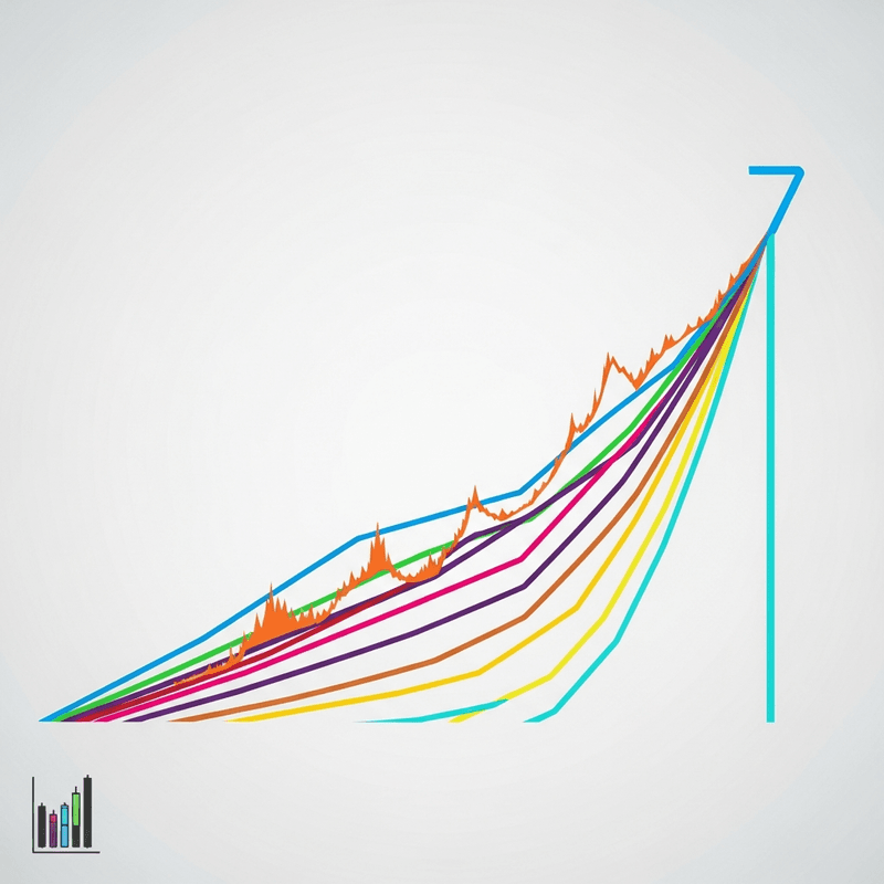
Data visualization charts represent 52% of all visual content used by organizations. Within that category, interactive line charts excel for time-series data like stock performance. Animated bar charts communicate ranking changes effectively. Treemaps reveal portfolio composition at a glance.
Consider interaction depth. Some audiences want full customization through filters and parameters. Others prefer guided exploration with preset views. Match complexity to expertise. Overwhelmed users disengage faster than underwhelmed users.
Anti-patterns to avoid: Do not select visualization types based on what looks impressive. Choose based on what communicates clearly. Avoid interactive elements that require instructions to use.
Success indicators: You can justify each visualization choice with audience data. Your interactive elements align with documented user preferences. Test users navigate your visualizations without guidance.
Step 3: Design for Narrative Flow and User Agency
Objective: Structure visualizations that guide attention while enabling exploration.
Effective data storytelling balances author control with user freedom. Open with a clear visual hook that establishes context. Layer interactive elements that reward curiosity without requiring it. Conclude with actionable insight.
Apply the principle of progressive disclosure. Present the most important insight immediately. Allow users to drill deeper through interaction. This approach serves both skimmers and deep-divers without compromising either experience.
Design interaction patterns that feel intuitive. Hover states should reveal additional context. Click actions should filter or expand views. Scroll-triggered animations should advance the narrative. Consistency across these patterns builds user confidence.
Anti-patterns to avoid: Do not hide essential information behind interactions. Users who never click should still understand your core message. Avoid animation for decoration. Every moving element should communicate information.
Success indicators: Your visualization communicates its main point within three seconds of viewing. Interactive elements enhance rather than obscure understanding. User testing reveals consistent navigation patterns.
Step 4: Automate Production Without Sacrificing Quality
Objective: Reduce manual production steps while maintaining professional output standards.
Production bottlenecks typically occur at three points: data formatting, visual design, and animation. Automating any of these accelerates your entire workflow. Companies leveraging visual data discovery tools provide analytics access to 48% more employees because automation removes technical barriers.
Identify repetitive tasks in your current process. Data import and formatting often consume hours that templates could eliminate. Animation timing and easing curves follow predictable patterns that AI can generate. Color palette application and typography styling should happen automatically.
Tools like Flowi automate the creation of After Effects-quality charts and motion graphics without timeline editing. This approach eliminates handoffs between analysts and designers, keeping content creators focused on insights rather than technical execution.
Anti-patterns to avoid: Do not automate before standardizing. Automating an inconsistent process amplifies inconsistency. Avoid tools that require extensive customization for basic outputs.
Success indicators: Production time decreases by at least 40% for standard content types. Quality remains consistent across outputs. You spend more time on analysis than on formatting.
Step 5: Implement Engagement Measurement Systems
Objective: Track interaction patterns to optimize future content decisions.
Standard analytics provide incomplete pictures for interactive content. Page views and time-on-page matter, but interaction depth reveals true engagement. Track which elements users click, how far they explore, and where they drop off.
Establish engagement rate measurement beyond surface metrics. Calculate interaction rate (users who engaged with interactive elements divided by total viewers). Track exploration depth (average number of interactions per engaged user). Monitor completion rate for guided visualizations.
Data-driven visuals improve website conversion rates by 86%. Measuring which specific visualizations drive conversions allows you to replicate success and eliminate underperformers.
Anti-patterns to avoid: Do not measure everything. Focus on metrics that inform decisions. Avoid comparing interactive content engagement to static content without accounting for format differences.
Success indicators: You can identify your highest-engagement visualization types. You understand which interaction patterns correlate with sharing behavior. Your measurement system requires minimal manual effort to maintain.
Step 6: Iterate Based on Performance Data
Objective: Create a continuous improvement cycle that compounds engagement gains over time.
Review performance data weekly for high-volume creators, monthly for others. Identify patterns in your highest and lowest performing content. Document hypotheses about what drove differences.
Test one variable at a time. If you suspect interaction complexity affects engagement, produce two versions of similar content with different complexity levels. Measure results before drawing conclusions. Intuition guides hypotheses. Data confirms them.
Build a library of proven formats. When a visualization type consistently outperforms, template it. When an interaction pattern fails repeatedly, document why and avoid it. This institutional knowledge accelerates future production.
Anti-patterns to avoid: Do not chase trends without testing relevance to your audience. Avoid abandoning formats after single underperformances. Statistical significance requires adequate sample sizes.
Success indicators: Your average engagement metrics improve quarter over quarter. You can predict performance ranges for new content with reasonable accuracy. Your production time decreases while engagement increases.
Practical Application: Before and After
Scenario: Quarterly Earnings Analysis
Before (Static Approach): A finance creator produces quarterly earnings content using screenshots from financial databases. Each piece requires manual chart creation in spreadsheet software, export to image editing tools, and assembly in video editing software. Production takes 6-8 hours. Viewers watch for an average of 45 seconds.
After (Interactive Approach): The same creator uses automated visualization tools to generate animated charts directly from data feeds. Interactive elements allow viewers to compare current earnings against historical performance. Production drops to 2 hours. Average view duration increases to 2 minutes, with 34% of viewers interacting with comparison features.
PwC demonstrated this principle at enterprise scale in 2024. Their implementation of advanced data visualization tools enabled real-time financial performance insights, strengthening client relationships through transparent, data-driven advisory services.
Scenario: Market Trend Explainer
Static version: Line chart showing index performance over 12 months with text annotations.
Interactive version: Same data with hover states revealing daily values, toggles comparing multiple indices, and user-controlled date range selection. Engagement rate triples because viewers personalize the experience to their specific interests.
Common Mistakes and How to Avoid Them
Overcomplicating interactions: More interactive elements do not equal more engagement. Each interaction should serve a clear purpose. If users need instructions, simplify.
Neglecting mobile experience: Interactive elements designed for desktop often fail on touch devices. Test across platforms before publishing. Hover states need tap equivalents.
Prioritizing novelty over clarity: Unusual chart types may attract attention but often confuse more than they communicate. Standard formats with excellent execution outperform experimental formats with mediocre execution.
Ignoring accessibility: Color-only differentiation excludes colorblind users. Animation without pause controls creates barriers. Accessible design expands your audience.
Measuring vanity metrics: High view counts mean little if viewers do not engage or convert. Focus on metrics that connect to your actual goals.
What to Do Next
Start with your next piece of content. Apply one element from this framework. If you currently use only static visuals, add a single interactive element. If you already use interactivity, implement one measurement improvement.
Document your baseline metrics before making changes. Without comparison data, you cannot evaluate improvement. Even rough estimates provide value.
Return to this guide as a reference when planning content types or troubleshooting engagement issues. The framework remains consistent even as tools and platforms evolve. Build incrementally. Sustainable improvement compounds over time.
Frequently Asked Questions
What is data visualization and why is it important for audience engagement?
Data visualization transforms numerical information into graphical formats that humans process more efficiently than raw numbers. For audience engagement, visualization reduces cognitive load, enabling viewers to grasp complex financial concepts quickly. When audiences understand content easily, they stay longer, interact more, and share more frequently. The visual format also creates emotional resonance that spreadsheets cannot achieve.
How can interactive charts improve audience engagement compared to static visuals?
Interactive charts transform passive viewing into active exploration. When users can manipulate data through filters, hover states, and custom views, they invest cognitive effort that increases retention. This agency creates personalized experiences where each viewer extracts information relevant to their specific interests. Studies show interactive visuals boost engagement rates by 47% compared to static alternatives.
Which metrics should I track to measure visualization effectiveness?
Track interaction rate (percentage of viewers who engage with interactive elements), exploration depth (average interactions per engaged user), and completion rate for guided visualizations. Combine these with standard metrics like time-on-content and share rate. Most importantly, connect visualization performance to your business goals, whether that means newsletter signups, video completions, or community growth.
What are best practices for designing effective financial data visualizations?
Lead with the most important insight visible immediately. Use progressive disclosure to layer additional detail for users who want it. Maintain consistent interaction patterns throughout your content. Choose chart types based on data relationships, not visual appeal. Test with representative users before publishing. Ensure accessibility through color contrast, alternative text, and pause controls for animations.
How can I reduce production time without sacrificing visualization quality?
Standardize your most common visualization types into reusable templates. Automate data formatting and import processes. Use AI-powered tools that generate animations from data inputs rather than requiring manual keyframing. Eliminate handoffs between team members by using integrated platforms. Focus your manual effort on narrative decisions rather than technical execution.
When should I use static visuals instead of interactive charts?
Static visuals work better when your message is singular and unambiguous, when your platform does not support interactivity (like email newsletters), when load time constraints exist, or when your audience primarily consumes content on low-bandwidth connections. Static formats also suit archival content where the specific data point matters more than exploration capability.
Sources
Read Next
Continue Exploring
7 Engagement Metrics Finance Creators Must Track in 2025
Discover 7 engagement metrics that reveal what your finance audience actually wants. Learn to use data storytelling insights that drive real audience engagem...

7 Visualization Techniques That Make Data Stories Click
Discover visualization techniques that transform raw data into compelling stories. Strategic methods for finance creators to boost engagement and retention.

AI Visualization Tools Are Building Toll Booths
The AI visualization market is moving to credit-based pricing. Learn how this shift impacts finance content workflows and what creators should do now.