
Transform raw spreadsheet data into animated, narrative-driven visuals without manual editing
Learn to build a complete workflow that converts financial data into broadcast-quality presentations automatically. This tutorial eliminates manual timeline editing and reduces presentation creation from hours to minutes.
TL;DR
Define narrative before data - Write a three-sentence summary of your story before opening any visualization tool to ensure focused, coherent presentations.
Clean data prevents errors - Format spreadsheets with consistent date formats, clear headers, and no mixed data types to avoid import and rendering failures.
Match template complexity to data - Simple data needs simple templates; complex scientific diagrams require templates designed for multiple variables and staged reveals.
Verify accuracy at every step - Always compare rendered output against source data before distribution, as automated systems can misinterpret values or scaling.
Automate once, output everywhere - Configure a single project to generate multiple formats (video, GIF, static images) optimized for different distribution channels.
What You Will Build
By the end of this tutorial, you will have a complete workflow for automating storytelling in financial presentations using scientific visualization techniques. You will transform raw financial data into animated, narrative-driven visuals that communicate complex information in seconds rather than hours.
Your success criteria: a polished financial presentation with animated charts, trend visualizations, and data-driven storytelling elements, all generated without manual timeline editing. You will verify completion when your content management workflow produces consistent, broadcast-quality outputs from spreadsheet data alone.
Prerequisites and Setup
Before starting, confirm you have the following ready:
A Flowi account with access to financial templates
Your financial data in CSV or Excel format (quarterly earnings, stock performance, or market comparisons work well)
A clear narrative angle for your presentation (what story does this data tell?)
30 to 45 minutes for initial setup; subsequent presentations will take 10 to 15 minutes
Potential blockers include inconsistent data formatting and unclear narrative objectives. Address these before proceeding. Clean data with consistent column headers and date formats will prevent errors downstream.
Why This Approach Works
Traditional financial presentation workflows require multiple handoffs: analysts prepare data, designers create charts, editors animate sequences. Each handoff introduces delays and potential accuracy errors. Data visualization can reduce meeting time by up to 24% by accelerating comprehension, but only when the visuals themselves do not become bottlenecks.
Scientific visualization principles, originally developed for complex scientific diagrams in research contexts, translate directly to financial storytelling. These principles prioritize clarity, accuracy, and visual hierarchy. When automated through AI-driven tools, they eliminate the technical barriers that slow content production.
This tutorial uses Flowi as the primary tool because it handles the animation and visualization layers automatically, letting you focus on narrative structure rather than keyframe timing.
Step 1: Structure Your Financial Narrative
Action: Define your presentation's core message before touching any tool.
Open a text document and answer these three questions in one sentence each: What changed? Why does it matter? What should the audience do with this information? These answers become your narrative spine.
Expected result: A three-sentence summary that guides all visual decisions. For example: "Q3 revenue grew 18% year-over-year. This outpaced sector averages by 7 points. Investors should note the margin expansion in the services segment."
Common failure: Starting with data instead of narrative leads to cluttered visuals. Fix this by writing your summary before opening your dataset.
Step 2: Prepare Your Data for Visualization
Action: Format your spreadsheet with visualization requirements in mind.
Ensure your data follows this structure: Column A contains dates or categories, subsequent columns contain numeric values with clear headers. Remove merged cells, empty rows, and inconsistent date formats. Save as CSV for maximum compatibility.
Expected result: A clean CSV file where each row represents one data point and each column represents one variable. The first row contains headers only.
Common failure: Mixed data types in single columns cause import errors. If you see "NaN" or blank values in your preview, check for text entries in numeric columns.
Step 3: Select Your Visualization Template
Action: In Flowi, navigate to the template library and select a financial presentation template that matches your narrative type.
For trend stories, choose line chart templates with annotation capabilities. For comparison stories, select bar or column chart templates. For composition stories (showing parts of a whole), use donut or stacked area templates. The BFSI sector holds 22.56% of the data visualization market share, which means financial templates receive significant development attention and refinement.
Expected result: A template loaded in your workspace with placeholder data visible.
Common failure: Choosing visually complex templates for simple data creates cognitive overload. Match template complexity to data complexity.
Step 4: Import and Map Your Data
Action: Upload your CSV file and map columns to visualization elements.
Click the data import button, select your CSV, and use the mapping interface to assign columns to axes and series. Flowi will preview the visualization with your actual data before you confirm.
Expected result: Your financial data appears in the template with correct axis labels and data series assignments.
Common failure: Incorrect date parsing shows dates as text strings. Verify your date column is recognized as a date type in the mapping preview. If not, reformat dates in your CSV to YYYY-MM-DD format.
Step 5: Configure Animation Sequences
Action: Set the animation timing and sequence order for your data elements.
Access the animation panel and select "Build" animation for charts that should reveal data progressively. Set duration between 2 and 4 seconds for most financial charts. For complex scientific diagrams showing multiple variables, extend to 6 seconds and enable staged reveals.
Expected result: A preview showing your chart building from left to right (for time series) or from baseline up (for comparisons).
Common failure: Animations that are too fast prevent comprehension. If viewers cannot read labels during the animation, increase duration by 50%.
Step 6: Add Narrative Annotations
Action: Insert callouts and annotations that connect visuals to your narrative spine.
Using the annotation tool, add text callouts at key data points. Reference your three-sentence summary from Step 1. Each annotation should answer one of your guiding questions. Position callouts to appear after the relevant data animates into view.
Expected result: Annotations that appear in sequence, guiding viewers through the data story without overwhelming the visual.
Common failure: Too many annotations compete for attention. Limit to three annotations per chart. If you need more, split into multiple visualizations.
Step 7: Apply Brand Consistency
Action: Configure color schemes, fonts, and logo placement to match your brand guidelines.
Access the brand settings panel. Upload your logo, set primary and secondary colors using hex codes, and select fonts from the available library. These settings persist across all future projects, streamlining your content management workflow.
Expected result: All visual elements reflect your brand identity without manual adjustment per project.
Common failure: Color choices that reduce data readability. Test your palette with colorblind simulation tools before finalizing. Avoid using red and green as the only differentiators.
Step 8: Generate and Review Output
Action: Render your presentation and review for accuracy and narrative flow.
Click the generate button and select your output format (MP4 for video, GIF for social snippets). Watch the full output once without pausing. Then watch again, pausing at each data point to verify accuracy against your source spreadsheet.
Expected result: A polished video or animation file ready for distribution.
Common failure: Data discrepancies between source and output indicate mapping errors. Return to Step 4 and verify column assignments.
Step 9: Integrate Into Distribution Workflow
Action: Export in formats optimized for each distribution channel.
For LinkedIn and Twitter, export as square or vertical MP4 with captions enabled. For presentations, export as 16:9 MP4 or embed directly. For newsletters, export key frames as static images with GIF alternatives. Dynamic dashboards are replacing static reports across financial communications, making video and animated formats increasingly expected by audiences.
Expected result: Multiple output files optimized for different platforms, all generated from a single source project.
Common failure: File sizes too large for platform limits. Use the compression settings to target specific file sizes without visible quality loss.
Configuration and Customization
Several variables in this workflow merit adjustment based on your specific needs:
Animation duration: Default is 3 seconds per chart. Increase for complex data, decrease for social media snippets.
Annotation density: Default recommendation is 3 per chart. Data-heavy presentations may require fewer to maintain clarity.
Output resolution: Default is 1080p. Increase to 4K for large-screen presentations; decrease to 720p for faster social media loading.
Frame rate: Default is 30fps. Use 60fps for smooth motion on high-refresh displays; 24fps creates a more cinematic feel.
Safe defaults work for most financial presentations. You must change brand colors and logo settings to match your organization's identity.
Verification and Testing
Your workflow is successful when you can answer yes to all of the following:
Does every number in the visualization match the source data exactly?
Can a viewer unfamiliar with the data understand the key message in one viewing?
Do annotations appear at the correct moments relative to the data they reference?
Does the output render correctly on your target platforms?
Test edge cases by importing data with negative values, very large numbers, and date ranges spanning multiple years. Verify that axis scaling handles these appropriately without manual intervention.
Common Errors and Fixes
Error: "Data type mismatch in column X"
Cause: Mixed text and numeric values in a single column. Fix: Open your CSV in a spreadsheet application, filter the column for non-numeric entries, and correct or remove them.
Error: Chart renders with overlapping labels
Cause: Too many data points for the selected chart type. Fix: Aggregate data to fewer points (monthly instead of daily) or switch to a template designed for dense data.
Error: Animation stutters during playback
Cause: Output file exceeds playback device capabilities. Fix: Reduce resolution or frame rate, or split into multiple shorter clips.
Error: Brand colors appear different in output
Cause: Color space conversion during export. Fix: Verify your hex codes are entered correctly and test output on the target display before distribution.
Error: Dates display in wrong order
Cause: Date parsing interpreted month and day incorrectly. Fix: Standardize all dates to YYYY-MM-DD format in your source file.
Next Steps and Extensions
With your automated workflow established, consider these extensions:
Template customization: Create custom templates for recurring report types (earnings calls, market updates) to further reduce production time.
Data connection automation: Connect live data sources to generate real-time visualizations for dynamic dashboards.
Multi-language output: Configure annotation text as variables to generate localized versions from a single project.
The data visualization market is projected to reach USD 18.36 billion by 2030, driven by demand for real-time insights. Mastering these workflows now positions you ahead of this curve. Explore interactive visualization features next to add audience engagement layers to your financial storytelling.
Frequently Asked Questions
What is AI animation in data visualization?
AI animation in data visualization refers to automated systems that generate motion graphics and animated charts from raw data without manual keyframe editing. These tools use algorithms to determine optimal timing, transitions, and visual emphasis based on the data structure and narrative intent. For financial presentations, this means charts that build progressively, highlight key metrics, and maintain visual consistency automatically.
How does scientific visualization differ from standard charting?
Scientific visualization applies principles developed for complex scientific diagrams to any data presentation. These principles emphasize accuracy, clear visual hierarchy, and appropriate use of color and motion to convey meaning. Standard charting focuses on displaying data; scientific visualization focuses on communicating understanding. In financial contexts, this distinction determines whether viewers grasp trends and implications or merely see numbers.
Why should finance creators automate their content management workflow?
Automation eliminates the production bottlenecks that delay financial content. Manual workflows require multiple handoffs between analysts, designers, and editors. Each handoff introduces delays and potential errors. Automated workflows using tools like Flowi reduce a multi-day process to minutes while maintaining accuracy. This speed matters when market conditions change rapidly and timely content drives engagement.
What challenges exist in maintaining accuracy with AI-driven animation?
The primary challenge is ensuring visual representations match source data exactly. AI systems can misinterpret data types, apply inappropriate scaling, or generate misleading visual emphasis. Verification steps are essential: always compare output against source data before distribution. Additionally, automated systems may not understand contextual nuances that affect how data should be presented, requiring human oversight of narrative elements.
When should I use static visuals versus animated presentations?
Use animated presentations when your audience will view content sequentially and you need to guide attention through a narrative. Video formats excel on social media, in webinars, and during live presentations. Use static visuals when audiences need to reference specific data points repeatedly, such as in reports or documentation. Many workflows benefit from generating both formats from the same source project.
How do I measure success for automated financial visualizations?
Track engagement metrics specific to your distribution channels: view duration and completion rates for video, shares and saves for social posts, and time-on-page for embedded content. Compare these against your pre-automation baseline. Also measure production time reduction and error rates. Successful automation should improve both audience engagement and operational efficiency simultaneously.
Sources
Read Next
Continue Exploring
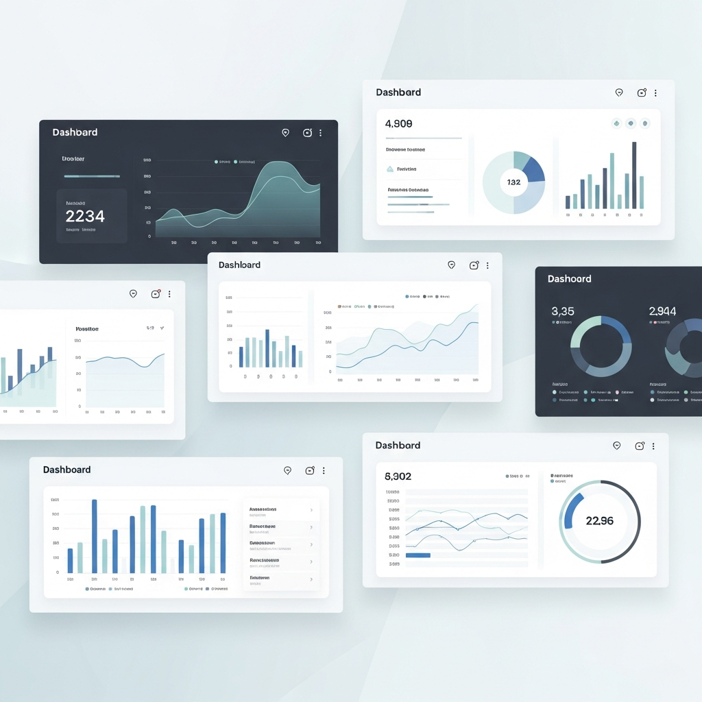
7 Customizable Dashboards for Data-Driven Storytelling
Explore 7 customizable dashboards for data-driven storytelling in finance. These tools connect content performance analysis to actionable audience insights.

7 Data Storytelling Examples That Make Finance Click
Discover data storytelling examples that turn complex finance data into compelling narratives. See side-by-side comparisons of what works and what falls flat.

How to Animate Complex Scientific Diagrams with AI Tools
Transform complex scientific diagrams into engaging animations with AI tools. Step-by-step tutorial for creating professional financial visualizations in min...