
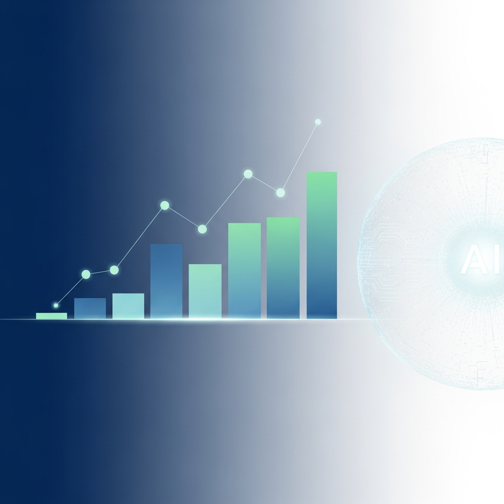
Why precision in dynamic models separates trustworthy finance content from misleading visuals in 2025
Learn why scientific accuracy has become the critical differentiator in AI-generated financial visualizations. This guide helps data journalists and finance creators avoid costly errors that erode audience trust.
TL;DR
Trust is earned through precision: Finance audiences scrutinize data closely, and a single visualization error can undermine your entire body of work
Dynamic models compound mistakes: Small errors in animated charts amplify across frames, making endpoint verification essential
AI tools accelerate production, not accuracy: The technology handles rendering and animation, but scientific accuracy remains the creator's responsibility
Integration points introduce risk: Data corruption often occurs during import from legacy systems, requiring spot-checks against original sources
Start with three priorities: Verify endpoints match source data, document your methodology, and choose domain-specific tools designed for financial data
The Stakes Have Changed for Financial Visualization
The AI visualization market is expanding rapidly. The global AI Graph Makers market reached USD 766 million in 2024 and is projected to hit USD 1,797 million by 2032. Finance content creators now have access to tools that can generate charts, animate data, and produce motion graphics in minutes rather than days.
But this speed creates a new problem. When AI can visualize anything quickly, the question shifts from "can we make this?" to "is this accurate?" A misplotted axis or incorrectly scaled animation does not just look unprofessional. It misleads audiences and erodes trust in your analysis.
Scientific accuracy in dynamic models has become the differentiator between content that informs and content that misinforms. For finance communicators, this distinction carries real consequences.
What This List Covers (And What It Does Not)
This listicle is for data journalists, finance influencers, and analysts who create visual content for audiences that make decisions based on what they see. You need your charts and animations to be both compelling and correct.
We focus on why scientific accuracy matters specifically within AI-driven visualization tools. This is not a tutorial on chart design or a comparison of software features. Instead, these five reasons explain why accuracy should guide your tool selection and workflow decisions in 2025.
How These Reasons Were Selected
Each reason addresses a specific failure mode observed when AI visualization tools prioritize speed over precision. The selection draws from market research, documented integration challenges, and the practical realities finance content creators face when their visuals reach audiences who act on the information presented.
1. Audience Trust Depends on Verifiable Precision
Why It Matters
Finance audiences are trained to scrutinize data. A chart that shows incorrect proportions or an animation that misrepresents rate of change will be noticed. Once viewers catch an error, they question everything else you have published.
What It Looks Like Today
Nearly 90% of notable AI models in 2024 came from industry, up from 60% in 2023. This shift means visualization tools are being built for speed and scale, not necessarily for the domain-specific accuracy finance requires. Generic AI tools may generate visually appealing charts that fail basic data integrity checks.
How to Apply It
Before publishing any AI-generated visualization, verify that axis scales match your source data. Check that animations accurately represent the time intervals and magnitude of changes. Build a verification step into your workflow, even when deadlines are tight.
2. Dynamic Models Amplify Small Errors Over Time
Why It Matters
Static charts display a single moment. Dynamic models, including animated charts and motion graphics, show change over time. A small calculation error in frame one compounds across every subsequent frame, producing visualizations that drift further from reality as they progress.
What It Looks Like Today
Generative AI is expected to grow at a CAGR of 43.4% from 2025 to 2032. As these tools become more sophisticated, they generate longer and more complex animations. Without scientific accuracy built into the underlying model, errors become harder to detect and more damaging when they reach audiences.
How to Apply It
When working with dynamic visualizations, test the endpoint against your source data, not just the starting frame. If your animation shows a stock price over 12 months, confirm that the final value matches your dataset exactly.
3. Regulatory and Editorial Standards Are Tightening
Why It Matters
Financial content operates under increasing scrutiny. Misleading visualizations can trigger regulatory attention, editorial corrections, or audience backlash. The cost of fixing an inaccurate viral chart far exceeds the time saved by skipping verification.
What It Looks Like Today
Generative AI attracted $33.9 billion in global private investment in 2024, an 18.7% increase from 2023. This investment is accelerating tool development, but regulatory frameworks have not kept pace. Content creators bear responsibility for accuracy that their tools do not guarantee.
How to Apply It
Document your data sources and visualization methodology. When using AI tools, maintain records of the inputs you provided and the outputs generated. This creates an audit trail if questions arise about your content's accuracy.
4. Integration Challenges Introduce Silent Data Corruption
Why It Matters
Most finance professionals pull data from multiple sources: Bloomberg terminals, internal databases, public APIs, spreadsheets. Each handoff between systems creates an opportunity for data corruption. AI visualization tools that do not handle these integrations carefully can introduce errors before any chart is generated.
What It Looks Like Today
Integration challenges with legacy systems remain a documented barrier to scientific accuracy in the AI visualization market. Tools that promise seamless data import may truncate decimal places, misinterpret date formats, or drop data points without warning.
How to Apply It
After importing data into any visualization tool, spot-check at least three data points against your original source. Pay particular attention to edge cases: the highest value, lowest value, and any dates near year boundaries where formatting errors commonly occur.
5. Scientific Accuracy Enables Predictive Credibility
Why It Matters
Finance content often includes projections, trend lines, and forecasts. When your historical visualizations are demonstrably accurate, your predictive content carries more weight. Scientific accuracy in past work builds the credibility that makes future analysis valuable.
What It Looks Like Today
North America dominated the global AI market with 35.5% revenue share in 2025, where deep learning powers visualization tools requiring high scientific accuracy for operations. The tools exist to produce accurate predictive visualizations. The question is whether creators prioritize accuracy over speed.
How to Apply It
When creating forward-looking visualizations, clearly label projections as distinct from historical data. Use consistent methodology so audiences can evaluate your track record over time. Accuracy in one forecast builds trust for the next.
The Pattern Across These Five Reasons
Each reason points to the same underlying dynamic: AI visualization tools have made production faster but have not made accuracy automatic. The technology handles rendering, animation, and visual polish. The responsibility for scientific accuracy remains with the creator.
This creates both risk and opportunity. Creators who treat accuracy as a feature, not a given, will differentiate their content in a market flooded with fast but unreliable visuals. The tools that support this approach, including domain-specific platforms designed for finance, reduce the verification burden without eliminating it entirely.
Trust compounds like interest. Each accurate visualization strengthens your reputation. Each error withdraws from it.
Where to Start
You do not need to overhaul your entire workflow immediately. Begin with these three priorities:
Verify endpoints: Check that the final frame of any animation matches your source data
Document sources: Maintain records of where your data originated and how it was processed
Choose domain-specific tools: Generic AI visualization platforms lack the financial data handling that specialized tools provide
Time constraints are real. Not every project allows for exhaustive verification. But building accuracy checks into your standard process, even abbreviated ones, protects your credibility when it matters most.
Frequently Asked Questions
What is AI animation in data visualization?
AI animation in data visualization refers to using artificial intelligence to automatically generate motion graphics and animated charts from raw data. These tools can interpolate between data points, create smooth transitions, and produce professional-quality animations without manual keyframing. For finance content, this means transforming spreadsheet data into dynamic visuals that show change over time.
Why is scientific accuracy important for AI-driven financial visualizations?
Financial audiences make decisions based on the data they see. An inaccurate visualization can mislead investors, misrepresent market trends, or violate regulatory standards. Scientific accuracy ensures that the visual representation matches the underlying data precisely, maintaining trust and credibility with your audience.
What challenges do AI visualization tools face in maintaining accuracy?
Common challenges include data corruption during import from legacy systems, incorrect handling of date formats and decimal places, and compounding errors in dynamic models where small mistakes in early frames amplify over time. Generic AI tools may also lack the domain-specific logic needed to handle financial data conventions correctly.
When should finance creators use AI for data visualization?
AI visualization tools work well when you need to produce polished content quickly and have reliable source data. They are particularly valuable for recurring reports, real-time market updates, and content that requires consistent visual branding. However, creators should always verify outputs against source data before publishing.
How can I verify that my AI-generated charts are accurate?
Start by checking that axis scales match your source data. For animations, verify both the starting and ending values against your dataset. Spot-check at least three data points, including edge cases like maximum and minimum values. Maintain documentation of your data sources and the methodology used to create each visualization.
What distinguishes domain-specific AI visualization tools from generic options?
Domain-specific tools, such as those designed for finance, include built-in handling for common financial data formats, appropriate chart types for market data, and templates that follow industry conventions. They reduce the risk of errors that generic tools introduce when they encounter specialized data structures.
Sources
https://www.intelmarketresearch.com/ai-graph-makers-market-6573
https://www.marketsandmarkets.com/Market-Reports/artificial-intelligence-market-74851580.html
https://hai-production.s3.amazonaws.com/files/hai_ai_index_report_2025.pdf
https://www.grandviewresearch.com/industry-analysis/artificial-intelligence-ai-market
Read Next
Continue Exploring

AI Visualization Tools Are Building Toll Booths
The AI visualization market is moving to credit-based pricing. Learn how this shift impacts finance content workflows and what creators should do now.
AI Visualization Market Guide for Finance Creators
Explore the AI visualization market to find generative models that cut production time for financial videos. Practical evaluation framework for finance creat...
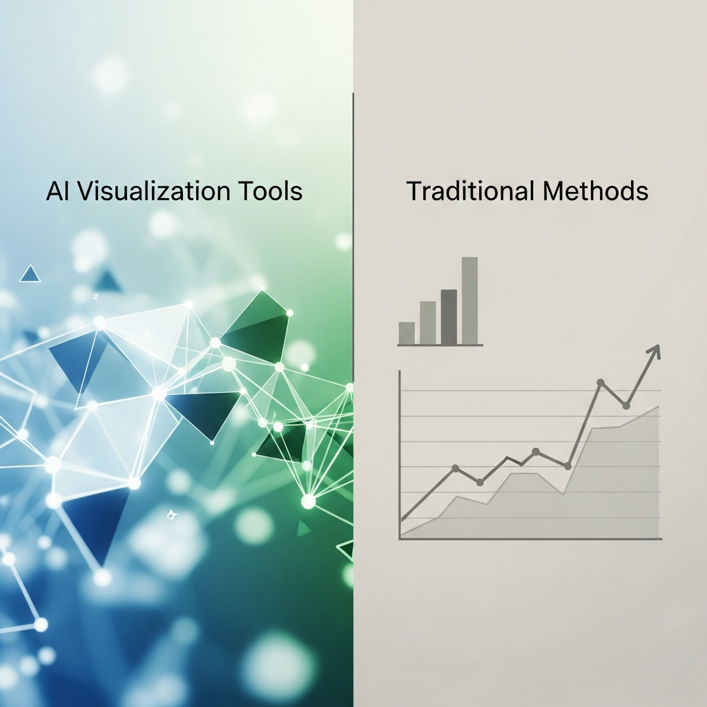
AI Visualization Tools vs Traditional Methods for Finance YouTubers
Compare AI visualization tools vs traditional methods for finance YouTubers. See which approach wins on data accuracy, production speed, and visual quality.