
Replace manual chart building with automated visual storytelling techniques that drive measurable audience growth
Learn to build a streamlined production workflow that transforms 2-3 hour finance videos into 30-minute projects. This tutorial walks you through automated visualization setup and engagement tracking.
TL;DR
Audit first, automate second - Document your current workflow to identify where hours disappear before implementing changes
Standardize your data format - Clean, consistent data structure enables reliable automation and eliminates import errors
Use domain-specific templates - Finance-focused visualization templates include appropriate scales, labels, and storytelling structures
Apply visual storytelling techniques - Progressive data reveals and clear narrative arcs drive 22% higher brand recall than static presentations
Track production time and engagement metrics - Measure both efficiency gains and audience response to validate your new workflow delivers results
What You Will Build
By the end of this tutorial, you will have a streamlined production workflow that cuts finance content creation time by 50% or more. You will replace manual chart building and timeline editing with automated visual storytelling techniques that drive measurable audience growth.
Your success criteria: produce a polished, data-driven finance video in under 30 minutes that previously took 2-3 hours. You will verify this by tracking your production time and comparing engagement metrics before and after implementation.
Prerequisites and Setup
Before starting, confirm you have the following ready:
Access to your financial data source (spreadsheet, API, or database)
A Flowi account with workspace configured
Brand assets: logo, color codes, preferred fonts
Sample dataset for your first automated visualization
Distribution platform accounts (YouTube, LinkedIn, or TikTok)
Time estimate: 45-60 minutes for initial setup, then 20-30 minutes per video thereafter. Potential blocker: inconsistent data formatting will slow your first run. Clean your source data before proceeding.
Why This Approach Works
Traditional finance video production requires separate tools for data processing, chart creation, animation, and editing. Each handoff introduces delays and error potential. 89% of businesses now use video marketing, yet most finance creators still rely on fragmented workflows.
This tutorial consolidates those steps into a single automated pipeline. Alternative approaches (After Effects templates, Canva animations, manual screen recordings) either sacrifice quality or demand technical expertise. The method below prioritizes accuracy and speed without compromising professional output.
Step 1: Audit Your Current Production Workflow
Action: Document every step in your existing content creation process, from data collection to final export.
Open a spreadsheet and create columns for: Task, Tool Used, Time Spent, and Pain Points. Track your next video production in real-time, logging each activity.
Expected result: A detailed breakdown showing where hours disappear. Most finance creators discover 40-60% of time goes to manual chart formatting and animation adjustments.
Common failure: Underestimating transition time between tools. Include every export, import, and file conversion in your log.
Step 2: Structure Your Data for Automated Visualization
Action: Reformat your financial data into a standardized template that automated tools can process consistently.
Create a master spreadsheet with these columns: Date, Metric Name, Value, Category, and Notes. Ensure dates follow ISO format (YYYY-MM-DD) and values contain only numbers (no currency symbols or commas in cells).
Expected result: A clean dataset that imports without errors. Test by importing into Flowi and confirming all values display correctly.
Common failure: Mixed data types in columns. If you see "NaN" or blank charts, check for text mixed with numbers. The fix: use spreadsheet formulas to strip formatting before export.
Step 3: Select Domain-Specific Templates
Action: Choose visualization templates designed for financial data rather than generic chart options.
In Flowi, navigate to the template library and filter by "Finance" or "Analytics." Select templates that match your content type: earnings breakdowns, market comparisons, trend analyses, or portfolio performance.
Expected result: Templates pre-configured with appropriate scales, labels, and animation timing for financial storytelling. Narrative video content delivers 22% higher brand recall, so prioritize templates with built-in story arcs.
Common failure: Selecting templates based on aesthetics alone. Verify the template supports your data structure (time series, categorical, comparative) before committing.
Step 4: Configure Your Brand Settings
Action: Upload brand assets and set global styling preferences that apply automatically to all future content.
Access your workspace settings and input: primary and secondary colors (hex codes), logo file (PNG with transparency), preferred fonts, and default chart color palette. Save as your brand profile.
Expected result: Every visualization you generate will match your established visual identity without manual adjustment. This eliminates the repetitive formatting that consumes production hours.
Common failure: Logo resolution too low. Use minimum 1000px width for crisp rendering at all export sizes.
Step 5: Build Your First Automated Visualization
Action: Import your prepared dataset and generate an animated chart using AI-driven automation.
Click "New Project," select your template, and upload your formatted data file. Map columns to the appropriate fields (X-axis, Y-axis, categories). Click "Generate" to create the initial visualization.
Expected result: A fully animated chart with professional motion graphics, accurate data representation, and brand styling applied. Review the preview for accuracy before proceeding.
Common failure: Axis scaling issues. If values appear compressed or expanded incorrectly, manually set minimum and maximum values in the chart settings panel.
Step 6: Apply Visual Storytelling Techniques
Action: Transform raw data visualization into narrative-driven content that resonates with your audience.
Add these storytelling elements: an opening hook (highlight the most surprising data point first), progressive reveal (animate data points sequentially to build tension), and a clear conclusion (end on the key takeaway).
Expected result: Content that holds attention and drives engagement. Posts with images get 2.3x more engagement, and animated data visualizations outperform static images significantly.
Common failure: Overloading with data points. Limit each visualization to one core insight. Split complex analyses into multiple short segments.
Step 7: Add Contextual Annotations
Action: Insert text overlays that explain what viewers should understand from the data.
Use the annotation tool to add: a headline summarizing the insight, callout labels for significant data points, and source attribution. Time annotations to appear as relevant data animates on screen.
Expected result: Self-explanatory content that communicates clearly without voiceover dependency. This expands accessibility and enables silent autoplay viewing.
Common failure: Text too small for mobile viewing. Preview at 1080x1920 (vertical) and 1920x1080 (horizontal) to verify readability on both formats.
Step 8: Optimize for Platform-Specific Requirements
Action: Configure export settings for each distribution channel's technical specifications.
Create export presets for your primary platforms:
YouTube: 1920x1080, 30fps, H.264 codec
LinkedIn: 1920x1080 or 1080x1080, under 10 minutes
TikTok/Reels: 1080x1920, under 60 seconds, optimized for the 52 minutes daily users spend on short-form video
Expected result: One-click exports tailored to each platform without manual re-editing.
Common failure: Aspect ratio cropping cuts off important elements. Design with safe zones, keeping critical content within the center 80% of frame.
Step 9: Establish Your Production Template
Action: Save your configured project as a reusable template for future content.
After completing your first video, click "Save as Template." Name it descriptively (e.g., "Weekly Market Recap" or "Earnings Analysis"). Include all styling, animation timing, and annotation placements.
Expected result: Future videos start 70% complete. You only need to update data and adjust specific callouts.
Common failure: Saving with sample data still embedded. Clear all data fields before saving to prevent accidental publication of placeholder content.
Step 10: Implement Engagement Metrics Tracking
Action: Set up measurement systems to quantify the impact of your new audience growth strategies.
Create a tracking spreadsheet with columns for: Video Title, Production Time, Platform, Views (24h), Views (7d), Engagement Rate, and Shares. Log every piece of content published using your new workflow.
Expected result: Data that proves (or disproves) efficiency gains and engagement improvements. Storytelling marketing grew 46% in 2024, and your metrics will show whether you are capturing that growth.
Common failure: Tracking vanity metrics only. Include engagement rate (interactions divided by impressions) and shares, which indicate content resonance better than raw view counts.
Configuration and Customization
These settings significantly impact output quality and should be adjusted based on your specific needs:
Animation speed: Default is 1.0x. Reduce to 0.8x for complex data that needs more viewing time. Increase to 1.2x for simple comparisons.
Color contrast: Ensure minimum 4.5:1 ratio between data elements and background for accessibility compliance.
Data refresh frequency: For real-time content, configure API connections to pull fresh data automatically. For static analyses, manual import maintains control.
Export quality: Use "High" for YouTube and LinkedIn. Use "Optimized" for TikTok to balance quality with file size limits.
Must-change settings: Default watermarks, placeholder logos, and sample brand colors. These should never appear in published content.
Verification and Testing
Before publishing your first automated video, complete this verification checklist:
Data accuracy: Cross-reference three random data points against your source
Visual clarity: View on mobile device at arm's length, confirm all text readable
Brand consistency: Compare against existing content for style alignment
Technical compliance: Upload to each platform as "unlisted" or "draft" to verify processing
Edge cases to verify: Negative values display correctly, zero values do not break charts, and date ranges spanning year boundaries format properly.
Common Errors and Fixes
Error: "Data import failed: Invalid format"
Cause: Hidden characters or formatting from copy-paste operations. Fix: Export your data as CSV, open in plain text editor, save, then re-import.
Error: Chart displays blank or shows "No data"
Cause: Column mapping mismatch between data structure and template expectations. Fix: Verify column headers match exactly what the template requires (case-sensitive).
Error: Animation renders choppy or stutters
Cause: Too many data points animating simultaneously. Fix: Reduce dataset to key points or extend animation duration to spread processing load.
Error: Export file exceeds platform size limit
Cause: Duration or resolution too high for target platform. Fix: Reduce export quality setting or split content into multiple parts.
Error: Colors appear different after export
Cause: Color space mismatch (RGB vs. sRGB). Fix: Ensure source colors use sRGB values and export settings match.
Next Steps and Extensions
With your streamlined workflow operational, consider these expansions:
Batch processing: Configure weekly data imports that automatically generate recurring content (market summaries, portfolio updates)
A/B testing: Create two versions of the same data visualization with different storytelling approaches, measure which drives higher engagement
Team collaboration: Share templates with colleagues to standardize visual communication across your organization
The visual content market is projected to reach $72 billion by 2032. Mastering automated production now positions you to capture audience growth as demand for data-driven video continues expanding.
Frequently Asked Questions
What is data visualization and why is it important for audience engagement?
Data visualization transforms complex numbers into visual formats (charts, graphs, animations) that audiences can understand quickly. For finance content, this matters because viewers retain visual information significantly better than text or spoken numbers. Research shows narrative video content generates 31% stronger emotional response compared to non-narrative presentations, making visualization essential for audience connection.
How can interactive charts improve audience engagement?
Interactive charts invite viewers to explore data on their own terms, increasing time spent with content and deepening understanding. For finance creators, interactive elements work best in long-form content or embedded website features. For social video, animated charts that reveal data progressively achieve similar engagement without requiring user interaction.
Which engagement metrics should I prioritize when measuring content performance?
Focus on engagement rate (interactions divided by impressions), share rate, and watch-through percentage rather than raw view counts. These metrics indicate whether your visual storytelling techniques resonate with viewers. High shares suggest your content provides value worth spreading, while watch-through percentage reveals if your narrative structure maintains attention.
What are best practices for designing effective financial data visualizations?
Limit each visualization to one core insight. Use consistent color coding across related content. Ensure text remains readable at mobile sizes. Add contextual annotations that explain significance. Source your data visibly to build credibility. Animate data progressively to create narrative tension rather than revealing everything simultaneously.
How long should finance video content be for optimal engagement?
Platform determines ideal length. TikTok and Instagram Reels perform best at 15-45 seconds. LinkedIn videos see strong engagement at 30 seconds to 2 minutes. YouTube allows longer analysis pieces (5-15 minutes) for audiences seeking depth. Match your content length to platform norms and audience expectations.
Can automated visualization tools maintain the accuracy finance content requires?
Yes, when configured correctly. Automated tools like Flowi pull directly from your data source, eliminating manual transcription errors. The key is validating your data format before import and spot-checking outputs against source values. Automation reduces human error while maintaining the precision finance audiences demand.
Sources
Read Next
Continue Exploring

How to Boost Engagement with Interactive Data Visualization
Learn how interactive data visualization helps finance creators boost audience engagement. Practical frameworks for visual storytelling and workflow automation.
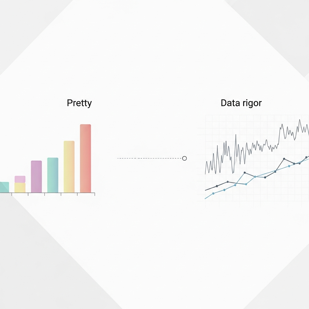
Why Pretty Charts Fail: Visual Storytelling Needs Data Rigor
Visual storytelling in finance fails without rigorous data analysis techniques. Learn why pretty charts mislead and what actually drives decisions.

5 Benefits of Multi-Image Fusion for Financial Narratives
Learn 5 ways multi-image fusion elevates financial narratives with better visual fidelity, faster turnaround, and stronger investor engagement.