A step-by-step workflow for connecting engagement metrics with audience insights and animated charts
Learn to transform raw tracking data into compelling visual narratives. This tutorial walks you through connecting user interaction metrics with granular audience insights, then rendering them as professional motion graphics.
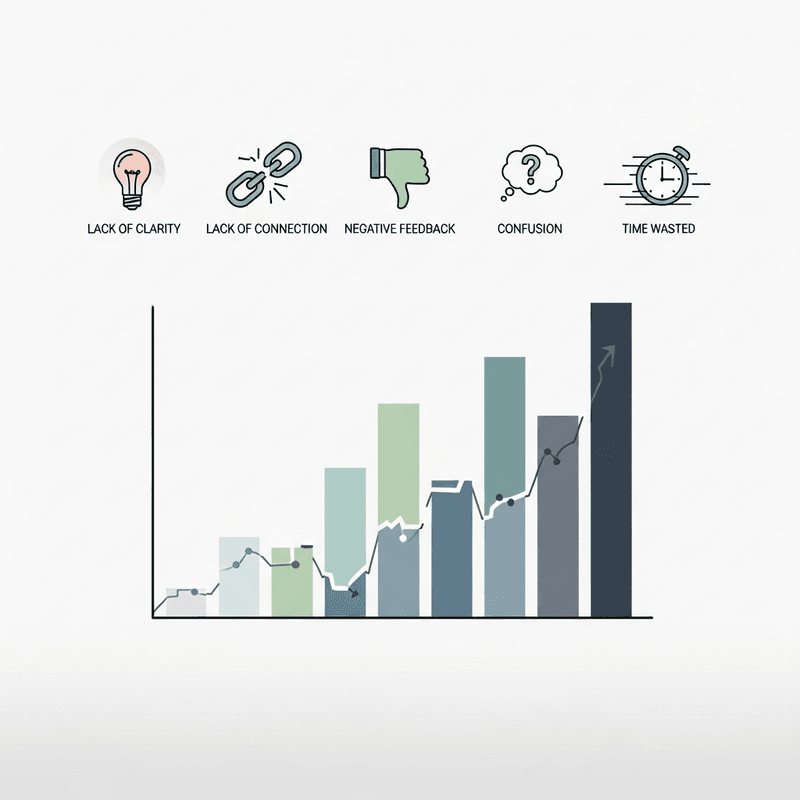
TL;DR
Define before you collect - Start with a specific story question that connects user behavior to business outcomes, then configure tracking to capture exactly that data.
Segment for insight - Raw aggregate data hides the story; granular audience insights emerge when you compare high engagers, new visitors, and returning users separately.
Structure enables automation - Transform exports into consistent formats (Date, Segment, Metric columns) so visualization tools like Flowi can generate animations without manual intervention.
Annotate the narrative - Data visualization becomes data storytelling when you add contextual callouts at key moments, guiding viewers through your evidence.
Test before distribution - Platform compression affects text legibility; always preview uploads as drafts to catch quality issues before your audience does.
What You Will Build
By the end of this tutorial, you will have a complete workflow for transforming raw user interaction data into compelling financial narratives. You will connect tracking metrics with audience behavior analysis, then visualize these insights as professional-grade motion graphics.
Your success criteria: a finished data story that shows exactly how your audience engages with financial content, presented through animated charts ready for distribution. You will verify this by producing a shareable visual that maps interaction patterns to specific audience segments.
This approach replaces guesswork with evidence. Instead of assuming what resonates, you will demonstrate it through granular audience insights rendered as polished visuals.
Prerequisites and Setup
Before starting, confirm you have access to these tools and resources:
Analytics platform access with user interaction tracking enabled (Google Analytics 4, Mixpanel, or equivalent)
Data export capability in CSV or JSON format from your tracking platform
Flowi account at flowi.video for automated chart animation
30-45 minutes for initial setup; 15-20 minutes for subsequent stories
Historical data spanning at least 14 days of user activity
Potential blockers include insufficient tracking implementation or data access restrictions. Verify your analytics permissions before proceeding. If your organization uses enterprise tracking tools, coordinate with your data team for export access.
Why This Method Works
Surface-level metrics tell you what happened. Granular audience insights reveal why it matters. The user activity monitoring market reached USD 3.1 billion in 2025, reflecting how organizations now prioritize detailed behavioral data over aggregate numbers.
This tutorial takes a layered approach: first capture interaction data, then segment by audience characteristics, finally visualize the narrative. Alternative methods exist, including manual chart creation or static reporting, but these require significantly more time and produce less engaging outputs.
Expect moderate complexity in the data preparation phase. The visualization and animation steps are straightforward once your data structure is correct.
Step 1: Define Your Story Question
Action: Write a single question your data story will answer.
Open a document and complete this sentence: "This visualization will show [specific audience] how [specific metric] changed because of [specific factor]." For example: "This visualization will show institutional investors how engagement duration increased after we added interactive charts to quarterly reports."
Expected result: A focused question that connects user behavior to business outcomes. Your question should reference both an audience segment and a measurable interaction.
Common failure: Questions that are too broad ("How do users engage?") produce unfocused visuals. Fix this by adding specificity: which users, which engagement type, over what timeframe.
Step 2: Configure Interaction Tracking Events
Action: Set up or verify tracking for the specific interactions your story requires.
In your analytics platform, navigate to event configuration. Create custom events for each interaction type relevant to your story. For financial content, prioritize these events:
Chart hover duration (indicates data exploration)
Section scroll depth (shows content consumption patterns)
Download or share actions (signals high-value engagement)
Return visits within 7 days (measures content stickiness)
Expected result: Active tracking events appearing in your real-time analytics dashboard within 24 hours of implementation.
Common failure: Events fire but data appears empty. Check that your tracking code loads before user interactions occur. Verify event names match exactly between your implementation and dashboard filters.
Step 3: Segment Your Audience Data
Action: Create audience segments based on behavioral and demographic characteristics.
Access your analytics audience builder. Define segments using combinations of these criteria: traffic source, device type, geographic region, session frequency, and engagement depth. The database monitoring segment shows 18.7% CAGR through 2030, indicating that detailed segmentation capabilities are becoming standard infrastructure.
Create at least three segments for comparison: high engagers (top 20% by session duration), new visitors (first 30 days), and returning users (3+ sessions).
Expected result: Named audience segments with population counts visible in your analytics interface.
Common failure: Segments show zero users. This typically means criteria are too restrictive. Broaden date ranges or reduce the number of required conditions.
Step 4: Export Interaction Data by Segment
Action: Generate CSV exports containing interaction metrics for each audience segment.
Navigate to your analytics export function. Select your date range (minimum 14 days recommended), choose your first audience segment, and include these columns: date, event name, event count, average engagement time, and unique users. Export to CSV format.
Repeat for each segment. Name files clearly: high_engagers_interactions_2024Q4.csv
Expected result: Separate CSV files for each segment, each containing daily interaction metrics with consistent column headers.
Common failure: Export times out or fails for large datasets. Reduce date range to 7-day increments and combine files afterward. Alternatively, use the Analytics Data API for programmatic extraction.
Step 5: Structure Data for Visualization
Action: Transform raw exports into a visualization-ready format.
Open your CSV files in a spreadsheet application. Create a new sheet with these columns: Date, Segment Name, Primary Metric, Secondary Metric, Comparison Value. Populate rows by copying relevant data from each segment export.
Calculate comparison values: percentage change from period start, deviation from segment average, or ratio between segments. These calculated fields become your story's evidence.
Expected result: A single consolidated spreadsheet with clearly labeled columns and no empty cells in your metric columns.
Common failure: Date formats inconsistent between exports. Standardize to YYYY-MM-DD format before consolidation. Use spreadsheet date functions to convert: =TEXT(A2,"YYYY-MM-DD")
Step 6: Identify Your Narrative Arc
Action: Analyze your structured data to find the story worth telling.
Scan your consolidated data for patterns: sudden changes, consistent trends, or surprising segment differences. Research shows $1 invested in UX returns $100, which demonstrates how granular user insights directly impact business outcomes. Your narrative should connect similar dots.
Mark 3-5 data points that support your story question from Step 1. These become your visualization's key moments.
Expected result: Annotated data with highlighted cells indicating narrative-critical values.
Common failure: Data shows no clear pattern. This is valid information. Consider reframing your story to explain stability, or expand your date range to capture longer-term trends.
Step 7: Generate Animated Charts
Action: Import your structured data into Flowi and configure chart animations.
Log into Flowi and select a chart template matching your data type (line chart for trends, bar chart for comparisons, area chart for cumulative metrics). Upload your consolidated CSV file.
Map columns to chart elements: Date to X-axis, Primary Metric to Y-axis, Segment Name to series color. Flowi automatically generates animation timing based on data density.
Expected result: A preview showing your data animated across the timeline, with segment colors differentiated and axis labels populated.
Common failure: Chart displays incorrect values or missing series. Verify column headers match exactly (no trailing spaces) and all cells contain numeric values for metric columns.
Step 8: Add Contextual Annotations
Action: Insert text callouts at narrative-critical moments in your animation.
In Flowi's annotation editor, position text labels at the data points you identified in Step 6. Write concise callouts (under 10 words) that explain significance: "Q3 campaign launch" or "Mobile segment overtakes desktop."
Time annotations to appear as the chart reaches each relevant data point. This synchronization transforms data visualization into data-driven storytelling.
Expected result: Animated chart with text appearing at strategic moments, guiding viewer attention through your narrative.
Common failure: Annotations appear too early or late relative to data points. Adjust timing in 0.5-second increments until text and visual align precisely.
Step 9: Configure Export Settings
Action: Set output format and resolution for your distribution channels.
Access Flowi's export panel. Select format based on destination: MP4 for social platforms, MOV for editing software integration, GIF for email embeds. Choose resolution: 1080p for general use, 4K for presentation contexts.
Enable transparent background if you plan to overlay the chart on other footage. Set frame rate to 30fps for smooth animation.
Expected result: Export queue showing your configured settings, with estimated file size and render time displayed.
Common failure: File size exceeds platform limits. Reduce resolution or trim animation duration. For social platforms, target under 50MB for reliable uploads.
Step 10: Verify and Test Your Output
Action: Review the exported visualization against your original story question.
Play your exported file completely. Verify these elements: data accuracy (spot-check 3 values against source), annotation timing, color contrast for accessibility, and audio sync if applicable.
Test on your target platform by uploading as a draft or private post. Check that compression does not degrade text legibility. The 49% of users who abandon apps after first-session issues illustrate why testing before distribution matters.
Expected result: A polished visualization that answers your Step 1 question with clear, accurate, and visually engaging evidence.
Common failure: Text appears blurry after platform compression. Increase font size by 20% in Flowi before re-exporting. Sans-serif fonts compress better than serif alternatives.
Configuration and Customization
Adjust these variables based on your specific requirements:
Animation duration: Default is 15 seconds. Extend to 30 seconds for complex multi-segment comparisons. Shorten to 8 seconds for social media snippets.
Color palette: Use your brand colors for segment differentiation. Ensure sufficient contrast (minimum 4.5:1 ratio) between adjacent segments.
Data smoothing: Enable for volatile daily data to show trends. Disable for precise point-in-time reporting.
Axis scaling: Auto-scale works for most cases. Lock Y-axis minimum to zero when comparing absolute values to prevent misleading visual proportions.
Safe defaults include 15-second duration, auto-scaling, and standard color palette. Must-change settings: always customize segment labels to match your audience's terminology.
Common Errors and Fixes
Error: "Invalid data format" on CSV upload
Cause: Non-standard encoding or hidden characters from spreadsheet export. Fix: Re-save CSV as UTF-8 encoding. In Excel: Save As → CSV UTF-8. In Google Sheets: Download as CSV (UTF-8 is default).
Error: Chart shows flat line despite varied data
Cause: Y-axis scale too large relative to data variance. Fix: Enable auto-scaling or manually set Y-axis range to 20% above and below your data's min/max values.
Error: Segments appear in wrong order
Cause: Alphabetical sorting overrides intended sequence. Fix: Prefix segment names with numbers ("1_High Engagers") or reorder rows in your source CSV before upload.
Error: Export fails at 99%
Cause: Memory limitation on complex animations. Fix: Close other browser tabs, reduce resolution to 1080p, or split into multiple shorter exports.
Error: Annotations overlap with data points
Cause: Auto-positioning conflicts with dense data regions. Fix: Manually offset annotation Y-position by 15-20 pixels above or below the data line.
Next Steps and Extensions
With your first data story complete, consider these extensions:
Automate weekly updates: Connect your analytics API directly to Flowi for scheduled data refreshes and re-renders.
Build a template library: Save successful configurations as templates for recurring reports (quarterly earnings, monthly engagement summaries).
Add comparative overlays: Layer industry benchmarks or competitor data alongside your metrics for contextual storytelling.
The cloud deployment of user activity monitoring shows 24% CAGR, suggesting that real-time data pipelines will increasingly feed visualization workflows. Position your process to integrate with these emerging capabilities.
Frequently Asked Questions
What is data visualization and why is it important for audience engagement?
Data visualization transforms numerical information into visual formats like charts, graphs, and motion graphics. For audience engagement, visuals process faster than text (the brain handles images in milliseconds) and create emotional connections that raw numbers cannot achieve. Financial communicators use visualization to make complex metrics accessible, which increases content shareability and retention.
How can interactive charts improve audience engagement?
Interactive charts invite participation rather than passive viewing. When users hover, click, or filter data themselves, they invest attention and form personal connections with the information. This interaction generates behavioral data you can track, creating a feedback loop: engagement metrics inform future content decisions, which improves subsequent engagement rates.
Which metrics are most important to track in user interaction tracking?
Prioritize metrics that connect behavior to outcomes. Session duration indicates content quality. Scroll depth reveals where attention drops. Return visit frequency measures lasting value. For financial content specifically, track chart interactions (hovers, zooms) and download actions, as these signal high-intent engagement from your target audience.
How do I interpret trends in my audience engagement data?
Look for patterns across three dimensions: time (daily, weekly, seasonal cycles), segments (how different audiences behave), and content types (which formats perform). Rising trends with stable segments suggest content improvement. Rising trends with shifting segments indicate audience evolution. Sudden changes warrant investigation into external factors or platform algorithm updates.
What are best practices for designing effective data visualizations?
Start with your audience's question, not your data's availability. Use the simplest chart type that conveys your point (line for trends, bar for comparisons). Limit colors to 3-5 distinct values. Remove unnecessary elements (gridlines, decorative graphics) that do not support comprehension. Annotate key moments to guide interpretation rather than leaving viewers to find patterns themselves.
How often should I update my data storytelling workflow?
Review your tracking configuration quarterly to ensure events still capture relevant interactions. Update visualization templates when brand guidelines change or new chart types become available. Refresh your audience segments monthly, as behavioral patterns shift with market conditions and content strategy evolution.
Sources
Read Next
Continue Exploring
5 Signs Your Interactive Charts Are Failing to Engage
Discover 5 key indicators that your interactive charts aren't engaging audiences. Learn which engagement metrics reveal real problems versus vanity numbers.

Dynamic Models vs. Static Visuals: Which Drives Engagement?
Compare dynamic models and static visuals for finance content. Discover which approach drives better engagement based on your platform, timeline, and data type.

Visual Communication Tools for Finance Creators
Learn how to integrate visual communication tools with engagement metrics. A practical framework for finance creators building sustainable audience growth.