You spent hours researching. You pulled compelling data. You built a clear narrative around the numbers. Then you screenshotted your Excel sheet, dropped it into your video, and watched your retention graph cliff-dive.
Sound familiar?
Here's the brutal truth: that static chart sitting in your timeline for 45 seconds is hemorrhaging viewers. Every second it's on screen, people are clicking away. Your carefully researched data is literally driving your audience to other videos.
This isn't speculation. It's pattern recognition from thousands of successful data-driven YouTube channels. The creators winning in finance, business, explainer, and educational content have figured something out: static charts are channel killers.
Motion is the fix. And it's no longer reserved for creators with After Effects skills or animation budgets.
<h2 id="retention-reality">The Retention Reality: What YouTube's Algorithm Actually Rewards</h2>
<p>Before we diagnose the problem, let's understand what we're optimizing for.</p>
<h3 id="watch-time-is-king">Watch Time Is King</h3>
<p>YouTube's algorithm cares about one metric above almost all others: watch time. Not views. Not likes. Not subscribers. Watch time.</p>
<p>When viewers watch more of your video, YouTube assumes your content is valuable. Valuable content gets recommended. Recommendations drive views. Views generate more watch time. The flywheel spins.</p>
<p>When viewers leave early, the opposite happens. YouTube assumes your content isn't holding attention. Recommendations dry up. Your video dies.</p>
<p>This is why retention—the percentage of your video that viewers actually watch—matters so much. A 10-minute video with 70% retention outperforms a 10-minute video with 40% retention, even if they have similar view counts initially.</p>
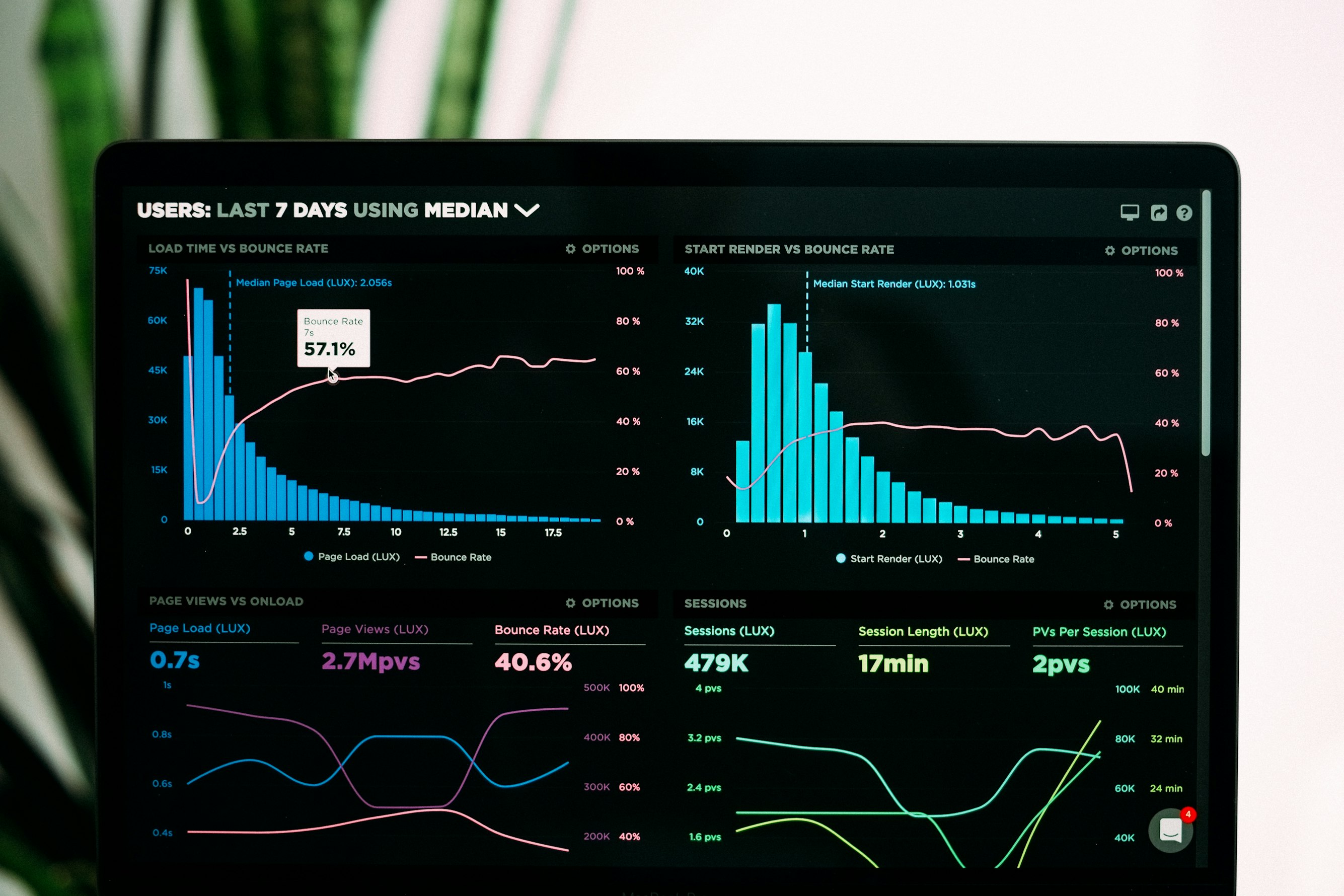
<h3 id="the-retention-graph">Reading Your Retention Graph</h3>
<p>Every YouTube creator should be obsessed with their retention graphs. That squiggly line in YouTube Studio tells you exactly where viewers are engaged and where they're leaving.</p>
<p>What you'll typically see:</p>
<ul>
<li><strong>Initial drop:</strong> First 30 seconds lose casual browsers. Normal and expected.</li>
<li><strong>Plateaus:</strong> Sections where the line stays flat. Viewers are engaged here.</li>
<li><strong>Cliffs:</strong> Sudden steep drops. Something drove viewers away.</li>
<li><strong>Gradual decline:</strong> Slow, steady drop. Natural fatigue over long videos.</li>
</ul>
<p>The cliffs are what we're hunting. And if you look closely at videos with data presentation, you'll notice something: the cliffs often happen right when static charts appear.</p>
<h2 id="why-static-charts-fail">Why Static Charts Destroy Retention</h2>
<p>Let's break down exactly why that Excel screenshot is killing your videos.</p>
<h3 id="visual-boredom">Visual Boredom</h3>
<p>YouTube is a visual medium. Viewers expect movement. When the screen suddenly becomes a static image—especially one that looks like work software—their brain disengages.</p>
<p>Think about it from the viewer's perspective. They're watching a video. Images are moving. Cuts are happening. Then suddenly: a frozen spreadsheet for 30 seconds while you narrate numbers.</p>
<p>Their brain interprets this as: nothing is happening here. Time to check what else is available.</p>
<h3 id="cognitive-overload">Cognitive Overload</h3>
<p>Static charts present all information simultaneously. A bar chart with 8 bars? The viewer sees all 8 bars at once. Their eyes don't know where to focus. The narrative you're building gets lost in visual noise.</p>
<p>Compare this to an animated chart where each bar builds in as you discuss it. The viewer's attention is guided. They process information sequentially, matching your narration. Comprehension goes up. Engagement stays high.</p>
<h3 id="spreadsheet-association">The Spreadsheet Association</h3>
<p>Here's a psychological factor most creators ignore: Excel and Google Sheets look like work.</p>
<p>When viewers see a screenshot that looks like it came from their office software, subconscious associations kick in. Reports. Meetings. Monday mornings. Budget reviews.</p>
<p>These associations are not conducive to entertainment. Even educational content needs to feel engaging, not obligatory.</p>
<h3 id="pacing-disruption">Pacing Disruption</h3>
<p>Good videos have rhythm. Cuts, movement, and visual variation create pacing that holds attention. A static chart breaks that rhythm completely.</p>
<p>It's like a song that suddenly stops for 30 seconds of silence. Technically, the song continues after, but you've lost the listener.</p>
<h2 id="channels-doing-it-right">Channels That Get Data Visualization Right</h2>
<p>Let's look at creators who've figured this out. These channels present complex data constantly—and maintain excellent retention.</p>
<h3 id="vox">Vox</h3>
<p>Vox's explainer videos are masterclasses in animated data. Notice how their charts never just appear. Bars grow. Lines draw themselves. Numbers count up. Labels animate in.</p>
<p>Even when presenting simple statistics, there's always motion. A number doesn't just appear—it types itself or scales up. The visual is always doing something.</p>
<p>Result: Vox videos routinely hit 60-70%+ retention on 10+ minute explainers covering topics that could easily be boring.</p>
<h3 id="coldfusion">ColdFusion</h3>
<p>ColdFusion covers business and technology stories heavy with financial data. Revenue figures. Market share. Growth trajectories.</p>
<p>Watch how Dagogo presents this information. Charts build progressively. Data points highlight as they're discussed. Comparisons animate between states. The information reveals itself in sync with the narration.</p>
<p>This isn't accidental. It's deliberate retention optimization through motion.</p>
<h3 id="wendover">Wendover Productions</h3>
<p>Wendover tackles logistics, economics, and geography—all data-heavy subjects. Their approach to charts and maps is consistently animated.</p>
<p>Notice their maps especially. Routes draw themselves. Regions highlight sequentially. Data layers build up rather than appearing all at once.</p>
<p>The result is complex information that feels watchable rather than work.</p>
<h3 id="common-thread">The Common Thread</h3>
<p>These channels have different styles, topics, and audiences. But they share one principle: data is never static.</p>
<p>Every chart, graph, map, and statistic has motion. Information reveals progressively. The visual always has something happening.</p>
<p>They've learned what YouTube's algorithm teaches: motion retains. Static doesn't.</p>
<h2 id="retention-data">The Retention Impact: Real Numbers</h2>
<p>How much difference does animation actually make? While exact figures vary by channel and content type, patterns emerge consistently.</p>
<h3 id="what-analytics-show">What Analytics Show</h3>
<p>Creators who've A/B tested static versus animated data presentations report:</p>
<ul>
<li><strong>15-30% higher retention</strong> during data-heavy segments with animation</li>
<li><strong>Significantly fewer cliff drops</strong> when charts build progressively</li>
<li><strong>Higher average view duration</strong> overall when animation is used throughout</li>
<li><strong>Better click-through on end screens</strong> (viewers who stay engaged longer are more likely to click)</li>
</ul>
<p>The compound effect matters most. A video that retains 10% more viewers through each segment delivers dramatically more total watch time by the end.</p>
<h3 id="algorithm-ripple">The Algorithm Ripple Effect</h3>
<p>Better retention doesn't just help one video. It helps your channel.</p>
<p>When YouTube sees a video performing well (high retention, good watch time), it tests that video with larger audiences. If it keeps performing, it pushes harder.</p>
<p>This means one well-optimized video can boost your entire channel's performance. The algorithm starts trusting your content more. Future videos get more initial distribution.</p>
<p>Static charts are leaving this compound growth on the table.</p>
<h2 id="the-old-solutions">The Traditional Solutions (And Why They Don't Scale)</h2>
<p>Creators have known about this problem for years. The traditional solutions have significant drawbacks.</p>
<h3 id="after-effects">Option 1: Learn After Effects</h3>
<p>After Effects is the industry standard for motion graphics. It can create stunning animated charts.</p>
<p>The problems:</p>
<ul>
<li><strong>Learning curve:</strong> 40-100+ hours to reach basic competency</li>
<li><strong>Time per chart:</strong> 1-3 hours for a single animated visualization, even when skilled</li>
<li><strong>Software cost:</strong> $22.99/month for After Effects alone</li>
<li><strong>Ongoing time investment:</strong> Every video requires hours of animation work</li>
</ul>
<p>For full-time creators with animation backgrounds, this works. For everyone else, it's impractical.</p>
<h3 id="hire-editor">Option 2: Hire a Motion Graphics Editor</h3>
<p>Outsource the problem to someone with the skills.</p>
<p>The problems:</p>
<ul>
<li><strong>Cost:</strong> $50-200+ per animated chart, depending on complexity and editor rates</li>
<li><strong>Turnaround:</strong> Days to weeks, depending on editor availability</li>
<li><strong>Communication overhead:</strong> Explaining what you want, revision cycles</li>
<li><strong>Scaling issues:</strong> Every new video means more cost and coordination</li>
</ul>
<p>This works for occasional high-budget videos. It doesn't scale for consistent content production.</p>
<h3 id="templates">Option 3: Use After Effects Templates</h3>
<p>Buy pre-made templates and swap in your data.</p>
<p>The problems:</p>
<ul>
<li><strong>Still requires After Effects:</strong> You need the software and basic knowledge to customize</li>
<li><strong>Limited flexibility:</strong> Templates don't fit every data structure</li>
<li><strong>Generic look:</strong> Popular templates become recognizable; your charts look like everyone else's</li>
<li><strong>Time investment:</strong> Faster than from-scratch, but still 20-45 minutes per chart</li>
</ul>
<p>Templates reduce the problem but don't solve it.</p>
<h3 id="canva-basic">Option 4: Canva or Basic Tools</h3>
<p>Use simpler tools with basic animation features.</p>
<p>The problems:</p>
<ul>
<li><strong>Limited motion quality:</strong> Animations feel basic, not broadcast-quality</li>
<li><strong>Not purpose-built:</strong> Animation features are add-ons, not core functionality</li>
<li><strong>Restricted customization:</strong> Limited control over timing, easing, and style</li>
</ul>
<p>Better than static, but noticeably less professional than proper motion graphics.</p>
<h2 id="ai-solution">The AI Solution: Animated Charts in Seconds</h2>
<p>AI motion graphics generators have changed this equation entirely.</p>
<p>Instead of learning complex software or paying for every chart, you provide your data and the AI generates professional animation automatically. No keyframes. No timeline manipulation. No motion design knowledge.</p>
<p>The output isn't basic animation. Modern AI tools produce genuine motion graphics—proper easing, professional timing, broadcast-ready quality. The kind of animations that would take hours to create manually.</p>
<h3 id="how-it-works">How It Works</h3>
<ol>
<li><strong>Input your data:</strong> Paste numbers directly or upload a simple data file</li>
<li><strong>Choose visualization type:</strong> Bar chart, line graph, pie chart, comparison</li>
<li><strong>Select style:</strong> Match your channel's aesthetic</li>
<li><strong>Generate:</strong> AI creates smooth, professional animation in seconds</li>
<li><strong>Download:</strong> Export video file ready for your timeline</li>
</ol>
<p>Total time: 30-60 seconds per chart.</p>
<p>Compare that to 1-3 hours in After Effects or $50-200 per freelancer chart. The math changes completely.</p>
<h3 id="quality-comparison">Quality Reality Check</h3>
<p>You might expect AI-generated animation to look cheap or basic. Modern tools have closed this gap dramatically.</p>
<p>AI motion graphics now feature:</p>
<ul>
<li><strong>Proper easing:</strong> Elements accelerate and decelerate naturally, not linearly</li>
<li><strong>Professional timing:</strong> Builds and reveals happen at appropriate speeds</li>
<li><strong>Clean motion:</strong> Smooth animation without jitter or awkward movements</li>
<li><strong>Broadcast-ready output:</strong> 1080p/4K, proper frame rates, quality export</li>
</ul>
<p>Would a skilled After Effects artist create better animation? Possibly, for highly custom or complex needs. For standard data visualization in YouTube videos, AI output is genuinely professional quality.</p>
<h2 id="implementation-guide">Implementing Animated Charts: A Practical Guide</h2>
<p>Let's get tactical. Here's how to start using animated charts in your videos.</p>
<h3 id="identify-data-moments">Step 1: Identify Data Moments in Your Scripts</h3>
<p>Before production, review your script or outline. Mark every moment where you'll present:</p>
<ul>
<li>Statistics or numbers</li>
<li>Comparisons between things</li>
<li>Trends over time</li>
<li>Breakdowns of wholes into parts</li>
<li>Rankings or hierarchies</li>
</ul>
<p>Each of these is a candidate for animated visualization.</p>
<h3 id="choose-chart-types">Step 2: Choose the Right Chart Type</h3>
<p>Match your data to the appropriate visualization:</p>
<p><strong>Bar charts:</strong> Comparisons between discrete items. "Company A revenue vs Company B revenue."</p>
<p><strong>Line charts:</strong> Trends over time. "Stock price over 5 years."</p>
<p><strong>Pie/donut charts:</strong> Parts of a whole. "Market share breakdown."</p>
<p><strong>Counter animations:</strong> Single impressive numbers. "$47 billion in revenue."</p>
<p><strong>Comparison animations:</strong> Before/after or side-by-side. "2020 versus 2025."</p>
<h3 id="prepare-clean-data">Step 3: Prepare Clean Data</h3>
<p>Garbage in, garbage out. Before generating animations:</p>
<ul>
<li><strong>Simplify:</strong> 5-7 data points maximum. Too many bars/lines create visual noise.</li>
<li><strong>Round numbers:</strong> $1.2B, not $1,247,893,421. Viewers can't process precise numbers anyway.</li>
<li><strong>Clear labels:</strong> Short, readable text. "Apple" not "Apple Inc. (NASDAQ: AAPL)".</li>
<li><strong>Logical order:</strong> Arrange data to support your narrative. Largest to smallest, chronological, or whatever serves the story.</li>
</ul>
<h3 id="generate-animations">Step 4: Generate Animations</h3>
<p>Use an AI tool like <a href="https://flowi.video">flowi.video</a> to create your visualizations:</p>
<ol>
<li>Input your cleaned data</li>
<li>Select chart type</li>
<li>Choose style that matches your channel aesthetic</li>
<li>Set aspect ratio (16:9 for YouTube)</li>
<li>Generate and download</li>
</ol>
<p>With flowi, this process takes roughly 30 seconds per chart. A video with 5 data moments requires about 2-3 minutes of chart creation total.</p>
<h3 id="integrate-into-edit">Step 5: Integrate Into Your Edit</h3>
<p>In your video editor:</p>
<ol>
<li>Import your animated chart files</li>
<li>Place them in your timeline where data is discussed</li>
<li>Adjust timing so animation matches your narration</li>
<li>Add any additional text overlays if needed</li>
</ol>
<p>The animation should build as you introduce information. If you're explaining three companies' revenue, the bars should appear as you name each company.</p>
<h3 id="retention-test">Step 6: Review Retention After Publishing</h3>
<p>After your video goes live, check retention analytics specifically during data segments:</p>
<ul>
<li>Compare retention during animated charts versus any remaining static moments</li>
<li>Look for improvement in cliff drops at data-heavy sections</li>
<li>Track overall average view duration changes</li>
</ul>
<p>Use this data to refine your approach on future videos.</p>
<h2 id="flowi-solution">How flowi.video Solves the Animated Chart Problem</h2>
<p><a href="https://flowi.video">flowi.video</a> is purpose-built for exactly this use case: turning data into retention-friendly motion graphics without the traditional barriers.</p>
<p><strong>Why it works for YouTube creators:</strong></p>
<p><strong>Speed that matches content velocity:</strong> You don't have 3 hours to animate a chart when you're trying to publish weekly. flowi generates professional animations in 30 seconds. A video with multiple data points still only requires minutes of chart creation.</p>
<p><strong>No learning curve:</strong> You don't need to understand keyframes, easing curves, or composition. Paste data, select style, generate. The AI handles motion design principles automatically.</p>
<p><strong>Broadcast-quality output:</strong> Proper easing. Professional timing. Smooth motion. Output that looks like you hired a motion graphics editor—without the cost or coordination.</p>
<p><strong>YouTube-ready formats:</strong> Generate in 16:9 at 1080p or 4K. Export as MP4 ready for your timeline. No format conversion, no quality loss.</p>
<p><strong>Consistent style:</strong> Save your preferences. Every chart across every video maintains consistent branding. Your data visualizations become recognizable as part of your channel's visual identity.</p>
<p><strong>The bottom line:</strong> flowi turns your boring spreadsheet data into retention-hacking video content in 30 seconds. The data that was killing your watch time becomes the data that keeps viewers engaged.</p>
<h2 id="beyond-charts">Beyond Charts: Other Static Elements Killing Retention</h2>
<p>While we've focused on charts, the same principle applies to other static elements common in data-heavy videos.</p>
<h3 id="static-maps">Static Maps</h3>
<p>Showing a map screenshot while discussing geography? Viewers zone out.</p>
<p>Solution: Animated maps where locations highlight, routes draw, and regions pulse as discussed.</p>
<h3 id="static-text">Text Screenshots</h3>
<p>Showing a quote or text block as a static image? Engagement drops.</p>
<p>Solution: Kinetic typography where text animates in, key words highlight, and the visual has movement.</p>
<h3 id="static-comparisons">Static Comparison Tables</h3>
<p>Side-by-side screenshots comparing products, features, or data? Eyes glaze over.</p>
<p>Solution: Animated comparisons where elements reveal progressively, winners highlight, and the comparison tells a visual story.</p>
<p>The principle is universal: if it can move, it should move. If it's static for more than a few seconds, viewers are leaving.</p>
<h2 id="retention-mindset">The Retention Mindset Shift</h2>
<p>Improving retention isn't about tricks or hacks. It's about respecting your viewers' attention.</p>
<p>Every second someone watches your video, they're choosing you over infinite alternatives. Every static moment is a moment you're testing their patience.</p>
<p>The creators winning on YouTube have internalized this. They treat every frame as an opportunity to earn the next second of attention. Data moments aren't exceptions—they're critical points where attention is most at risk.</p>
<p>Motion isn't decoration. It's retention infrastructure.</p>
<p>When you stop thinking of animated charts as "nice to have" and start thinking of them as essential retention tools, your approach to content creation shifts. Every data point becomes an engagement opportunity rather than a risk.</p>
<h2 id="conclusion">Stop Losing Viewers to Static Charts</h2>
<p>Your data isn't the problem. Your research isn't the problem. Your narrative isn't the problem.</p>
<p>The static presentation is the problem.</p>
<p>Every Excel screenshot in your timeline is a viewer exit point. Every frozen chart is attention leaking away. Every static data moment is retention you're leaving on the table.</p>
<p>The solution is no longer difficult. AI motion graphics have made animated charts accessible to every creator, regardless of technical skill or budget.</p>
<p>30 seconds to generate a chart. Professional motion quality. YouTube-ready output.</p>
<p>Your next video can be different. The same research, the same data, the same narrative—but with motion that keeps viewers watching instead of static that drives them away.</p>
<p>The retention graph doesn't lie. It's showing you exactly where viewers leave. Now you have the tools to fix it.</p>
<div style="background-color: #f8f9fa; padding: 24px; border-radius: 8px; margin-top: 32px;">
<h3 style="margin-top: 0;">Turn Data Into Retention-Hacking Motion Graphics</h3>
<p style="margin-bottom: 16px;">Stop losing viewers to static charts. flowi.video transforms your spreadsheet data into professional animated visualizations in 30 seconds. No After Effects. No motion design skills. Just better retention.</p>
<p style="margin-bottom: 0;"><a href="https://flowi.video" style="font-weight: bold;">Try flowi.video free →</a></p>
</div>Read Next
Continue Exploring

Data Democratization: End the 72-Hour Wait for Content
Data democratization cuts content production from weeks to hours. Learn how to eliminate bottlenecks and improve engagement rate measurement in finance content.

What Is AI Motion Generation and How Does It Work?
Learn how AI motion generation creates professional animated maps, charts, and logo reveals in minutes—no After Effects skills required.

5 Mistakes Beginners Make with AI Motion Graphics Generators (And How to Avoid Them)
Avoid common AI motion graphics mistakes that waste time and hurt results. Learn how to get professional animated maps, charts, and logos right the first time.