
A practical framework for creating visual data narratives that drive decisions and audience engagement
Learn how to transform complex data into clear, actionable stories. This guide covers narrative structure, visualization selection, and production workflows for analysts and communicators.
TL;DR
Data storytelling dramatically improves retention - Audiences remember 67% of information presented as stories versus 5-10% for statistics alone, making narrative structure essential for effective communication.
Follow a four-phase framework - Discovery (find the insight), Design (map the narrative), Development (create visuals), and Distribution (optimize for channels) provides a repeatable system for faster, higher-quality output.
Start with insight, not visualization - The most common mistake is creating charts before identifying what audiences actually need to understand and act upon.
Animation solves attention management - Sequential reveal of data points guides comprehension in ways static charts cannot, particularly for complex multi-variable relationships.
Automation is accelerating production - 75% of data stories are projected to be AI-generated by 2025, shifting professional focus from technical execution to strategic narrative decisions.
Guide Orientation: What You'll Learn About Data Storytelling
This guide covers the complete process of transforming raw data into compelling visual narratives that drive audience engagement and decision-making. You'll learn a systematic framework for data storytelling that combines analytical rigor with narrative structure.
This content is designed for data journalists, finance influencers, and analysts who need to communicate complex information quickly and accurately. By the end, you'll understand how to structure data narratives, select appropriate visualizations, and accelerate production without sacrificing quality.
We focus on practical execution rather than theoretical foundations. This guide excludes basic charting tutorials and assumes familiarity with data analysis concepts.
Why Data Storytelling Matters Now
The gap between data availability and audience comprehension continues to widen. Organizations generate unprecedented volumes of information, yet most presentations fail to translate insights into action. 92% of business leaders believe data storytelling is an effective method to present insights, but execution remains inconsistent.
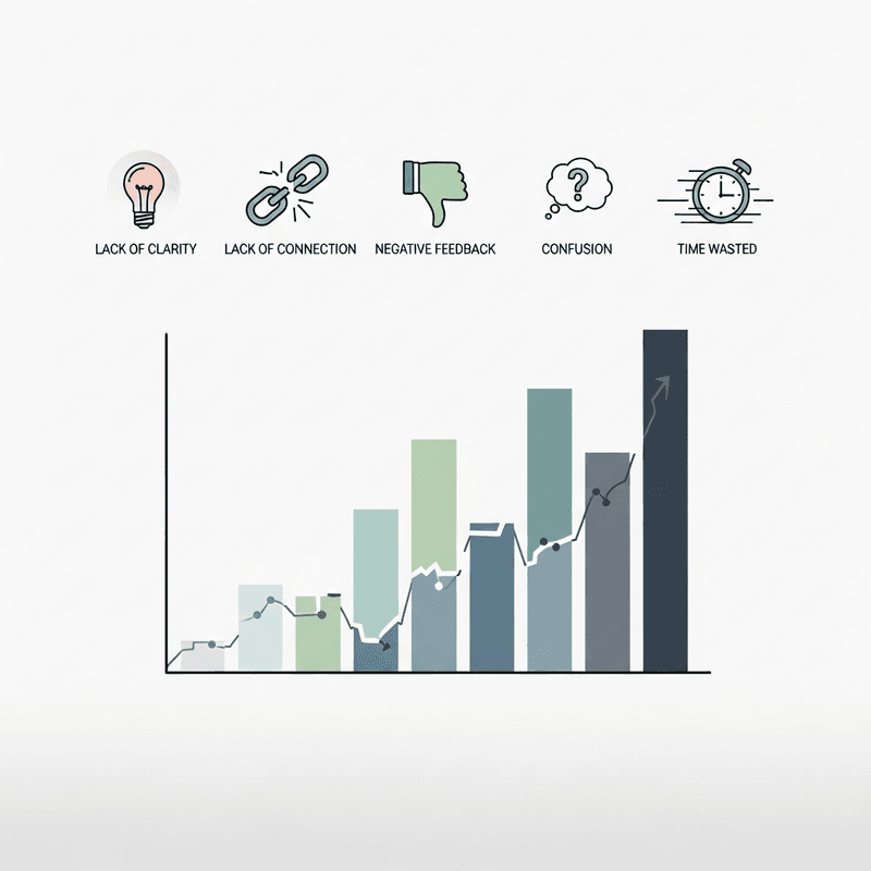
Raw data dumps create cognitive overload. Audiences disengage when confronted with spreadsheets and dense tables. The cost of poor data visualization extends beyond missed engagement. It manifests as delayed decisions, misallocated resources, and lost competitive advantage.
Storytelling marketing grew 46% in 2024, with thousands of new queries emerging around narrative-driven content. This shift reflects audience expectations. People now anticipate visual storytelling across financial reports, market analysis, and performance reviews.
The professionals who master this skill differentiate themselves in crowded content markets. Those who rely solely on traditional reporting formats risk irrelevance as audience attention spans compress and visual literacy increases.
Core Concepts: Understanding Data Narrative Fundamentals
What Separates Data Storytelling from Data Presentation
Data presentation displays information. Data storytelling guides interpretation. The distinction matters because audiences process narrative structures differently than isolated facts. People are 22 times more likely to remember facts when delivered in a story rather than as bare data.
A data narrative contains three essential components: context (why this matters now), tension (what problem or opportunity exists), and resolution (what action follows). Without all three, you have a chart, not a story.
The Retention Problem with Raw Statistics
Data retention jumps from 5-10% (statistics alone) to 67% when paired with storytelling. This cognitive reality shapes how effective communicators structure their content. Leading with numbers before establishing context creates immediate friction.
Visual Storytelling vs. Decoration
Effective data visualization serves comprehension, not aesthetics. Every visual element should answer a specific question or support a particular claim. Decorative charts that obscure rather than clarify represent a common failure mode among inexperienced practitioners.
The goal is not impressive graphics. The goal is instant understanding followed by appropriate action.
The Data Story Framework: Four-Phase Structure
Accelerating data story creation requires a repeatable system. This framework organizes the process into four interconnected phases: Discovery, Design, Development, and Distribution.
Discovery identifies the core insight and audience context. Design maps the narrative arc and visualization approach. Development produces the actual visual assets. Distribution optimizes delivery for specific channels and formats.
Each phase builds on the previous one. Skipping Discovery leads to unfocused narratives. Rushing Design creates rework during Development. Ignoring Distribution limits impact regardless of content quality.
The framework applies whether you're creating a single chart for a quarterly report or producing animated data videos for social platforms. Scale and complexity vary, but the underlying structure remains consistent.
Step-by-Step Breakdown: Executing Each Phase
Step 1: Discovery: Identifying Your Core Insight
Objective: Isolate the single most important finding that your audience needs to understand and act upon.
Begin by reviewing your dataset with a specific question in mind. Avoid exploratory analysis at this stage. Instead, focus on what your audience needs to know versus what the data technically contains. The gap between these two perspectives often reveals the story.
Document the insight in one sentence. If you cannot articulate it clearly without jargon, you haven't found it yet. Test this sentence against audience priorities. Does it address a decision they face? Does it challenge or confirm their existing assumptions?
Anti-patterns to avoid: Starting with the most visually interesting data rather than the most strategically relevant. Attempting to communicate multiple insights simultaneously. Assuming audience familiarity with domain-specific context.
Success indicators: You can explain the insight to someone outside your field in under 30 seconds. Stakeholders immediately recognize the relevance to their decisions.
Step 2: Design: Mapping Narrative Structure
Objective: Create a logical flow that guides audiences from context through analysis to actionable conclusions.
Structure your narrative using the tension-resolution model. Open with context that establishes why this topic matters now. Introduce the specific question or challenge your data addresses. Present findings in a sequence that builds understanding progressively. Close with clear implications or recommended actions.
Select visualization types based on the relationships you're communicating. Comparisons require different formats than trends over time. Part-to-whole relationships demand different approaches than correlations. Match the visual form to the analytical function.
Data-driven stories can boost audience engagement by up to 300%, but only when structure supports comprehension. Random chart sequences, regardless of individual quality, fail to create this effect.
Anti-patterns to avoid: Organizing content chronologically by when you discovered insights rather than by audience learning needs. Selecting visualizations based on aesthetic preferences rather than communication requirements.
Success indicators: Each section answers a question raised by the previous section. Audiences can predict the general direction of the narrative after the opening.
Step 3: Development: Producing Visual Assets
Objective: Generate polished visualizations that communicate clearly at a glance and maintain accuracy under scrutiny.
This phase traditionally consumes the majority of production time. Manual chart creation, animation sequencing, and quality assurance create bottlenecks that delay publication and increase error rates. 75% of data stories are projected to be automatically generated by AI and augmented analytics tools by 2025, reflecting industry recognition of this inefficiency.
Prioritize clarity over complexity in visual design. Remove elements that don't directly support comprehension. Ensure data accuracy through systematic verification, not assumption. Maintain consistent styling across all assets to reinforce narrative cohesion.
For animated content, consider how motion can guide attention and reveal relationships progressively. Static charts force audiences to process all information simultaneously. Animation allows you to control the sequence of understanding.
Anti-patterns to avoid: Adding visual complexity to appear sophisticated. Skipping accuracy verification under time pressure. Inconsistent formatting that creates cognitive friction.
Success indicators: Audiences understand the main point within seconds of viewing. Data sources and methodology can withstand critical examination.
Step 4: Distribution: Optimizing for Channel and Context
Objective: Adapt your data story for specific platforms while maintaining narrative integrity and visual quality.
Different channels impose different constraints. Social platforms favor shorter, more dynamic content. Professional reports allow for greater depth. Presentations require formats that support verbal explanation. Each context demands specific adaptations.
73.67% of marketers use storytelling to communicate sales-related information, but effectiveness varies dramatically based on channel alignment. The same insight requires different treatments for LinkedIn versus investor presentations versus internal dashboards.
Consider how audiences will encounter your content. Mobile viewing requires larger text and simpler compositions. Autoplay environments need visual hooks that work without audio. Email distribution may require static alternatives to animated content.
Anti-patterns to avoid: Creating one version and deploying it everywhere unchanged. Optimizing for your preferred platform rather than where your audience actually engages. Sacrificing accuracy for engagement metrics.
Success indicators: Content performs consistently across intended channels. Audience feedback indicates clear understanding regardless of viewing context.
Step 5: Iteration: Refining Based on Response
Objective: Systematically improve future data stories based on audience behavior and feedback.
Track engagement patterns to identify what resonates. Note which visualizations generate questions versus which create immediate understanding. Document production bottlenecks for process improvement. Build a library of effective templates and approaches.
Storytelling improves conversion rates by 30% and increases perceived product value significantly, but these benefits compound over time as you refine your approach. Each data story provides learning opportunities for the next.
Create feedback loops with your audience. Direct questions often reveal comprehension gaps that engagement metrics miss. Use this input to adjust narrative structure, visualization choices, and distribution strategies.
Anti-patterns to avoid: Treating each project as isolated rather than part of an evolving practice. Ignoring negative feedback or low engagement as anomalies. Over-optimizing for metrics that don't reflect actual comprehension.
Success indicators: Production time decreases while quality improves. Audience engagement trends upward across comparable content types.
Practical Application: Scenario Comparison
Quarterly Earnings Report: Traditional vs. Story-Driven Approach
Traditional approach: Dense tables showing revenue, expenses, and margins. Bullet points listing percentage changes. Minimal context or interpretation. Audience required to extract meaning independently.
Story-driven approach: Opens with the strategic question the quarter addressed. Visualizes key metrics in context of annual targets and competitive benchmarks. Animates trend progression to show momentum. Closes with specific implications for upcoming decisions.
The data remains identical. The comprehension and retention differ dramatically. The story-driven version requires more upfront planning but generates significantly higher engagement and clearer stakeholder alignment.
Market Analysis: Static vs. Animated Presentation
Static presentation: Multiple charts displayed simultaneously. Audience attention disperses across competing visual elements. Key relationships obscured by information density.
Animated presentation: Sequential reveal of data points builds understanding progressively. Motion guides attention to specific comparisons. Narrative pacing allows processing time between insights.
Animation adds production complexity but solves the attention management problem inherent in complex data communication. The tradeoff favors animation when insights depend on understanding relationships across multiple variables.
Common Mistakes and How to Avoid Them
Starting with the visualization instead of the insight. Beautiful charts that don't answer relevant questions waste audience attention. Always begin with Discovery, regardless of time pressure.
Overloading single visuals with multiple messages. Each chart should communicate one primary idea. Supporting details belong in supplementary materials or subsequent visuals.
Neglecting accuracy verification under deadline pressure. Data errors destroy credibility faster than any other factor. Build verification into your process as a non-negotiable step.
Assuming audience context that doesn't exist. What seems obvious after deep analysis often requires explicit explanation for audiences encountering the data fresh.
Optimizing for production speed at the expense of narrative structure. Fast content that fails to communicate wastes more time than slower content that succeeds. Invest in the Design phase to avoid rework.
What to Do Next
Select one upcoming data communication task and apply the four-phase framework deliberately. Document where you encounter friction and where the structure accelerates your process.
Start with Discovery even if you feel confident about your insight. The discipline of articulating it clearly often reveals assumptions worth examining. Use this guide as a reference during Design to ensure your narrative structure supports comprehension.
Consider how automation tools might address your specific production bottlenecks. Effective data presentation increasingly depends on systems that handle technical execution while you focus on strategic decisions about narrative and visualization.
Return to this framework as your practice evolves. The principles remain stable, but your application will become more sophisticated with experience.
Frequently Asked Questions
What is data storytelling?
Data storytelling combines data analysis, visualization, and narrative structure to communicate insights in ways audiences understand and remember. Unlike raw data presentation, it guides interpretation through context, tension, and resolution. The approach transforms statistics into actionable understanding by connecting numbers to decisions and outcomes.
Why is data storytelling important?
Data retention increases from 5-10% with statistics alone to 67% when paired with storytelling. Audiences process narrative structures more effectively than isolated facts, leading to better comprehension, stronger engagement, and clearer decision-making. In competitive content environments, story-driven data communication differentiates professionals who influence outcomes from those who merely report information.
How can I create an effective data story?
Follow a systematic framework: identify your core insight (Discovery), map your narrative structure (Design), produce visual assets (Development), and optimize for your channels (Distribution). Each phase builds on the previous one. Start with the single most important finding your audience needs, then structure everything else to support that central insight.
When should I use data storytelling instead of traditional reporting?
Use data storytelling when you need audiences to understand implications and take action, not merely acknowledge information. Traditional reporting works for reference documentation and compliance requirements. Data storytelling works for persuasion, decision support, and audience engagement. If your goal involves behavior change or strategic alignment, storytelling approaches consistently outperform traditional formats.
Which visualizations are best for data storytelling?
The best visualization depends on the relationship you're communicating. Use bar charts for comparisons, line charts for trends over time, and pie charts sparingly for simple part-to-whole relationships. Animated visualizations work well for complex relationships that benefit from sequential reveal. Match visual form to analytical function rather than selecting based on aesthetic preferences.
What are the key elements of a data story?
Every effective data story contains context (why this matters now), tension (the problem or opportunity), and resolution (what action follows). Supporting elements include accurate data, appropriate visualizations, clear narrative structure, and channel-appropriate formatting. Missing any core element transforms a story into a disconnected data dump.
Sources
Read Next
Continue Exploring

5 Community Growth Strategies Using Real-Time Data Insights
Discover 5 community growth strategies that help finance creators turn real-time insights into compelling data storytelling. Reduce your insight-to-publish gap.
5 Signs Your Interactive Charts Are Failing to Engage
Discover 5 key indicators that your interactive charts aren't engaging audiences. Learn which engagement metrics reveal real problems versus vanity numbers.
7 Customizable Dashboards for Data-Driven Storytelling
Explore 7 customizable dashboards for data-driven storytelling in finance. These tools connect content performance analysis to actionable audience insights.